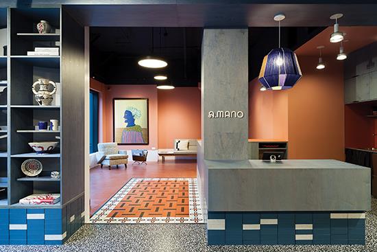
Designer Forum: Sergio Mannino Studio’s design of a Brooklyn, New York hub for artists – May 2022
By Sergio Mannino
When Katherine Wells decided to turn her online, handmade home decor business into a brick-and-mortar hub for artists, Brooklyn, New York residents and retailers-a space facilitating collaboration and accessibility to local art on a larger scale-she turned to Brooklyn-based Sergio Mannino (SM) Studio to design a new space to serve as both a store and a gathering place. Wells had read Mannino’s articles in Forbes about what it means to own a store today and had decided to rebrand from the name “Cain Sloan” to something more evocative and indicative of the culture she was trying to create.
THE INSPIRATION
The team at SM Studio always starts with one big question: How can we keep people excited? In a world where everything is changing all the time, the team is driven by the need to come up with invigorating design solutions that are not only sustainable, materially diverse, ethical and politically informed, but also solutions that will last, both functionally and aesthetically. Made up of professional architects, interior designers, graphic designers and branding consultants, SM Studio is motivated by the desire to create spaces that synthesize creativity, excitement and functionality.
Wells’ newly rebranded A.MANO Brooklyn is a home decor shop merging the retailing of locally made ceramics, art and upcycled fine furniture. In addition, A.MANO is partnering with Bklyn Clay, a ceramic school/workshop located right next door. This collaboration fosters the promotion of local art, and the sales of the pieces benefit both entities. For A.MANO’s physical location, Wells inspired SM Studio to create a vibrant, welcoming space full of artistic references that she cherishes.
The project also incorporates SM Studio’s dual heritage: Italian Radical Design on one side and American minimalism on the other. The design for A.Mano features minimal as well as bold, funky design, while also incorporating a raw feel to the space. The corresponding logo and branding were carefully designed to reflect tidiness, while also maintaining a delicate and unique look. This is representative of the handmade, one-of-a-kind ceramics being sold. In fact, the Italian phrase “a mano” translates to “handmade.”
The unique and modern store combines various design aesthetics, from ’80s Italian design to minimalist to industrial, drawing inspiration from iconic artists and designers such as Donald Judd and the Milanese Memphis Group. Additionally, the store was sustainably designed, allowing for all the fixtures to be disassembled without destroying the materials. No glue was used to connect all the parts, even the glazed bricks, showcasing that sustainable design can be done wisely and doesn’t have to limit creativity.
THE SPACE
To tie both sides of the project together, the team considered each material and element of the physical space from an architectural perspective as well as a graphic one. The brand’s primary colors-black, white and smoky blue-are reflected in the floor and glazed brick materials. The colors were selected for their strong character, contrasting tones and bold presence.
The team’s material research was guided not only by those colors but also by thinking about clay (the main medium on display at A.MANO) and all the different ways it has been used for construction over the centuries.
A.MANO’s interior is distinctly divided into three different spaces: a main gallery, a coffeeshop and a back gallery that can be used for various purposes. Each has a unique feel. The goal of the overall design is to create a progressive flow and allow for different experiences for each of the clients.
The main gallery is an eye-catching space featuring blue-stained plywood shelving sitting on a base of blue and white glazed bricks, paired with a black-and-white terrazzo floor. The raw and minimalist look and the use of plywood in the design was inspired by Donald Judd, positioned on top of a base made of colored glazed bricks for a finished look that doesn’t detract from the wares displayed. The main floor features a porcelain floor by Florim with a digitally printed terrazzo design, which quickly became a pattern for the business cards and the window graphics, as well.
The coffee area, located to the left of the main gallery, has a more intimate and homey feeling. Here, a bolder terracotta/orange tone on the walls and floor is evocative of the ceramic pieces sold by A.MANO. The stained concrete floor is punctuated by a series of Mattonelle Margherita tiles by Mutina, designed by Nathalie Du Pasquier, a Milan-based designer known for her iconic Memphis Group design and art. SM Studio used the tiles to create what looks like a ceramic rug on the floor through a custom mosaic pattern that welcomes visitors to the coffee counter.
Lastly, the back room is a more neutral area where the store will periodically show rare and valuable vintage furniture from different eras. It has a blue-stained concrete floor and two large windows overlooking a garden.
The whole space is characterized by a 16” baseboard aligned with the top of the glazed bricks. The “baseboard issue” is recurring for many architects, with some trying to remove it entirely, leaving just a reveal. The studio opted for a bolder solution to make it a strong presence in the space, painting it in contrast with the wall behind.
Copyright 2022 Floor Focus
Related Topics:Florim USA
