


The Influence of Color in Health and Healing: A new study seeks to understand the use and impact of color in healthcare settings – Dec 2021
By Jane Rohde and Dr. Debra Harris
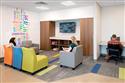
Evidence-based design is essential for creating healthcare environments that are supportive of users and demonstrate measurable outcomes for continued improvement and quality of life for staff, patients, residents and visitors. Within this context, does color, in all its forms, have an influence on the health and healing of occupants in healthcare facilities?
In 2004, the Coalition for Health Environments Research (CHER) funded a study called “Color in Healthcare Environments,” which found that the use of color in healthcare settings, at that time, was not based on significant research, which meant there wasn’t enough data to publish a universal guideline. The concluding remarks of the original study suggested that understanding the needs of multiple users within the healthcare environment and a focus on the context-locality, systems, practices, experiences and traditions-might provide more meaningful outcomes for the use of color in such settings. The presence of multiple users and the complexity of the issues of meaning and communication within the environment render prescribed guidelines unsuitable. While this study used content analysis to address the function of color with respect to psychological, physical, spatial, temporal and semantic perspectives, the recommendation focused on concentrating on specific and concrete problems rather than abstract and universal questions advocating for empirical research.
JSR Associates Inc. and RAD Consultants Inc. revisited the topic in a study released earlier this year called “Healthcare Environments & Color: An Evidence-Based Approach to the Influence of Color.” The purpose of this research review was to conduct the search to focus on color but expand the search for evidence beyond applied color theory, emotions and perceptions to understand if the evidence supports the use of color in healthcare settings or if the evidence supports the findings of the original study.
THE STUDY Emotional responses to colors are caused by culturally learned associations and by the physiological and psychological temperament of an individual. Many other factors also influence a person’s experience, including their role in the organization; physical, emotional and psychological status; and other environmental conditions such as thermal comfort, noise and lighting. While there is evidence that colors have a perceptual influence on space, this is attributed to value and tone, rather than hue. The results of the follow-up study indicate that current research studying the role of color in healthcare environments varies greatly in end-user targeted outcomes and methodology.
Differences between and within the groups that emerged highlight that the current knowledge surrounding color in healthcare environments is sparse and highly eclectic.
To compile the findings, the reviewers conducted a comprehensive search and review of topics related to color in healthcare environments and its impact on occupants. An extensive listing of terms was combined with healthcare, healthcare environments, hospital, long-term care and dementia keywords to focus on color’s influence on healthcare environments, and research articles meeting inclusion criteria were then evaluated using a peer-reviewed article rating system. Results showed that studies involving color in healthcare environments varied greatly in their targeted outcomes and focused on many novel ideas. Studies explored color in the built environment, on plates and on care staff’s clothing. Studies looking at color in the built environment also varied in that some explored lighting, color hue, wall color, multi- versus single-colored or monochromatic schemes, and art color. Within the psychiatric and dementia patient end-user subgroup, for example, studies ranged from focusing on the influence of color in the built environment on enhanced use of the space, to the influence of color in offices on perceived quality of care and qualifications of treatment providers.
In addition to the literature review, a survey targeted to interior designers, architects and consultants across all verticals was developed. It focused on perceptions and preferences of color related to product categories such as flooring, walls, signage, ceilings, artwork and furniture/casework; use of Light Reflectance Value (LRV); user demographics; use of guidelines and standards; and specification and use of technologies to inform design of interior spaces.
The survey results from 84 design professionals identify priorities and factors for consideration in specification of flooring products, as well as understanding how color is used across the design verticals: hospitality, acute healthcare, ambulatory healthcare, senior living, workspace, higher education and residential. PROJECT DETAILS This third-party research project was completed by JSR Associates Inc. and RAD Consultants Inc. to review and evaluate the literature on color and the influence on occupants in healthcare environments based on a rigorous methodology, specifically between 2004 and 2020, the years since the publication of “Color in Healthcare Environments” (Tofle, Schwarz, Yoon, & Max-Royale, 2004) previously funded by the Coalition for Health Environments Research (CHER). The primary investigator was Dr. Debra D. Harris from RAD, and the project manager was Jane Rohde from JSR. The recent updated literature review, report, interior design survey and CEU program was funded by Shaw Contract, including support of the research by Allison Wolff, director of senior living and healthcare, and Natalie Jones, director of marketing. FLOORING FINDINGS When considering colors missing from palettes in high-performance flooring products, participants responded with a need for light and dark greens, dark blues and light greys in flooring color palettes. Light blues and dark greys scored relatively high for increased options in the market. Dark reds and burgundies, light reds and pinks, light and dark oranges, and light yellow and golds all scored low in the ranking.
When considering textures of high-performance flooring products, linen/woven textile was the top texture identified as missing. The need for additional wood textures varied across the responses, from “additional wood textures are needed” to “there is much less need for additional wood textures.” Stone and abstract design for textures equally ranked as the next most important texture needed in the market. The third-ranked need was for solids with variegated tones of multiple colors and solids with variegated tones in the same color. Tile was ranked low, and metal was ranked last as a texture missing from palettes of high-performance flooring products.
All participants selected flooring products as a neutral when designing the built environment, except for senior living (55%) and acute healthcare (17%).
Overall, 60% of participants use Light Reflectance Value (LRV) to determine differentiation between vertical and horizontal surfaces in their design process. An average of 68% of the healthcare verticals use LRV, whereas hospitality (20%), workspace (44%) and higher education (50%) were less likely to use LRV to differentiate between vertical and horizontal surfaces. And 67% of residential design participants use LRV to differentiate between horizontal and vertical surfaces.
Lighting goes hand in hand with color when developing color and finish material palettes for the interior environment. Nearly all the participants (92%) said they use demographics, including age, low-vision needs, and mobility/accessibility needs, along with other factors to inform light levels-though that figure rises to 100% of ambulatory healthcare, higher education and residential design vertical participants. Of the other verticals, hospitality (80%) was least likely to use demographics to determine programmatic needs for lighting levels, indicating that most design professionals are utilizing demographic information to determine lighting requirements for end users. And understanding the factors contributing to specifications of products, colorways and performance are important to future considerations of product design.
BEST PRACTICES FOR USING COLOR IN CONTEXT Because the selection of color in the built environment is so integral-to lighting design, the use of Light Reflectance Value to create value contrast, and the importance of providing light-level control and cultural responsiveness-the following references are provided to assist in the design process for healthcare facilities of all kinds. Using universal design principles and approaches, it is recommended to also consider evaluating these design characteristics to improve the design of all built environments to create inclusive solutions.
The following offer best practices within the built environment (including healthcare and senior living), focusing on light, value, contrast and color; light, circadian rhythms and color; vision, color, tonality and pattern; and lighting levels and lighting comfort. • National Institute of Building Sciences’ Design Guidelines for the Visual Environment. • National Institute of Health’s National Eye Institute (NEI). • Illuminating Engineers Society’s Lighting and the Visual Environments for Older Adults and the Visually Impaired and Lighting Hospital and Healthcare Facilities. • Design Guide for Long Term Care Homes (2018 Edition). • On circadian systems: Rensselaer Lighting Research Center and two Sustainable Facilities tools developed by the U.S. General Services Administration: Circadian Light Section and Sustainability Facilities Tool: Building and Health Section. MORE ABOUT THE SURVEY RESPONDENTS Of the participants, 78% were interior designers or interior architects, 11% were architects and 11% identified as consultants. No participant selected multifamily, retail or secondary education as their predominant area of work. The design verticals represented were healthcare, including acute, ambulatory and senior living (63%); workspace (16%); hospitality (10%); residential (7%); and higher education (4%).

Join Our Newsletter
Get the latest flooring industry news delivered weekly.