Studio O+A's design of Cisco-Meraki's San Francisco office
By Primo Orpilla
When a space is as large as Cisco’s new office in San Francisco, a designer knows that he’s going to be thinking a lot about flooring. The employees that inhabit Cisco’s 110,000 square feet every day certainly aren’t focused on what’s beneath their feet, but the designers of the space evaluate every inch. We think about floors so the users don’t have to.
Studio O+A signed onto this project when Cisco acquired Meraki, a Bay Area company known for making unusually well designed routers. The new Cisco-Meraki moved from a much smaller space into a huge complex in the rapidly developing Mission Bay neighborhood. One of our key design goals emerged from interviews with Meraki’s staff about what they liked about their old office: the communal spirit, the cozy atmosphere. Cozy doesn’t come easy in 110,000 square feet, but we quickly saw ways of replicating the warmth of the old office by making strategic use of the floor.
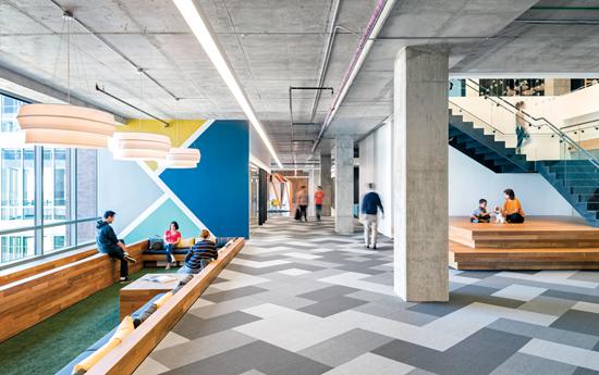
Throughout Cisco’s office, you will find sunken seating areas, self-contained spaces that drop below the base level of the floor. These areas form enclosures for meeting and relaxation that create intimacy without disrupting the long sightlines and visual expansiveness of the overall space. At the base of the office’s central staircase, we built terraced seating platforms that effectively raise the floor to create a cozy meeting area. In both cases, the level of the floor makes a large footprint smaller by carving communal space out of a common area. Carpet can sometimes have the same effect without altering the structure of the floor. In the freestanding yurts that give Cisco’s employees a get-away within the office, octagonal carpets set the parameters of the structures.
In these examples and others, we see a basic principle of practical architecture: flooring creates the greatest design impact for the least impact on budget. Because most new offices are open plan, flooring is a great way to define space economically in a large workplace. With the demise of cubicles, changes in flooring texture and color are often the best way to distinguish one department from another, delineate paths of travel and help visitors navigate complex floor plans. Ideally you want these textured “paths” to be subtle—but not so subtle that people go wandering through desks where other people are working. So it’s a careful balance.
At Cisco we wanted the flooring under the workstations to be neutral. Cisco has a do-it-yourself culture. These are people who like to shape their own environments and move things around. We quickly understood that if we aligned a distinctive floor pattern with a desk configuration that the user then changed, the pattern could get stranded. It could look out of place. So we opted for neutral choices in these work areas and saved our hits of color for the common spaces. And because the Cisco site is so big and open to natural light, it can support bright colors. We splashed a broad palette across Cisco’s floors, from rich blues in the conference areas to magenta in the game room to a quilted pattern in the big dining space.
At O+A we like to use color creatively and intuitively. We never just take a company’s logo color and put it on the wall. Color has such an impact on the way people feel about their spaces that a designer really must use it responsibly. For every project, we create a Pinterest site on which we pin up themes and inspirations. For the Cisco project, we took our cues from the materiality of the location on San Francisco’s waterfront. We wanted a kind of shipyard look—raw materials, weathered teak, but with bright hits of color. It’s the experience of being on the Bay: a clean, breezy environment, where the fog may cast everything in grey and a moment later the sun will break out. That’s the effect we wanted at Cisco.
Which is not to suggest that it’s all aesthetics. Flooring is an important functional component of any design, so you have to make your color and texture decisions within a framework of will-it-work and how-will-it-hold-up? O+A has been doing this long enough to have developed some basic—well, “rules” is not quite the word—let’s call it a vocabulary of design choices from which we build the individual statement of each project. For example, we like to use concrete. It’s kind of a signature look for us. It’s durable, easy to clean, and it instantly communicates the industrial look our clients tend to favor. On top of that concrete, we will work variations. For communal and circulatory spaces, we use hard materials; for team spaces, soft materials. Meeting rooms are always carpeted. Break rooms never are. (Who wants to pick popcorn out of a carpet?) It’s common sense, but the key to good design is applying common sense in ways that are stimulating and inspiring.
At Cisco we faced some practical challenges because it’s a raised floor. A raised floor always presents problems in terms of accessibility. It requires careful coordination with the mechanical team. Obviously, you can’t start ripping up hardwood floors to gain access to VAV boxes, so at Cisco we grouped the mechanical elements in centralized locations and then covered those spaces with area rugs to conceal the access points. It’s a good example of how the practical and the artful can work together. With Cisco, as with many of our tech clients, variety is important. These are creative people, and they want their workspaces to be creative. They’re not looking for repetition. They want a curated, individualized look, not a sea of carpet. The necessity of using area rugs to cover access points and the resulting mix of fabric and wood fed right into that taste for a patchwork aesthetic.
That marriage of the practical with a higher aesthetic comes through, as well, in the ongoing search for sustainability. This is an area where the flooring industry has set a standard for all the other building and design trades. In flooring now, sustainable, environmentally responsible products are the norm, not the exception. Increasingly, the industry standard is green. For a designer, that means your carpet and hard surface selections are going to default toward sustainability, which was certainly the case at Cisco, where we achieved LEED Gold without any significant design concessions. All through the design, the environmental and aesthetic considerations went hand-in-hand. We used reclaimed teak because it was environmentally desirable, and also because it fit the shipyard look we wanted for the project. Our carpets were from Interface, which has a great sustainable business model—and also happens to manufacture beautiful flooring.
This kind of harmony between purpose and design is the ultimate goal in creating interiors. At Cisco our design goal was to develop a workplace that was as simple and elegant in its utility as the beautifully designed routers that Meraki—now Cisco-Meraki—makes. And we wanted it to be cozy. The multiple flooring options we deployed on the project helped us achieve that goal. You might say they helped us keep our feet on the ground.
Copyright 2014 Floor Focus
Related Topics:Interface