McCarthy Nordburg's flooring specification for Big Yam: Designer Forum - June 2017
By David Hobart Jr.
Scottsdale, Arizona-based Big Yam, a creative advertising agency, was in need of a new space that reflected its unique, bold culture. McCarthy Nordburg was called on not only to design the space, but also to help the agency tell that story as visitors and employees interact with the interior spaces of the building.
Big Yam defines its agency as uncompromised and fearless, and this strong character is evident the moment you walk in the doors, through the carefully orchestrated use of architectural elements, interior finishes and furniture, all playing their individual roles in setting the stage. The marriage between brand and architecture is what McCarthy Nordburg defines as “humanizing the built environment.” Interior architecture is a synthesis of materials, such as carpet, concrete, tile and fabrics, that make up a built environment. When these materials tell a story, a new level of design unfolds. Texture, pattern, color and rawness all need to work together to bring the brand to life.
The moment visitors walk through the large steel entry doors into the agency, they are greeted with an immediate sense of place and brand. Reclaimed wood, raw steel and bold pops of color cover the walls and ceiling. The pairing of black steel, concrete and weathered brick with finely tailored turquoise textiles challenges how these materials connect and interact with each other. This unexpected juxtaposition of materials is celebrated in a bold, fearless fashion, the same way Big Yam defines its culture.
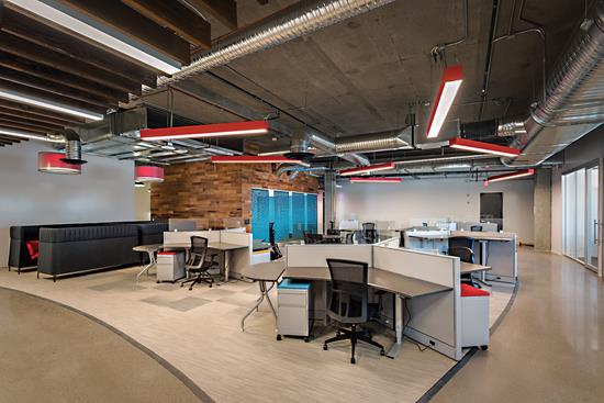
Flooring plays a key role in communicating the Big Yam values. Modular carpet and exposed concrete were used predominantly throughout the 30,000-square-foot agency. Ground concrete with exposed aggregate was used on the floor in the heaviest traffic areas, like the lobby, lounge and circulation paths, throughout the entire space. The decision to use concrete was two fold. Not only does concrete create a sense of rawness and edginess, which ties back to the agency’s brand and culture, but it was also specified due to its durability and ease of maintenance where the heaviest foot traffic occurs-an aesthetic and functional solution.
Within the open office and conference rooms, acoustics played a key role in deciding what flooring to specify, along with continuing to tie the flooring design language back to the agency’s brand. The open office was designed with an exposed ceiling made up of a concrete deck along with reclaimed wood planks-materials that do not absorb sound. While a work environment that has high levels of reverberant sound can be a distraction, reducing concentration and production, having a space that is too acoustically “dead” can be just as counter-productive. Combining exposed concrete ceilings with a modular carpet tile floor created the perfect acoustic solution for these spaces. Once the decision was made to use carpet tile, the designers set out to find the perfect pattern, color and texture that would continue to tell the story of Big Yam’s brand.
How can a carpet pattern be as unexpected and fearless as Big Yam? It all begins with the client’s objectives and program, and how to convey the design intent throughout the space. The solution was to create a carpet pattern that constantly changed as you moved through the space. The pattern and color under one workstation needed to be different from under another workstation.
Telling a visual story with flooring lends itself to products that can be made into large-scale patterns with visual interest. The Mohawk Group provided the perfect product with its Amused II
and Enthralled II carpet tile. This carpet allowed the designers to create a unique gradient pattern that transitioned from black to grey to tan and back to black. Using the gradient pattern ensured that no matter where an individual is standing or working in the open office, they will experience a different visual story in the flooring. Also, the use of bold pops of color was reserved for selected textiles and branding on the walls, so the carpet needed to create interest through visual pattern and texture within the grey and tan tones of the gradient.
One of the main challenges when creating a pattern that is made of 13 different carpets is how to communicate the design to the flooring installers. Not only were there 13 different shades of carpet tiles, but each carpet tile was rotated 90 degrees either clockwise or counterclockwise from the adjacent tile depending on where it fell in the gradient pattern. Detailed installation drawings and mockups from the flooring dealer ensured a seamless execution.
Sustainable design considerations were at the forefront when selecting flooring materials. The designers capitalized on the pristine concrete slabs, ground and polished to enhance their beauty, as a means of utilizing a material that existed in the building, so no additional flooring needed to be produced or shipped. And the Mohawk modular carpet that was selected featured recycled carpet content. This feature of the carpet allows the agency to not only tell a story about the brand but also to highlight the sustainability characteristics of the materials as they lead clients and visitors on a tour of the space.
If Big Yam is not shy about promoting its fearless culture, then why should its space not tell the same story? Bold textures and raw materials coexist alongside finely tailored textiles. Carpet patterns that transition from black to grey tell a visual story as employees and visitors move throughout the building. All of these carefully orchestrated design elements create a space where a bold, fearless and uncompromised brand is brought to life through the built environment.
Copyright 2017 Floor Focus
Related Topics:Mohawk Industries