Designer Forum: Mercy Health partners with GBBN to create an elevated patient experience in its new ambulatory care center - June 2020
By Amy Mees
Cincinnati, Ohio-based Mercy Health, now a partner in the Bon Secours Mercy Health system, is one of the largest Catholic health ministries in the United States, delivering healthcare services across the Midwest and Southeast. Mercy’s facilities range from smaller-scale, freestanding ambulatory care centers to hospital campuses with several hundred inpatient beds.
Mercy approached GBBN with the opportunity to design its newest ambulatory care center, Mercy Health Deerfield Medical Center in Mason, Ohio. The project consisted of clinic space supporting 13 primary and specialty care providers and an outpatient imaging center. With a new brand to establish, one of Mercy’s key goals was to create an exceptional patient and staff experience-a noble request that can be hard to articulate. As GBBN’s designers dug in, they unpacked how that would translate into the space: bring the outside in, flood the interior with natural light and amplify it in spaces that would most benefit its occupants, provide clear building navigation to destress the healthcare experience, enhance provider and staff ability to care for their patients efficiently, allow patient and staff flows to be separated, and create views to nature along the patient journey.
PATTERN FROM THE START
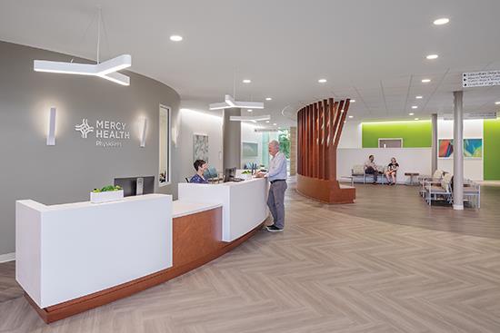
A herringbone-patterned path of Interface’s Studio Set LVT in Titanium begins at the entrance and leads patients to registration, picking up on planned walking routes that cut through the entry and waiting area. While a slightly darker shade of herringbone in Mushroom differentiates waiting zones from the main circulation paths, a break in the pattern-and a vibrant splash of color on adjacent walls-marks patient portals, making it easy for patients to find their way.
THE SHORTEST PATH IS A STRAIGHT LINE
During GBBN’s observations to discover the optimal patient and staff flow, the team had an “ah-ha” moment that led to a new prototype design for Mercy Health’s growing system. Block units of five clustered components-provider office, medical assistant station and three exam rooms-fit together like Lego pieces to become active collaboration pods. Because the pods are all the same, every patient receives the same experience. It’s modular, consistent, equitable and repeatable throughout the Mercy Health system.
When the modules were replicated and arrayed to satisfy the number required, GBBN’s design team discovered they created an optimal flow from the work zone to the care zone-fewer steps equals more efficiency and higher provider and staff satisfaction (and less tired legs by the end of the day). While bookending two larger clinical blocks on either side of the staff zone allows for efficiency in accessing the exam rooms, the design also provides a dramatic daylighting opportunity that floods the work area.
Providers and staff put in long, stressful hours, and the ability to experience sunlight-or whatever the weather may bring-is an important component of their health and well-being in order to perform at their top end.
POSITIVE DISTRACTIONS
Peeling the exam modules away from the building’s exterior enables patient traffic to happen outside of the staff and provider work area. This allows for confidential conversations to take place among staff without the fear of being overheard by a patient on their way to the exam room.
Interface’s Aerial collection in Fog provides an additional acoustical buffer to help keep those conversations private. Aerial’s color-infused, painterly carpet accent planks in Citron, Aquamarine and Azure identify three distinct work zones that correspond to the accent paint color of each of the flanking clinical neighborhoods.
In addition to separating flows, situating the patient circulation on the perimeter of the building creates views to the landscaping and brings ample daylight to warm the floor’s neutral palette. While the patient flow is mirrored, depending on whether their exam room is to the right or left of the staff zone, all patients follow a similar path to their exam neighborhood, providing equality in the patient experience. Along the journey to their treatment room, patients get the positive distraction of garden views from the window-lined corridors.
The design team chose Interface’s Studio Set LVT flooring to be used throughout the project, both for its acoustical properties and its 5mm thickness to match the abutting Aerial carpet planks, eliminating the need for transition strips. Studio Set conveys a natural texture without the need to use a literal wood-look LVT, and its directional qualities make pattern creation a breeze.
The team used three colorways of Studio Set LVT: Titanium for the field color with Mushroom and Silverlight as accents. While the overall flooring is neutral, clear yet subtle patterns articulate wayfinding cues for patients.
Restrained use of bright, branded accent paint bands in green, teal and blue at each neighborhood corner help guide patients to their treatment destination. In fact, the wayfinding is so intuitive that it allows for the possibility that the center could adopt a self-rooming model in the future if needed. Checkout and follow-up appointments could be taken care of in the privacy of the exam room. Upon exiting, patients would simply retrace their steps back out of the clinical neighborhood and head toward the bright green portal from which they came.
As Bon Secours Mercy Health expands regionally, the clinical prototype will continue to develop and respond through the rigors of the post-occupancy evaluation process. Like product development, the building layout will be on a cycle of testing, adjusting, refining and advancing with each new project in order to achieve perfection. Reality check: innovation never stops. On to the next project!
See you on the other side.
Copyright 2020 Floor Focus
Related Topics:Lumber Liquidators, Interface