Designer Forum: House in the Hill is a reimagined residence rooted in place – Jan 2026
By Gina Schaffrick and Colin Grant
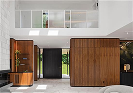
House in the Hill, located in the quiet town of Pelham in southern Ontario, is more than a renovation-it is a renaissance. Set deep within a mature Carolinian forest, the original residence had been home to the clients for four decades. Though beloved, the house was inwardly focused, its dated design offering little connection to the remarkable natural setting around it. The task for These Architects Inc. was to reshape the experience of the experience entirely: to re-engage the owners with their land, to bring nature into daily view and to craft an architecture and interior environment that felt deeply rooted in place.
Working within the constraints of the existing footprint, we expanded the structure both conceptually and physically, introducing new forms that anchor the home to its sloping forested site. A central corridor now organizes the plan, acting as a quiet sculptural spine dividing public and private realms. Toward the street, curvilinear geometries soften the façade; toward the forest, rectilinear “fingers” stretch outward as though reaching into the woods. Throughout the design process, we were intentional about framed vistas-each window, opening and threshold carefully orchestrated to strengthen the dialogue between interior life and the surrounding landscape.
FLOORING AS THE CONCEPTUAL ANCHOR
Flooring played a foundational role in realizing this vision. The first interior material selected-and ultimately the anchor for the entire palette-was Emilceramica’s Tele Di Marmo Reloaded in Quarzo Kandinsky large-format porcelain tile in an off-white tone. Installed on every level of the home, including all bedrooms, this tile became both the literal and conceptual ground plane upon which the design was built.
Large-format Italian porcelain offered several key advantages critical to achieving our goals. Its natural, quartzite-like markings brought subtle movement to the floors without visual clutter, supporting our desire for a serene, horizon-like interior expression. The material’s durability and sustainability aligned with the clients’ long-term vision for an easy-maintenance, age-in-place residence. Importantly, its refined matte sheen worked beautifully with the home’s shifting natural light, allowing exterior greens and earth tones to softly reflect across surfaces.
By choosing a single flooring product for the majority of the home, we maintained continuity, minimized threshold transitions and amplified the sense of seamless movement from space to space. The muted, stone-inspired hue of the Tele Di Marmo Reloaded also allowed bold architectural gestures-long corridors, open living spaces, sculptural stair elements-to read clearly without competition.
A PALETTE PULLED FROM THE FOREST
With the flooring established, the rest of the design palette began to emerge. The home’s location was an undeniable influence: mossy and forest greens, bark browns, and earthy neutrals guided our color and material decisions. Walnut millwork, deep forest-toned furnishings, natural stone accents and quiet metal details collectively reinforced the sense of groundedness we sought.
The connection between flooring and palette was deliberate. The off-white porcelain tile created a calm, neutral canvas that allowed richer elements to shine. In spaces where the forest view dominated, the flooring acted almost as a light reflector, amplifying the greens of the canopy and creating a soft interplay between interior and exterior color.
TILE AS A NARRATIVE THREAD
Beyond the primary floor tile, we introduced additional tile products that supported both functional needs and thematic continuity. Large penny round enameled glass in black from Marquina was utilized in one of the powder rooms to tie together other finishes in a homogeneous palette. Marazzi’s Lume collection-known for its handmade look, subtle texture and luminous glazes-was used strategically throughout the home to bring depth and character to key spaces. Blue, green and white variations were incorporated into ensuite bathrooms, the main kitchen, the pantry and the gym change room. In wet areas, these richly toned tiles offered practical benefits: exceptional cleanability, resistance to moisture and longevity. But just as importantly, they contributed to the visual storytelling of the house.
In the kitchen, soft white Lume tiles play against the blue cabinetry, while in bathrooms, deep green and blue tones echo the forest and sky just outside the windows. The textural quality of the Lume tiles helped bridge the natural and the crafted-an important theme that runs throughout the project. Their artisanal variation brought a human touch, softening the otherwise minimal architectural language.
CRAFT, COLLABORATION AND THE LIMITS OF MATERIAL
Because tile was central to the design concept, we treated it not merely as a surface finish but as a medium for architectural expression. With our fabricators and artisans, we explored opportunities to push the capabilities of thin porcelain, particularly in the kitchen and adjoining spaces.
One key design detail involved inserting thin slivers of solid surface material into nearly seamless expanses of porcelain slab. This technique allowed us to overcome typical size limitations inherent in large-format porcelain while introducing elegant vertical accents that tied into other architectural moments throughout the home.
For the kitchen island, bar, feature backsplash and even the interior of the appliance garage, we again turned to Emilceramica, this time the Tele di Marmo Revolution slab series. The slab’s veining aligned beautifully with the main flooring tile yet introduced a sense of increased scale and refinement appropriate for focal surfaces. The same porcelain slab was extended into the adjacent home office, lining the back wall of magazine shelving to maintain visual continuity between spaces.
MINDFUL PATTERNING AND A MID-CENTURY SPIRIT
Although porcelain was used extensively, careful attention to layout ensured the surfaces never felt repetitive or overwhelming. Joint alignments, veining direction and scale transitions were all thoughtfully planned to create a harmonious flow from room to room. The simplicity of this approach is reminiscent of mid-century interiors, where material honesty and visual clarity were paramount.
For House in the Hill, the great room double-height fireplace was completely finished with original mid-century-designed, handmade, dimensional oval tile by California-based Heath Ceramics. This subtle mid-century echo was not about style replication but about embracing a quiet, disciplined aesthetic that allowed the setting-and the clients’ furnishings-to take center stage.
A HOME RECONNECTED
In the completed residence, the new materiality reads as both understated and deeply intentional. Flooring, in particular, became a powerful design tool-its consistency establishing the rhythm of the home, its natural quality grounding the interiors, and its durability supporting the clients’ desire for a long-lasting, low-maintenance environment.
More than anything, the flooring strategy helped us achieve our primary goal: to reconnect the clients with their land. Every material decision, every textural contrast and every tile installation works toward the same outcome-a seamless, calming experience rooted in the beauty of the Carolinian forest.
House in the Hill now stands not only as a redesigned home but as a renewed bond between architecture, interior design and the natural world.
THE AUTHORS
Gina Schafrick is a detail-driven architect whose work is shaped by her belief in collaboration, sustainability and thoughtful design. After studying both fine art and then architecture at the University of Toronto, she explored her creative interests across furniture studios and architectural practices before finding her passion in residential design, leading her to launch her own firm, renamed These Architects in 2018, with Colin Grant.
Colin Grant is an architect driven by a passion for crafting spaces that express a compelling story. He is dedicated to elevating every project through thoughtful design and a highly collaborative team approach. After completing his bachelor of architecture at the University of Toronto, Grant built a diverse global portfolio while working with both boutique and large-scale firms in Toronto.
Related Topics: CERAMICS OF ITALY, Marazzi USA, Mohawk Industries