Designer Forum: Flooring in a new school balances practical requirements with visual appeal – October 2024
By Blima Ehrentreu
For the ground-up build of the Bobover Yeshiva primary school in New York City, The Designers Group (TDG) set out to create a fun, dynamic learning environment for the roughly 2,000 boys that will attend from grades one to eight. The objective was to design a space that enhances the learning experience and evolves with the students as they mature. Understanding the significant impact the physical environment has on cognitive development and wellbeing, we used various flooring materials and colors to stimulate the students’ senses and foster creativity. The diverse textures and hues were key in defining distinct zones within the school, making the space both more navigable and visually engaging while supporting different activities and learning styles.
A MODERN APPROACH
This project uses modern educational design principles, where the environment plays an active role in creating an inspiring atmosphere for both students and staff. To maintain a cohesive yet distinct environment across the school’s many different-use spaces, TDG balanced uniformity with individuality through its flooring choices. A consistent neutral tone was used throughout the flooring to create a backdrop that unifies the entire space, regardless of the functions of each area.
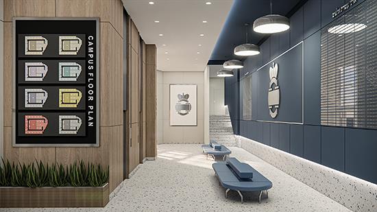
Beyond this neutral base, the school’s navy-blue theme-an essential element of its branding-was integrated into the design of every space. This was accomplished by incorporating navy into the flooring, wall paint and other design elements, like cabinet finishes. By using navy in various forms across all areas, TDG achieved visual continuity while allowing each room to highlight its unique character.
Working closely with the school, we navigated various challenges and adjustments to ensure that the final outcome would meet their vision and needs. The process involved not only selecting the right materials but also being responsive to evolving requirements and finding innovative solutions to unexpected issues, resulting in a school environment that is both cohesive and dynamic. The integration of durable materials, thoughtful color schemes and functional designs demonstrates how design can support a positive educational atmosphere. Feedback from the school has been overwhelmingly positive, with students enjoying the vibrant color scheme and the safe, comfortable flooring.
Overall, the flooring selections were a vital part of the design process. Every material and color was chosen not just for practicality but also for how it shaped each space’s identity. By using color to differentiate areas, the flooring helps students navigate the school and reinforces their sense of belonging. Whether it was creating a warm, neutral setting in the pool area or a vibrant, energetic vibe in the playrooms, each flooring choice supports the overall design narrative, making the school both functional and visually engaging.
A LONG-TERM VISION
A school requires the flooring to be durable and cost-effective, suitable for handling high traffic and active student use. Safety is also crucial, especially in the project’s pool area. Since this was new constructioin and the building would last for many years, the materials chosen were durable and unlikely to be discontinued. Although sustainability was considered, durability and cost-effectiveness were top priorities.
With roughly 2,000 students attending the school, the flooring had to be both functional and visually cohesive. We used a variety of materials throughout. In the lobby, custom terrazzo sets the tone, while VCT was specified in classrooms, corridors and staff areas. For the bathrooms and pool, we incorporated porcelain tile, and playrooms feature cushioned gym-style flooring.
The goal was to create a unified design while ensuring each grade feels a sense of progression as they advance. The school spans 25,000 square feet per floor with two classrooms per grade. The primary color palette features navy blue, complemented by secondary colors like light grey, and accents specific to each grade-such as yellow and blue for younger students, with lime green, light blue, olive and dark grey for higher grades.
VCT was the practical choice for most of the school, offering flexibility in design and ease of maintenance. The high traffic in a school environment requires flooring that can withstand heavy use while maintaining its appearance. Initially, TDG explored LVT and laminate options but faced limitations in the range of color and pattern options available. Concerns about durability and potential product discontinuation led the team to favor VCT, which is scratch-resistant, easy to maintain and budget-friendly. It also meets important safety standards, including low VOC emissions and slip resistance, while offering a softer, more forgiving surface compared to harder tiles. This helps reduce the risk of injury from falls, which is particularly important for younger students.
Balancing a fun, enriching atmosphere with durability, performance and student safety was central to the flooring selection process. VCT’s variety of color options allowed TDG to design vibrant, engaging spaces, and it offered the flexibility to create custom patterns and designs. This adaptability enabled the flooring to be tailored to meet both the specific needs and aesthetic goals of each space, making it an invaluable choice for projects where creativity and functionality must go hand in hand.
Ensuring color accuracy proved challenging-unpolished samples often differed from the final product, so TDG had to request polished samples for verification. Additionally, finding specific colors like lime green and olive green was tricky due to limited availability and matching wall base finishes. This required exploring various brands to find suitable options.
A VARIETY OF MATERIALS
After reviewing various VCT options, TDG chose Armstrong’s Standard Excelon Imperial Texture collection, which offers around 40 to 50 colors. This product allowed the school’s navy-blue branding to be integrated consistently throughout the design, reinforcing the school’s identity. Also, colors like yellow, olive green, apple green, light blue and orange were chosen for each’s visual appeal and role in defining different areas within the school, creating a vibrant and cohesive environment. In the conference room, neutral-colored VCT from Armstrong was selected for its ability to create a professional, understated aesthetic. This choice ensures the space remains functional while offering a clean, cohesive look that supports a quieter, more focused environment.
For other traditional spaces, like the study hall, porcelain?tiles from Lea Ceramiche’s Bio Select collection were chosen to reflect the focused atmosphere of the space. The natural wood-look tiles in Oak Cloves and Oak Vanilla provide a timeless, classic aesthetic and enhance the calming and serene environment, ideal for studying. These tiles also offer durability and low-maintenance qualities, ensuring that the space remains functional while aligning with the overall design’s emphasis on practicality and longevity.
For bathrooms, TDG chose porcelain tiles for the floors and ceramic for the walls, with accent colors varying by floor to keep the design theme consistent. Olympia Tile’s Deluxe series in Oyster and Daltile’s Color Wheel Classic in Galaxy and Dependable provide the base.
In the pool area, TDG selected Milestone’s EcoStone and Urban Living tiles with a honed finish for durability and ease of cleaning, while ensuring they dry quickly to prevent slip hazards, and went with a neutral color palette of taupe and beige to create a warm, inviting atmosphere. This design also suits the school’s goal of opening the pool to the community during summer. In the changing rooms, beige was paired with dark blue, complemented by travertine-look porcelain tiles (the aforementioned selections) and polished Schluter accents. TDG even customized the porcelain tiles for safety features like water depth markers, inlaid with contrasting dark grey.
In the playrooms, the design team opted for rubber flooring to provide extra protection and comfort for active play. Ecore’s Integrity Motivate collection was perfect for spaces used for soccer, basketball and other active play, providing both safety and longevity.
TDG also used a rubber riser and tread system from Tarkett’s Johnsonite for the staircases, focusing on durability and safety. The anti-slip surface matches the accent colors of each floor while maintaining a consistent base color across all landings.
The diverse flooring choices have performed exceptionally well in their respective settings. The VCT in corridors and the lunchroom has proven durable and easy to maintain, even with heavy foot traffic. The ceramic in the study hall and pool areas and the rubber flooring in play areas and gyms have met the specific needs of those spaces, providing both functionality and safety. Overall, the flooring selections balanced practicality with design, ensuring that the choices met the client’s needs and contributed to a vibrant and functional learning environment.
The VCT used has become a favorite due to its versatility. TDG particularly appreciates how these areas maintain neutral tones that are calming and not overwhelming for the children, while incorporating vibrant pops of color to energize the environment.
Copyright 2024 Floor Focus
Related Topics:Schluter®-Systems, Armstrong Flooring, Daltile, Tarkett, Mohawk Industries