Designer Forum: Cuningham’s design of the Jules Verne building in Verona, Wisconsin – April 2022
By Cuningham design team
Every successful design begins with a story. For the Jules Verne office building in Verona, Wisconsin, this is the case, literally. Drawing inspiration from the works of famed writer Jules Verne, the Cuningham design team used color palette, material selections and countless finishing touches to bring to life such literary classics as 20,000 Leagues Under the Sea and Around the World in 80 Days-all in the form of a modern office space.
Part of a larger “Storybook Campus,” the Jules Verne building presented unique challenges: not only did designers need to weave Verne’s various science fiction stories together into a single, thematically cohesive space, but they also had to connect it to the campus’s other buildings, which are also based on well-known literary properties.
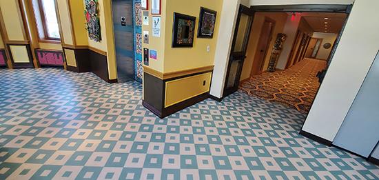
To create a consistent through-line and visually connect these spaces, designers turned their focus downward. Cuningham worked closely with commercial flooring contractor Diverzify to develop a strategic approach to flooring that could organize the building’s pockets of adventure both thematically and through wayfinding. Cuningham and Diverzify’s close collaboration resulted in unique concepts defined by their bold colors and crisp patterns. Final carpet designs provide traditional European patterning, while bold graphics lean into Verne’s more fantastical stories.
BLENDING WORK WITH ADVENTURE
While the various campus buildings have their own unique-sometimes fantastical-themes, they are first and foremost functional office spaces where the day’s tasks must be accomplished. Although the overall environments are designed to be immersive, the offices themselves remain grounded, while still tied into the overall design.
Within the Jules Verne building, each area focuses on a different adventure, introduced through custom storybook covers, some of the more than 150 custom graphics throughout the space. Within each area, vibrant pattern, color and texture are used to maintain a sense of place, with quieter zones giving everyday office inhabitants a calming environment in which to work.
The layers ebb and flow as one moves between the larger main areas and the smaller, individual professional spaces. The employee breakrooms offer additional moments of whimsy and provide concentrated vignettes of the tales brought to life in each wing. In the Explorer’s Club area, for example, the breakroom’s walls are lined with portraits of animals dressed up as royalty, anchored by a trapezoidal flooring pattern in regal blue, gold and white. It’s a customized vinyl flooring designed by Cuningham and printed through Suttle Strauss, the firm’s local printing partner.
The building’s centerpiece pays tribute to what is perhaps Verne’s most iconic tale, that of Captain Nemo and his underwater adventures. A towering octopus tentacle-the culmination of countless of hours of research, collaboration and experimentation-smashes through the wooden floor with prodigious effect.
To create the hallmark sea creature, the team spent weeks studying scientific illustrations and pictures of octopi, comparing the shading and proportions of the arms and suckers. To bring this outsized sea creature to life, designers turned to custom fabrication company Ravenswood Studio, which creates sets and scenery for theater and opera companies, museum exhibits and corporate clients.
While designing and fabricating the fiberglass and foam tentacle was difficult, integrating it into the landscape presented an entirely unique challenge. The team used flashing and LSI LVT to evoke the image of a ship and manually created a splintered wood floor. Since the area is a highly visible, well-trafficked corridor, the team used solid hardwood provided by Musolf’s Wood Flooring before transitioning to LVT from LSI in other areas of the building. The authentic material lends a degree of realism to the otherwise fantastical nautical scene.
The other most labor-intensive component of the overall buildout was the feature staircase. Flanking the large tentacle, this component transitions from a curved staircase to a traditional vertical construction and required more than a year of modeling and brainstorming. Intensive product-to-product color matching and specialty cuts were necessary to make the custom rigid nosing and treads curve and blend with the LVT used as a ship-like wallcovering. The project’s 3D sculptural modeling was important, not only due to its detailed nature, but also because the team was often remote. It set the benchmark for Cuningham’s projects moving forward.
WAYFINDING THROUGH MATERIALS
Moving through the building’s various adventures is meant to be a stimulating experience, but also an intuitive one. To help orient both employees and guests, patterns are used for both their form and function. Colorways and the repetition of shapes, such as an arabesque or Art Nouveau filigree pattern, identify each space while tying it to the specific story being told. The main carpet, a custom broadloom by Mohawk’s Durkan, depicts a series of gears in a homage to Verne’s avant-garde imaginings, while easing the transition between the neighboring buildings, Chocolate Factory and Monster Land.
Many of the carpets are custom, designed by the team’s graphic designer or working directly with the manufacturer’s designers to ensure that the final product met the owner’s expectations. In addition to wayfinding and storytelling, the team had to consider where the budget allowed for 24- versus 12- versus two-color constructions.
Believing that the floorcovering is integral to a truly immersive design and that the simple integration of running lines can feel flat, Cuningham-which does a lot of work in the hospitality sector-has designed so many custom carpets with various manufacturers that some have incorporated them into their own catalogs.
The offices offer a contemplative spot to work through the incorporation of carpets by Bentley, which are typically custom recoloring of running-line patterns. Among the other custom materials in the building is the sheet vinyl, printed on G-Floor vinyl for use in breakrooms, copy rooms and many vestibules. The breadth of custom graphics for this project led the team to standardize processes and develop a theming booklet to help keep track of the intense matrix digitally.
KEEPING AN EYE ON THE FUTURE
With such encompassing designs, the campus’ maintenance teams are an important partner in the process, both on the front and back end. The client has structured guidelines for where and how certain materials can be used, learned through trial and error and wear and tear.
Fusing the thematic and functional goals comes down to understanding how the materials and buildings themselves perform, which is detailed in models handed off to the facilities’ management team. While only materials with longevity are selected, how they are maintained can make a huge difference in their lifespan. Everything is considered-from the cleaning tools to the products used and the frequency of cleanings. New materials must be vetted and approved, not only for durability but also for incorporation into the maintenance team’s established practices.
As the campus’ spaces and available material options have evolved, there have been refreshes throughout the years to update the aesthetic or switch to a new, better-performing flooring construction. However, there have been no complete redos. This is a testament to the initial design process, which is a highly collaborative effort.
Copyright 2022 Floor Focus
Related Topics:Mohawk Industries