Designer Forum - July 2009
Interview by Brian Hamilton
In every building, flooring serves a role that extends far beyond the walking surface or base plane in the cube of a room. Many designers take into account not only how flooring will look and feel underfoot but how it will make people feel emotionally.
Some firms, like New York based Lippincott, take it all a step further and use flooring design to advance the brand of the client, which means in part they want customers to feel a particular way about the business and its products. For them, the choice of flooring is not an isolated decision—it’s intimately tied to what will surround it, from the graphics on the walls to woodwork, furniture and ceiling. This is especially important for retail establishments, where purchasing decisions are often made in part on emotion.
Andres Nicholls, a partner with Lippincott who specializes in retail, has worked with clients as diverse as McDonald’s restaurants and Samsung Electronics. Flooring has a little different role in each project. Sometimes, as in the case of McDonald’s, its role was to be barely noticed at all, while in the case of Samsung it was used to draw attention to an important area.
Every project starts with identifying the client’s brand attributes, such as whether it’s warm, friendly, modern or something else, and what it’s trying to communicate. Lippincott designers look at the brand components, such as company colors and logos, that make up its identity. From there, they start to create a color palette, then move on to more specific materials.
McDonald’s restaurants are obviously designed to appeal to children. However that has to be put in a long term context. A flooring that is durable enough to handle the high traffic that McDonald’s generates is likely to be expensive to replace. It’s also a lot easier and less expensive to give stores an updated look by replacing other elements in the design, such as paint and graphics, which is what McDonald’s wants customers to focus on.
“When we did McDonald’s, we started with a program to update their design and make sure it created new experiences, but it was not going to be the last time this was done,” Nicholls says. “They have 30,000 restaurants, so the approach to flooring and materials is a little different than when you do a one-off or even a smaller rollout. In the case of McDonald’s, we wanted to do a neutral floor and ceiling. The reason is, flooring is more labor intensive to change, so we wanted to create a floor that will go with future décors. A McDonald’s restaurant in five or seven years could change all their tables, fabrics and graphics but the floor still needs to be relevant for that design.”
Nicholls chose a 12” ceramic tile for the main restaurant area, which replaced a smaller format tile. Ease of maintenance was also a significant issue, and Nicholls felt the tile could be easily cleaned with products available here, or overseas, where McDonalds has a sizeable number of stores. He chose a different tile for the bathrooms, partly just to set them apart from the main restaurant area.
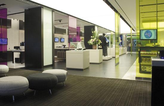
For Samsung, however, the challenge was different. Samsung sells all kinds of electronics, aimed largely at young adults, and it sees itself as a modern trendsetter. For a flagship store in Singapore, a large, long central portion of the store was devoted to displaying the latest computers and other gadgets, an area that Samsung wanted to draw a lot of attention to. The electronics were going to be perched on a light colored Corian covered bar.
“We went with a very dark, high contrast strip wood that would make this bar stand out and be a special focal point,” Nicholls says. “At the same time, it gave a very directional focus to the back of the store.”
The dark wood was flanked on each side by a warm stone tile, enhancing the contrast, and carpet was in a seating area at the end, with some high tech looking stools. The heavy contrast turned the area into a walk through, edgy electronics showcase that would be hard to avoid.
Nicholls was also involved in a makeover for Citizens Bank, which had acquired several banks in New England and needed a cohesive look to go along with its identity, which is wrapped up in the slogan, “Not Your Typical Bank.” The first prototype was a new branch in Belmont, Massachusetts, in a space that had previously been a Gap clothing store. Among other things, it had striking wood floors that no one wanted to replace, even though everyone knew they would be more difficult to maintain. The new brand identity featured a high impact storefront with bold graphics, and three dimensional merchandising on the inside, along with playful, oversize graphics, and a soothing green color palette, accented by up-tempo music, all in contrast to a typical low key bank. The effect was to create a friendly, contemporary environment.
“We worked with the client to determine how to integrate the wood flooring and how to align it with the brand,” Nicholls says. As it turned out, the wood perfectly reinforced the slogan, given that wood is rarely used in banks. “It’s warm, it’s friendly, it’s a little more up tempo and that, in combination with all the graphics, did something for that brand that’s very unique in that space. The bank loved it so much that we were able to use that wood flooring in other branches, just not across the whole floor. The color, the grain of the wood, was perfect for this brand.”
Copyright 2009 Floor Focus