Designer Forum - December 2009
By Emanuela Frattini Magnusson
EFM Design is a multidisciplinary
architecture and design practice based in New York. Our projects range from
commercial to residential, as we believe that the shift between the two areas
provides inspiration for each area. It is this cross-pollination of needs and
ideas that fosters creativity, as the residential realm can inform the
commercial.
On the other hand, the practicality of commercial
requirements can be successfully integrated into residential projects. The
overlap between the two is a lasting development, and how and where we work is
undergoing a sea of change. This shift opens up a whole new area of resources,
where options for material selections are unburdened from preconceived notions
of “appropriateness” and examined under a different light. This is how we like
to approach project specifications in general, by looking at the functional
requirements and how they can be met or exceeded, and not necessarily in the
conventionally prescribed set of options.
In our projects the selection
of the flooring material and finish in particular is for several reasons one of
the drivers for the entire design palette. Flooring tends to be both the most
abused and the most visible surface area, not to mention in general one of the
largest single material areas, and therefore a significant line item in the
budget.
In several of our recent projects the selection of flooring
material has posed a series of interesting challenges, from being a very strong
formal design element, to having to hold up to foot traffic in spaces like a
lower school lobby (think of what happens at dismissal…), to commercial
showrooms that have to look pristine and showcase product under all
circumstances, even when there is a slushy snowstorm outside.
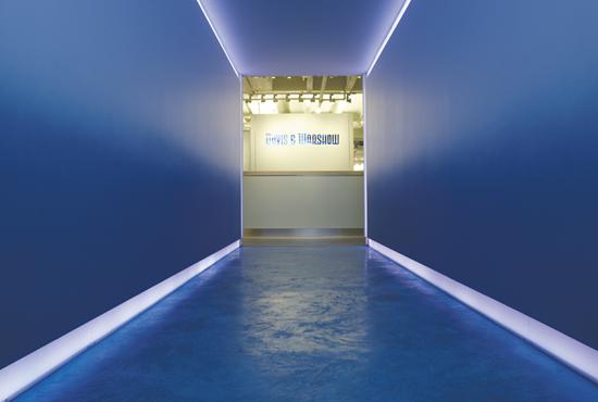
In a
recently completed showroom, for example, the entrance was through a tunnel-like
corridor that opened up into the product display. For the entrance we needed a
flooring material that would be perceived as high end, be colorful and capture
the attention of visitors, to draw them into the space. Floor, walls and
lighting were all we had to work with, given the limitations of the space.
Contrary to our first intuition to light the walls and use them as display
areas, we decided to dim the lights and only light the recessed cove along the
floor.
Because of the perspective created, the space would act like a
visual funnel. For the flooring material we went back into our historic
repertoire, and worked with Mimosa International in New York to recreate a
single pour, troweled “Venetian Pastellone” floor in various shades of ocean
blue. Besides being visually striking, it has the durability required in a
commercial space. It is one of the floor materials that improves with patina,
like natural stone, but with less maintenance.
A second project,
diametrically opposed to the one just mentioned, presented the challenges
typical of historic renovation and preservation. We were commissioned by the new
owners to renovate Frank Lloyd Wright’s house on Manursing Island, in Rye, New
York. It was originally designed by Wright for Max Hoffman in 1953, built in
1955-57, and extended by the second owner with a new wing commissioned to
Taliesin in 1972.
The original house, a “seaside cottage,” consisted of
an L-shaped plan, facing Long Island Sound. The layout included a large living
room with connected kitchen and dining areas, two small bedrooms, and one master
bedroom with study. The 1972 addition extended the entertaining areas by moving
the kitchen and formal dining into the new wing and expanding the original
living room. True to the spirit of organic architecture and to the finishes and
technologies available at the time, the flooring in the public areas was an
extension of the outside flagstone, with no thresholds and no saddles, while the
bedrooms were carpeted and the kitchen area floor was covered in
linoleum.
In our renovation we analyzed all possible approaches to a
historic landmark. We could eliminate everything that was not the original and
try to recreate it, or contrast the original with the new intervention and
intentionally show it. However, we took a third approach, of maintaining certain
rules dictated by the original, while breaking others. The rules we decided to
rigorously maintain were the four-foot grid on which the house is laid out, and
the “spirit,” the intentions of organic architecture, in terms of using natural
materials and blending inside and outside.
We broke some of the rules in
order to meet our client’s goal of creating a home for a young family with four
kids, a house to be used and enjoyed with many friends. The purpose wasn’t to
create a mausoleum to Wright. This approach was particularly relevant in the
real work areas like the kitchen, where floors get wet and equipment is used.
Linoleum, which was the original choice in the 50s, was a concern because of its
performance with water. We had the height limitations of a continuous slab, and
did not want to interfere with a transition to the original stone floor, so our
two options were a sheet floor or a poured floor.
We choose Allstate
Rubber tiles as a good bridge between the feel and look of the original
specification and the performance we were looking for, within the dimensional
limitations. Our color palette took some of Wright’s favorite hues and increased
their clarity, making them more contemporary. The Cherokee red became brighter,
and the olive is now the bright apple green of our floor. Function, cultural
content, aesthetics, and architectural history were all equally important
factors that filtered all available options down to this final choice.
Copyright 2009 Floor Focus
