Design Ovations: Angie Lee - Oct 2020

By Angie Lee
Creating a sense of place can be a little bit like painting, set design and dreaming. Understanding an organizational culture and helping highlight the aspirations and values of the people experiencing an interior environment is what we at FXCollaborative tried to do for a technology incubator in North Carolina. The emotion and energy harnessed by traditional pattern in a ceramic tile, broad swaths of energetic yellow anchoring deeply warm gray enclaves, and the high contrast impact of moody blue and black abstract planes are moments that resulted in conversations rooted in a search for joy and beauty. Flooring is a tactile, sensory medium that connects our memories of the past and builds memories for our future with a uniquely intimate and persistent engagement between our bodies and the material qualities of hard or soft planes.
MARCA CORONA & STONE SOURCE
The story we built was one that celebrated the beauty of the local regional vocabulary. Evocative of a quilted blanket, the inset accent flooring for the pantry was created using hexagon terracotta tiles in a variety of colors and patterns from Marca Corona’s Terra collection, including Anthracite, Nero and Decor. It is surrounded by a wood-look porcelain plank tile from Stone Source’s Wood-stock collection in the Vintage Wood color, which has an amazing fidelity to real wood. Durability and cleanability was very important to the client, so the expressive value of these robust products was a divine combination.
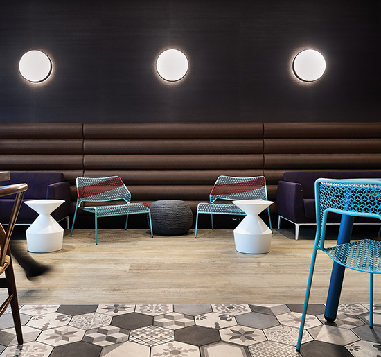
The pantry features a variety of tiles from the Terra collection by Marco Corona as well as a wood-look tile from Stone Source’s Wood-stock line. Photos by Chris Cooper, courtesy of FXCollaborative.
SHAW CONTRACT
The client provided spaces for their software developers that allowed for quick getaways from the desk. The intense ideation and constant communication that is part of their culture was balanced by more private, contemplative alcoves. The brighter chroma of the yellow enclaves was provided by Shaw Contract carpet tile called Color Frame Tile. I love that the name of the color is Glowing, and that the backing is part of its Ecoworx offering. Even though the intimate lounge setting was designed for a quieter volume of activity, we wanted to give it some happy energy, which was provided by the beautiful glow of yellow.
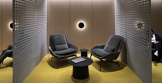
Alcoves in the building feature Shaw Contract’s Color Frame Tile in Glowing, which creates a happy atmosphere.
INTERFACE
This client has a public-facing component for a select group of entrepreneurial developers to set up shop for a short-term residency. The entryway signals a bold, high-contrast marker with the saturated blue and black seating area we created before the turnstiles. Creating spatial zones with the dramatic change in surface color was a fun commitment as we wrapped it from the floor, over the furniture and onto the ceiling. Finding the perfect color match between planes was harder than one would expect, but Interface has a great color line with one of the best sustainability programs in the industry. The black carpet tiles, which are Obscura from the Viva Colores collection, have hefty post-consumer nylon content and a GlasBac backing; and the dark blue carpet tiles-from the Touch and Tones collection in Ultra Marine-has 100% recycled nylon fiber.
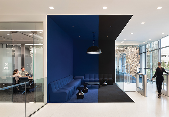
This seating area pops with color using carpet tiles from Interface’s Viva Colores and Touch & Tones collections.
Copyright 2020 Floor Focus
Related Topics:Interface, Shaw Industries Group, Inc.