Color Forecast 2019: Three reports from experts in color and design paint a picture of 2019 - Feb 2019
Diversity: in color, in places and in people.
By David Oakey and Cindi Oakey
Yes, tech continues to dominate our culture, yet there is a growing shift in emphasis away from screens to physical experiences, be they culturally rich events, exploration of the unknown or simply interiors for home, office and retail. Up until recently, futurists assumed that, as a result of technology, people would work and shop remotely. But today physical space is, by design, once again the focal point in the experience, and this design ethos places human value at the forefront of intentions. It’s no longer just about getting bigger but providing better. The focus is on the importance of well-being for the people who work in the spaces, and the driving force are the new kids in town.
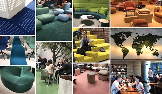
Gen Z, those born mid-1990s to early-2000s, are creeping into the workforce to presupposed spaces designed for informality, activity and inclusivity. Known for even more heightened tech use than Millennials, Gen Z is the most diverse, multi-racial generation-the first non-white majority generation. Gen Z members tend to rebel against the status quo-innately expecting their own relaxed way-utilizing informal areas with soft seating to provide privacy and acoustic solace, while connectivity, mentoring and meeting spaces allow relationships and networks to develop organically.
For ultimate office optimization, interior landscapes are constantly changing. New office campuses are growing into city subcultures, creative “ecosystems” if you will, expanding on amenities within the building to include housing, dining, fitness, personal care and wellness, retail and more. Tech companies continue to invest billions of dollars to bring their employees together-that from an industry that thrives on working remotely.
Alternatively, the co-working boom informs us not only how we will work in the future, but also where. Hotel lobbies dabble in free Wi-Fi and design to encourage people to come in and create a community atmosphere. Touch-down office space dominates the corporate office scene, growing exponentially, and this trend has spread quickly to retail and even restaurants, inviting people to come in, gather, and hang out with laptops or handheld devices. As a result, compounded with the macro movement of sustainable and biophilic design, a new aesthetic is driving interior design. What’s old is new again, but with a modern twist.
OLD IS NEW
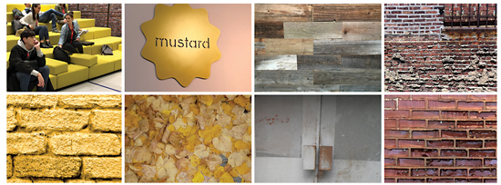
The global construction boom to reuse or revise, often known as adaptation, now injects new life into aging architecture with unique character using venerable craftsmanship. Once out-of-use dilapidated steel and brick structures are given new life for entirely different uses. Today’s innovative architects may turn a grain silo into a hotel or gasholders into luxury flats. As a result, we are forced to re-examine materials, seeking looks that resonate with modern values. Aging architecture and omnipresent sustainable design ideals to reduce, reuse and recycle drive interior aesthetics to look laid back and natural, yet exude a fresh, modern industrial environment that is rather rustic-for example, rough, worn, sturdy aesthetics in unconventional spaces. But do not misconstrue rustic as makeshift or uncomfortable. Interiors are clearly embracing color in contrast to the neutrality of rustic industrial design. Upscale adapted interiors offer comfortable spaces that creatively engage cohabitation, collaboration and productivity for all, driving employee and customer happiness.
These reprogrammed natural interiors utilize plywood partitions and wood floors accented by abstract design carpet or wall coverings, combined with glass and metals, exposed brick, smooth and soft textures as well as Old World craftsmanship in an open plan designed for deconstruction. Floor plans can adapt by being reassembled into different designs to ebb and flow with ever-changing community needs. Wabi-sabi, accepting less than a perfect manmade condition (a trend we embraced nearly 20 years ago), and the ubiquitous quest for sustainability are now mainstream and driving adaptability in interiors.
BIOPHILIA / WABI-SABI
Increasingly, this world of high-tech people yearn for human contact or touch, as theorized by John Naisbit in High Tech, High Touch (1982). As trends evolve, innovative activity escalates. Creative resources overlooked and sometimes unappealing natural resources are now transformed into desirable products. Nature is increasingly a rich resource. Designers collaborate with nature to produce more responsible materials that reduce waste and exist symbiotically with the environment, making creative use of previously neglected yet currently abundant supply materials, including mushrooms, seaweed, cork and bamboo.
The result: furniture makers are using natural and/or waste materials, harnessing controlled irregularity in surfaces between natural and synthetic, inspiring a contemporary dialogue about the relationship between craft and industrial production. It’s all part of the wabi-sabi movement, the acceptance of imperfections. Nearly 15 years ago, a designer gave me Leonard Koren’s book, Wabi-Sabi for Artists, Designers, Poets & Philosophers. Driven by sustainability and optimal wellness for the people, the interiors industry is beginning to embrace this concept as the new aesthetic, the continued move away from excess materials-and as a result, influencing a dichotomy in color: either the softening or weathering in tones or bold saturated colors that pop against the natural resources.

COLOR INFLUENCES
Biophilic design expands from the simplicity of adding green through foliage to utilizing nourishing, natural artifacts that resemble natural pigments extracted from the earth, like asphalt, clove, terracotta, pink sandstone and nubby, natural oat.
Green continues as one of the larger principle sub-palettes, offering an increasingly diverse spectrum of hues. Greens blend with soft blues and neutral tones as the peripheries of the hue group are extended, creating a soothing, nuanced and biophilic sub-palette inspired by fertile terrains. Verdant and botanical-inspired tones remain significant, with Pine Green, Turf, and the newcomer, refreshing Pale Mint livening up the mix.
The blue sub-palette increases to become one of the largest, asserting its importance for the season. Taking inspiration from deep water in saturated ocean blue, celestial blue skies and historic pigments, it spans dark, rich mid-tones and pale hues. Blue-greens evolve into the cerulean-teal shades that populate many mid-century designs.
Vibrant yellow, also known as Gen Z Yellow, upstages Millennial Pink, promoting optimism in uncertain times. The bright color of sunshine offers a refreshing twist in biophilic design, as do shades of mustard that evoke hues of autumnal leaves, complementing the rustic interiors.
Reds are softened into rustic, burnished red-oranges as seen in brick, russet, and terracotta. Rich burgundy prevails as purples fade. Sophisticated mid-tones are weathered, worn and faded; they have a desaturated quality.
Warm greys give way to ubiquitous flesh tones, as pinkish-beiges and blush prevail; while oat, sandstone and warm browns are foundations for neutrals.
Oxidized pigments and metallic features that subtly change over time give products a unique narrative. Bright colors are upbeat, energizing us with a sensory pop ideal for focal points or smaller spaces. In nature, bright hues can be fleeting, lasting only a short time. A range of neon and vivid shades reminiscent of the ‘90s rave culture and fluorescent lighting are called “heightened brights.” Will they find their way beyond graphic design, activewear and streetwear into interiors? Perhaps in unique, small doses.
The intertwining of digital and physical will continue to deepen in 2019. A wave of change, driven by retail and office environments, will hit all our spaces, from the most industrial to the least. We see an increasing call to end static interiors and create spaces that change and adapt to multi-generational needs to enhance our mood, productivity, rest and overall wellness.
Counterculture and calm come together in this year's palette.
By Holly Lester
The beginning of a new year always seems to jump-start an evaluation of pattern, color and trend, helping us focus on what lies ahead. But we can never just think in terms of pattern design or color direction alone. Rather, these two aspects of product development always go hand-in-hand. The observations that help us gather our inspiration and trend direction come from many sources, including an outward look at the world around us and an internal nod to industry needs. From these influencers come key forecast ideas. Ironically, these categories are often opposites, but each is equally relevant. Here are several color cases in point. Currently, a counterculture movement of sorts is forming, the result of the unrest and rejection of increasing politicization all around us. Inspiration can be found at the edges of society, in small-town communities, grassroots movements and through the surge of a “handcrafted” way of life that extends beyond DIY. These are the forces that will bring about positive change.
A wink to self-referential ideas and graffiti-inspired art lead the way to attention-grabbing pattern with color seen in layered mid-tones. Described as retro-futurism, this trend tries to distract us from the increasing risks prevalent in our world. Bright colors, like oranges, emeralds and golds, are heavily tinted to create a toned-down saturation. All colors gesture to a mid-century modern style with a new neutrality that is both optimistic and carefree.
The belief that blue is now considered a neutral will only grow stronger. Denim embraces this idea with a non-gender, non-demographic identity. This warm blue can be modern, timeless, approachable and calming. It is a perfect neutral, blank canvas.
In opposition to the bold counter-culture trend, there is a desire for a break from chaos and noise. Nature and sustainability are, as always, in the forefront. This grows beyond biophilia into a sense of renewal and simplicity. Returning to our roots and recalling times past ground us and create an antithesis, of sorts, to the technology of today.
Now more than ever, the workplace is a gender-neutral, shared space, and health and wellness are rightfully taking a comfortable seat in this setting. Ironically, smart, wearable technology is becoming part of our daily lives, guiding us to this calmer place.
The real neutral-grey-remains strong but will be joined by a warmer version of mink to create a contemporary palette. Earthy warm tones-think grain, seeds and sand-also push beyond grey, adding to the neutral scheme. Subtle gradients and minimalist sculptured textures create an inherently serene and sophisticated space. Shadowy pinks and maroons add warmth to the diffused neutral range.
Once again, we see purple come to play, but now it is much moodier and less saturated. These monochromatic combinations allow texture and sculpture to weave a new version of sophistication without distraction.
Greens are stronger than ever but not just as an acknowledgement to our efforts for sustainability. We will see chameleon colors reflecting complexity while reminding us we are part of the environment. Greens will range from a quiet, meditative olive to a deep hunter green-invigorating and impactful.
We are busy interpreting the world of organized chaos represented in dots, prints and playful repetition. As saturated consumers, our mission is building connections that allow us to stay rooted and find solitude. This is today’s ultimate luxury.
Diversity: in color, in places and in people.
By Ruthanne Hanlon
Every January, PPG’s team of color stylists convene for the annual Global Color and Design Summit to share what is happening in their part of the world and identify the influencers that will shape the forecasted trend stories and coordinating color palettes. These stylists also share reports from their respective segments-automotive, aerospace, consumer electronics and architectural coatings-and how those industries are shifting, advancing and evolving.
From that summit comes the annual PPG Color and Design Forecast that consists of trends not just for color but design elements as well. The goal is never to sway purchasing decisions but rather to provide an edited report to give design professionals insight as to what clients will be looking for and what the industry will be providing.
Because we are a very diverse population, we identify and compile four trend stories every year; you might appreciate one over another depending on who you are, how you live and what you hope to express and surround yourself with. The title of the 2019-2020 forecast is We Are, chosen to reference the new sense of community and collective discovery.
The first of the PPG trend stories, With It, is full of saturated happy colors and elements. The undercurrent of fresh optimism is evident in consumer behavior, despite the level of political turmoil and argument overload brought about by social media and chatbots. The palette is based in art, optimism, creativity and appreciation of individualism. It is for those that are seeking experiences and joy. This energetic palette is designed to create a space bursting with color for adventurous consumers or represented as a single hue on an accent wall, throw pillow or accessory for those just wanting to dip their toe in some bolder hues. We continue to see an increase of tinted stains versus natural; it is no longer unusual to see a touch of color on flooring, cabinets and furnishings.
The second trend story is With Class, and this palette represents the glamour and luxury that has found its way back to design and décor as the economy has improved. Stealth indulgence has made way for more showy opulence. With Class is not fickle or shallow, though; it is rooted in tradition and heritage. Classic elements and designs that have stood the test of time, reimagined parquet floors, brass inlays and deep rich stains bring us back to a stately charm that references history and has a solid foundation. Pair gold or brass fixtures with a deep charcoal gray, chocolate brown, near blacks or rich navy to create a timeless space with a contemporary twist. It is within this trend story that you’ll find the PPG Color of The Year, Night Watch. This rich, luxurious, and classic shade of green will be at the forefront of design trends in 2019, and it allows homeowners to emulate the feeling of lush greenery and the healing power of nature in their spaces.
In the third trend story, With Out, you will see a palette that is grounded in nature. Biophilic design has benefits in both commercial and residential settings; studies show it helps us be more productive in work spaces: it aids healing in healthcare facilities, and students are more focused in classrooms with views or aspects of nature. With the ever-growing interest in green and ecofriendly, it makes sense to have those benefits in our home as well: natural wood stains on floors, trim, cabinets, furniture; ample natural light via expansive windows or skylights; bamboo floors and furniture for its sustainable qualities; and even live plants for their benefits. The With Out palette is heavy with shades of organic greens but balanced with sky blues, soft whites, gentle pastels and even variations of black. Clean lines and lack of excess are key to this trend; clutter is absent. With Out provides calm in our chaotic lives.
The last of the trend stories, With Spirit, is both cosmic and romantic. Purple and violets are making a comeback and are represented in this palette along with scorched red/orange hues, natural neutrals and even a golden yellow. Purples are associated with independence, creativity and mystery. When paired with matte black or muted gray browns, they create a sophisticated space that leans toward mystical. Interiors in this theme are equal parts raw earthen and dynamic glamour, with ample use of blacks serving as the conduit to transition between the two.
We cannot discuss trends without mentioning grey. It has been a popular choice with consumers; it is readily available via the trades and retail at all price points, and it’s much-discussed in articles, blogs and posts. Grey started trending in 2008 when the economy took a turn; humans tend to gravitate toward safe and familiar when they feel insecure and unsettled, and grey is both safe and familiar, becoming the comfort food of color. As we move forward into 2019, however, grey is being shaken from its pedestal. We have seen grey in home décor and fashion for the past decade, and many are ready for something fresh and new. That is not to say grey is going away completely; it is a neutral and will always have its place.

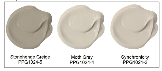
The current hot color is neither hot nor a color; for lack of a better name it is referred to as “greige.” It is a bridging color from cool greys to warmer neutrals. Greige helps us shift to a new look but still blends with grey elements we might already have in our home, such as flooring, countertops, cabinets and textiles. Moth Gray has been trending as one our most popular choices for both interior and exterior applications for commercial and residential projects; it is cool enough to work with existing greys but warm enough to transition to hues and elements with undertones of gold or brown. Its popularity continues to increase, along with other similar neutrals that lack a grey base, as we pursue new looks and feels for our spaces.
The overall mood we have seen at industry shows is that of optimism, despite the negativity and fears still in our world. Grey is not typically an optimistic hue, but greige is a safe way to venture from somber looks to those warmer and more hopeful. PPGs stain Color of The Year, Aspen Tan does exactly that; it’s a blend of grey and beige, it melds seamlessly with existing grey elements we might not be ready to part with as well as warmer, more optimistic hues that will be introduced as the market changes. Aspen Tan is classic and timeless yet contemporary and fresh.
Copyright 2019 Floor Focus
Related Topics:Coverings
