Color Forecast 2018: The year of awakening - Feb 2018

By Ginger Gilbert
I think it is fair to say that we should all be reasonably awake right now. It seems that 2018 has kicked off with an incredibly thunderous roar. As women (and men) stand together to jointly protest their individual experiences of injustice, we can look forward to the months ahead and confidently say that this year promises to be a time for exploration as well as awakening on many fronts. But as we look back for clues as to how we could have become so anesthetized to the social transgressions leading up to this revival, it seems that the answer is fairly clear. Connectivity has disconnected us from our real and immediate landscape.
We’ve quietly bowed down our heads and unintentionally morphed into a new generation of “huddled masses.” Huddled over monitors and smartphones, we’ve become hyper-connected to the cyber world at large. We receive instant alerts on everything from news (real or otherwise) to nail polish to recipes to recitals. We’re constantly fed information at a rate that has made us at least a little complacent when it comes to seeking out truth and real experiences that are vital as more meaningful components in our chosen societal assembly.
Thank goodness that 2018 is already proving to be the wake-up call that has our eyes open in search of the true and the real. It will have us standing up and standing out, embracing detail as well as each other, and looking beyond the screen to see what’s directly in our path. It will be a cultural shakedown that will change how we interact with one another, which in turn will directly alter the environments in which we connect and collaborate. Color, lighting and texture will align to evoke a myriad of emotional adjectives that will enhance our experiences and define the stories and events that are forged in these spaces.
THE SOCIAL SETTING
As we set down our devices for even the briefest of moments this year, we’ll realize that pocketing our phones won’t elicit the horrific withdrawal that we feared-especially when we redirect our time and energy to being present with friends and family. This year the honest simplicity found in enjoying a casual meal together will give way to a variety of mood-altering elements that will fulfill our appetite for connection in ways that Instagram couldn’t hold a candle to.
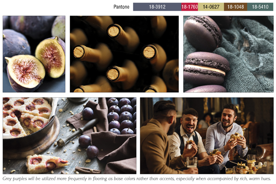
The social setting is represented by a two-part scenario that documents the day-to-night interaction of food-centric gatherings. The first course confirms that there’s something inexplicably indulgent about leisurely brunch dates on a slow, hazy morning. Effortless conversation and uncomplicated cuisine pair perfectly as we unwind and reconnect. Heirloom foods accompanied by the warmth of morning sunlight take center stage as we marvel at the perfectly imperfect hues of an unprocessed palette. Previously overlooked fruits, such as plums and figs, have now become staples on our table as well as inspiration for the finishes that surround it. Deep, chalky purples anchor this color family as they contrast with the surprising pop of blue-based reds and clean pear greens.
On the flip side, the second course embraces the indulgences of the late night gatherers. Dinner and drinks at the local pub or the newest farm-to-fork brings together friends, old and new alike, to create those memories that ironically become recounted and reveled in over brunch. A dimly lit environment blended with the rich browns and golden ambers of finely crafted concoctions provides a warm, solid foundation that supports the most spirited of conversations as well as colors.
THE HAUTE BOHEMIAN
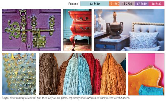
As we apply more emphasis on memorable, real world experiences, we’ll start to see a shift in how we want to enhance our daily experiences as well. Creating unique spaces that tell stories through an unpredictable assortment of discovered items will be a curious welcome in 2018. Mind you, this is not the hipster blend of reproductions and shabby embellishments that has oversaturated our markets as of late. These are affluent, curated surroundings in which each featured element has been thoughtfully acquired based on its unique value and appeal. This is a perfect representation of how individuality can be embraced within the sum of the whole.
The use of playful color combinations in stark contrast with the sophistication of rare antiquities creates a statement that conveys that its occupants not only appreciate the finer things in life but are also fairly unaffected by pretense. This is a style that has an obvious home within the residential and hospitality arenas. However, we will see this take a stronger hold in the corporate workplace as companies search for ways to outwardly authenticate an elevated sensibility that attracts talent of all ages and experience levels. It will be a collective of one-of-a-kind people as well as procurements.
Whether it’s a collection of opalescent Lalique vases reflecting vivid sky blues or a French panel of tangerine and hyacinth silk, the eclectic elegance of the haute bohemian movement will open our minds to new experiences and allow us to expand as needed.
THE EQUILIBRIUM

Technology has made life so much easier in a variety of ways, but for years we’ve known that we need to find a better balance between the frontiers of technology and nature.
The reign of the biophilic hypothesis has definitely been proof of that. So this will be the year that we stop focusing all of our resources on research and design for biophilia and actually start encountering it ourselves. Instead of focusing our attentions on bringing natural elements inward, we’ll soon see more people extracting themselves from the urban sprawl and outwardly embracing varied landscapes that will renew a sense of purpose and accord in this microcosm.
Color will be a vital component in cementing these experiences into our long-term memories. Deep, royal blue skies morphing into the blackened blue waters of a lakeside camping trip or blue-grey shadows that dance along the rocks of a mountain expedition; these are the images that will become as comforting and familiar as a well-worn pair of jeans. Blended with cool browns, warm charcoals and cool, intense black, saturated blues become the new neutrals for the freshman class of well-balanced individuals.
THE CULTURE CLUB
With all of the madness in U.S. politics lately, it seems that our desire to experience less tumultuous cultures is on the rise. Smaller, less-traveled countries have become popular destinations for those wanting to escape to a way of life that is more settled and less chaotic.
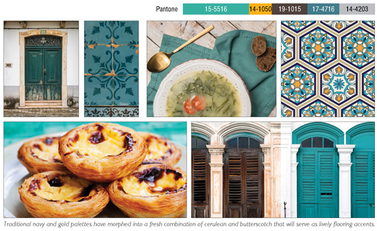
It’s being predicted that the most desirable destination for this year’s escapees is mainland Europe’s westernmost country of Portugal. From cobblestones to castles, beaches to bacalhau, Portugal offers inspirational outlets for a myriad of travel expectations. Known best for its grand Manueline and Pombaline architecture with beautifully detailed navy and gold tilework murals, Portugal can now boast a fairly strong following by the modern architecture enthusiasts as well. Architects such as Alvaro Siza and Eduardo Souto de Moura have been essential in altering the visual of the country’s city centers and beyond.
Stark planes of light grey and pure white concrete in modern, sculptural forms now have a well-deserved placeholder in the story of the country’s built environment. However, this colorful landscape wouldn’t feel like Portugal without at least a small amount of bright pigment. In the past, blue and gold were the cultural colors of choice for exterior accents. The present day palette takes these historic colors and cleverly blends them to produce a fresh variety of greens and blue-greens. These playful colors, in direct contrast to the subdued greys, offer a complex visual that others around the globe are taking their cue from for both exterior and interior interest.
CUSTOMIZE YOUR CONCLUSION
If you read this and don’t agree or can’t yet visualize how these colors will truly be utilized in interior finishes, that’s okay. You see, some people read trend reports to inform and guide them in the right direction, some read them in order to validate their current efforts, and some read them so that they can devise completely opposite aspirations. The beauty of this is that all are completely valid in how they individually utilize the information. After all, we’re talking about a trend report here and not a visual standards report. And as stated above, 2018 (and 2019) will be about finding our individuality in the masses and understanding how we can take common information, like color trends, and utilize it in a manner that is unique but still laced with a common thread.