


Color & Design Trends 2026: How calm, contrast and craft are shaping the next era of interiors – Feb 2026
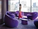
As the flooring industry looks ahead to 2026, color and design are no longer being driven by short-lived trends or surface-level aesthetics. Instead, they are responding to deeper cultural, emotional and functional shifts in how people experience space-at work and at home. Today’s environments are expected to do more: to calm and restore, to energize and inspire, and to adapt to changing moods, identities and patterns of use throughout the day. Neutrals are returning-but with greater depth, warmth and intention. Bold color is resurging-but in more controlled, purposeful ways. Texture, craft and material honesty are becoming as important as hue itself, reflecting a renewed focus on authenticity, sustainability and emotional intelligence. This year’s Color & Design outlook brings together insights from leading voices in commercial and residential design to explore how these forces are reshaping the built environment. From tension-driven color strategies in commercial spaces to residential palettes rooted in warmth, craftsmanship and layered materials, the trends ahead point to a shared goal: creating interiors that feel balanced, human and enduring-spaces designed not just to be seen, but also to be inhabited. TRENDS IN COMMERCIAL Todd van der Kruik founder and creative director of Neutral Haus, a creative consultancy, and principal design consultant for Bentley Mills In 2026, the world is moving at two speeds simultaneously. In the first, people are looking for calm, stability and spaces that let them exhale. After years of acceleration, uncertainty and constant input, there is a deep craving for environments that feel grounded, restorative and emotionally steady. Places that slow the nervous system. Places that feel reliable. In the second, people still want play, rebellion, self-expression and moments that feel alive inside the chaos. They want color that signals energy. Materials that surprise. Spaces that allow them to shift identities and moods throughout the day. They are not abandoning stimulation. They are simply becoming more intentional about when and where they invite it in. THIS IS NOT A CONTRADICTION; IT IS THE NEW BASELINE To make sense of this, consider a philosophy I like to call the “Paradox Principle.” It is a simple idea: opposing forces do not cancel each other out; they create meaning through their relationship. Calm becomes more powerful when it sits next to energy. Restraint becomes more meaningful when expression is possible. When design feels most dynamic and most natural, it is because there is tension between two opposing states. Instead of choosing one emotional direction for a space, tension-driven design intentionally holds two opposing qualities at once. Stillness and disruption. Precision and imperfection. Comfort and edge. The tension between those qualities is what makes a space feel alive rather than flat, memorable rather than neutralized. This is not a seasonal story. Rather, it is a long-range shift in how people want spaces to feel and perform underfoot. COLOR IS NO LONGER ON THE SURFACE; IT DOES THE WORK Color is no longer just about styling. It is about how a space feels, functions and performs over time. It shapes mood, supports focus, creates calm and allows moments of release and energy when needed. Color is now understood as an active participant in how a space operates emotionally and psychologically. Through the lens of tension-driven design, color is no longer asked to solve for just one feeling. It is asked to balance multiple emotional jobs at once. This is why contrast, restraint and timing now matter as much as hue itself. A quiet color placed in the wrong moment can feel lifeless. A bold color used without grounding can feel overwhelming. Every color direction heading into 2026 is shaped by five operating principles: • Longevity before novelty-Color must last culturally and emotionally, not just visually. The goal is not to chase what feels new today, but also to design what still feels relevant years from now. • Emotional regulation before stimulation-Spaces must restore before they excite. Energy works best when it has a place to land. • Construction before coating-How something is made and how it feels matter more than surface application. Depth, texture and material structure now carry as much meaning as pigment or dye. • Craft before polish-Evidence of making, variation and human touch outweigh flawless perfection. • Sustainability before spectacle-Environmental responsibility is no longer an afterthought. It is foundational to how color systems are designed. When these forces are held in balance, color becomes a working system, not a visual exercise. The tension between calm and expression is not something to eliminate. It is something to design with. THE WORLD NEEDS NEUTRALS AGAIN, JUST SMARTER ONES Neutrals are becoming emotional infrastructure. People choose them because they feel stable, grounded and credible in an unpredictable world. They offer visual rest. They create continuity from space to space. They let other elements breathe. But today’s neutrals are no longer cold or passive. We are seeing a clear shift away from icy greys and dusty pastels toward: • Sanded taupes • Chalked limestone • Rose-inflected beiges • Mineral ivories • Warmed architectural greys These tones feel lived-in, not sterile. They sit directly inside the paradox. Calm, but not empty. Neutral, but not flat. They hold warmth without demanding attention. Their multi-tonal nature creates stillness without feeling vacant. These updated neutrals also align naturally with circular materials, recycled content, water-saving processes and waste-to-resource strategies. Sustainability is no longer layered on as an afterthought. It is built into the color logic itself. In many cases, the color is a direct byproduct of the material process, not something applied afterward. In this way, neutrals become more than a background. They become the emotional ground plane of the built environment. AT THE SAME TIME, THE WORLD WANTS TO PLAY AGAIN While calm becomes the foundation, a counterforce is rising. People are pushing back against restraint. Fragmented identities, playful subcultures and expressive rebellion are reshaping how color shows up. After years of neutral minimalism, there is a renewed appetite for energy, personality and creative risk. This is tension-driven design in its most visible form: the meeting point between order and disruption. This energy shows up through: • Controlled disruptions: Unexpected color moments placed inside otherwise quiet systems • Transitions and thresholds: Hallways, connectors and in-between spaces becoming expressive rather than invisible • Collaboration and social zones: Areas where people gather are becoming permission zones for color The brights of 2026 are not fashion brights. They are emotional signals: • Acid botanicals • Hyper-violets • Nocturnal magentas • Electric aquas • Vibrant industrials • Charred embers They do not flood the space. They punctuate it. Their power comes from contrast. Calm carries the load. Expression creates the spark. This is what allows bold color to feel intentional rather than chaotic. TACTILITY IS NO LONGER OPTIONAL As digital systems become seamless and invisible, the physical world must feel human again. People trust what they can touch. They want softness, friction, weight and signs of use over time. In a world dominated by screens, physical sensation becomes a form of grounding. Once again, the Paradox Principle shows up clearly here. Precision still matters. So does imperfection. We are seeing a rise in: • Worn textures • Brushed and sueded finishes • Velvet-like softness • Softly fractured patterning Perfect uniformity is losing relevance. Evidence of making is becoming the new signal of care. The tension between exactness and imperfection is what now creates emotional credibility. Materials that look too perfect feel distant. Materials that show a trace of time and variation feel trustworthy. The floor is no longer just a performance surface. It is part of how a space supports emotion, focus, movement and rest. It carries the physical memory of how people move through a place day after day. THE FOUR MACRO COLOR STORIES FOR 2026 All of this resolves into four long-range color stories that appear across finishes and environments, with each one is built around a different tension: • Quiet Engineering: This story is about designed calm. Warm, mineral neutrals create trust and visual calm across large spaces. These colors carry the stillness side of the paradox. They ground everything. This is where longevity, restraint and emotional regulation live. • Love-Worn Modern: Washed clays, muted terracottas, dusty roses, pale ochres and softened greens bring softness and memory into space. Comfort and craft share the stage. These colors feel human, broken-in and emotionally generous. • Poetic Rebellion: Expressive, high-chroma colors used with intention. Expressive, controlled brights appear in feature moments to support identity, play and emotional release. Energy lives inside restraint. These colors are punctuation marks, not the full sentence. • Refined Circularity: Botanical greys, clay-washed neutrals and mineral-light tones draw from bark, root, ash and lichen. These colors feel grown, not manufactured. Responsibility is expressed through quiet variation and material depth rather than overt signaling. Together, these four stories allow color to work in layers rather than in a single emotional tone. HOW THIS SHOWS UP IN SPACE Large open fields lean into Quiet Engineering and Refined Circularity to create stability and trust. These are the visual foundations that allow a space to exhale. Collaboration zones, lounges and social spaces shift into Love-Worn Modern for warmth and ease. These areas soften the experience and encourage connection. Feature moments, wayfinding, brand expressions and innovation zones activate Poetic Rebellion through controlled accent placement. These moments give identity to the environment without overwhelming it. The result is layered environments that feel calm and expressive at the same time. WHY THIS MOMENT MATTERS The role of color has changed. It is no longer about trend cycles. It is about stewardship, longevity and emotional intelligence. It is about designing spaces that people can live with for years, not months. Tension-driven design allows spaces to: • Rest and perform at the same time • Feel grounded and expressive at the same time • Be quiet and memorable at the same time This is the Paradox Principle in practice. FINAL THOUGHT 2026 will not be defined by a single look. It will be defined by how well design holds opposing forces in balance: stillness and disruption, restraint and expression, precision and imperfection. The future of color lives inside that tension.
TRENDS IN RESIDENTIAL Melissa Murphy co-owner of Johnston Paint and Decorating Today’s consumers have once again been given a license to love the spaces in which they live. Historically, this has happened when there is a de-escalation in housing prices or an increase in supply. I see homeowners relaxing a bit and realizing that it is okay to do things they love and worry less about the “resale value” of their home. They often aren’t intending to sell for five to seven years anyway. (Side note: I’ve always believed that interior spaces that are well designed will always sell better than those that are simply trying to follow the current trend. You can feel it the moment you walk through a space.) That means they are dragging out boxes of treasures that were forced into storage during the minimalist, conformist era of the past six to eight years. These objects are often colorful or handcrafted and serve as reminders of travel or nods to previous generations. We’re seeing a renewed appreciation for authenticity, and today’s customer has a more discerning palate when it comes to quality. The customer now possesses much stronger visual acuity and tactile awareness. It is more important than ever at the retail level to share those differences when interacting with clients. Helping customers understand why they like what they like makes them more comfortable spending more on the product. One tool I’ve always used is to identify the style-let’s say Calacatta, since that’s a hot one right now-and then show an entry-level option, followed by a mid-range selection and a couple of higher-end pieces. The customer can easily see the depth found in more discerning products versus the cloudiness of the starter option. When it comes to trends in tile, we’re currently seeing a major shortage of chiseled-edge porcelains-yes, a nod back to the 1990s and early 2000s. I’m hopeful manufacturers will answer the bell this spring with new introductions. If not, we’ve missed our mark, as this has been a shortfall for at least the past year. Combining today’s technology for more realistic imagery with matte or semi-lappato finishes-complete with subtle indulations that represent pitting and fill marks-is a missing piece in the market. Emily Holle director of trend and design for MSI As interior design continues to evolve, today’s most compelling trends are shaped by a global perspective and a thoughtful eye toward craftsmanship, mixed materials and color. By scouring the globe for inspiration and closely tracking paint forecasting and design direction, these trends reflect a refined understanding of how culture, nature and innovation influence the spaces we live in. From light-filled neutrals rooted in natural materials to richly layered hues that evoke heritage and warmth, each trend celebrates balance-between old and new, bold and serene, refined and approachable. Together, these design stories reveal how intentional color, texture and pattern come together to create interiors that feel timeless, inviting and distinctly personal for the year ahead. TILE: WARMTH, TEXTURE AND CRAFTED CHARACTER Tile design for 2026 is defined by a return to warmth, craftsmanship and visual depth. Porcelain and ceramic stone-look tiles such as marble and limestone with textured finishes are taking center stage, celebrated for their organic variation and authentic character rather than uniform, high-gloss perfection. This shift pairs seamlessly with earthy color palettes like clay, terracotta, rich browns, mossy greens and sandy neutrals that are replacing cool greys and stark whites to create spaces that feel both inviting and elevated. Large-format tiles and oversized porcelain slabs continue to rise in popularity, offering a seamless, expansive look with fewer grout lines that feels especially refined in kitchens, baths and open-concept spaces. On the wall, texture also plays a major role, with fluted, sculptural, ribbed and 3D tiles adding tactile interest and dimension to feature walls and shower surrounds. Bold patterning is equally important, as geometric layouts like herringbone, stacked subways, hexagon and updated checkerboards bring movement and personality without overwhelming the design, often enhanced with mixed shapes and varied scales. Rounding out the trend is a strong appreciation for handcrafted and artisanal looks, including zellige-inspired tiles with irregular edges and subtle glaze variation, which lend warmth, authenticity and a curated feel to backsplashes, accent walls and wet areas. LVT & ENGINEERED WOOD: GROUNDED WARMTH MEETS PERFORMANCE Like paint, countertops and tile, wood flooring trends for 2026 reflect a decisive shift toward warmth, authenticity and performance-driven beauty. After years of cool, grey-leaning finishes, interiors are embracing earth-anchored wood tones, honeyed oaks, caramel walnuts, golden mid-tones and rich browns that create inviting, grounded spaces and pair seamlessly with today’s natural materials and layered palettes. Wide and long planks continue to dominate, delivering a more expansive, uninterrupted look that enhances flow and cohesion across interiors in both engineered wood and LVT formats. At the same time, advances in luxury vinyl are raising the bar for realism, with embossed-in-register textures and nuanced printing that convincingly replicate natural grain, knots and variation while offering superior durability and water resistance for high-traffic and moisture-prone areas. Pattern is also reemerging as a design feature, with herringbone, chevron and mixed-format layouts adding architectural rhythm and lasting elegance without overwhelming a space. High-gloss sheens and overly busy grain patterns are fading in favor of matte, low-luster surfaces that feel tactile, understated and comfortably lived-in.

Join Our Newsletter
Get the latest flooring industry news delivered weekly.