Cevisama 2025: This year’s show offered exquisite artistry and technical innovation in Spanish ceramic tile – April 2025
By Ruth Simon McRae
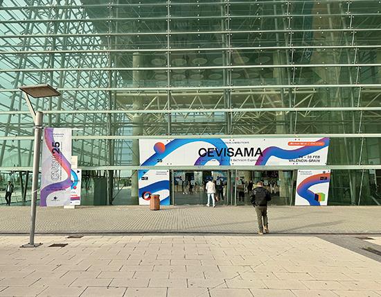
Cevisama, the Spanish international ceramic tile trade fair, was held in Valencia, Spain from February 24 to 28, with about 70,000 attendees, including distributors, journalists, and architects and designers from around the world.
Tile of Spain brought a large contingent from around the world to experience the exhibition, including a group of designers and journalists from North America. Led by Ryan Fasan, technical consultant for Tile of Spain, the Passport to Creativity tour provided a full experience of Spanish tile and culture, with an architectural tour of the city, two days of curated visits to exhibition showrooms and a day of ceramic mill tours in Castellón.
According to the Spanish Ceramic Tile Manufacturers Association (ASCER), Spain’s tile industry, at $5.1 billion in 2024, was down just 0.9% from 2023’s numbers. Exports were down a bit, though there was an increase in domestic sales. Its two largest areas of export are Europe at 51% and North America (U.S. and Canada) at 16%-the U.S. made up 13.5%, totaling $498 million. Production in 2024 grew by 1.3% to 4.3 billion square feet.
TRENDS IN SPANISH TILE
Innovation was everywhere at Cevisama, on both subtle and grand scales. In terms of color, many palettes were softened, with hues from soothing terra cotta to cream, very light blues and greens, as well as some contrasting richer cool tones. Also on display were color-influenced metallic finishes in a wide variety of tones, mostly in the range of black to brass, gold, copper and warm pewter. These metallics looked great with the earthy color palette.
From a style perspective, retro design trends combining 1970s and Art Deco looks spiced up the show.
A multitude of designs in smaller-format tiles were on display, mixing different patterns together on the wall and often featuring a different pattern in a similar scale on the floor. The combination of so much pattern seemed to neutralize its impact, creating a harmonious total effect. Nods to traditional Spanish tile were in evidence, including terra cotta tiles with smaller intersecting diamonds that had the look of traditional majolica-the typical majolica has bright colors in detailed patterns on a white field.
Spanish tile manufacturers have managed to successfully reproduce the look of vintage, handmade tiles as well as refine the look of materials such as marble and natural stones with very sophisticated imagery and surfaces. A renaissance is occurring in the use of technology and artistry to create realistic-and even better than realistic-visuals.
CEVISAMA AND CASTELLON HIGHLIGHTS
Decocer is a phenomenal small-format company that sells primarily B2B. Its show space served as a capability study in order to demonstrate to larger clients what the manufacturer can do.
Two classic geometric designs, Senda Aztec and Senda Chain, offered tonal colorations, with the interest provided by contrasting matte and higher gloss glazing. Another standout design, Bamboo, had the unique appearance of a multicolored ikat-a Japanese dyeing technique originally known for vertical tonal variation. Bamboo is offered in a rich palette of tiny stripe combinations.
With a soft, classic neutral palette overall, Decocer also featured an on-target retro ’70s inspired palette, as well as some colors for schools and universities.
Equipe produces porcelain tiles for interior and exterior flooring applications, all in small formats, along with white-body wall tile for interiors.
Showcasing ranges of rich, saturated zellige-look tiles, Equipe has taken many very traditional looks and is making them in a new and rapid way, using inkjet on top of a traditional mineral glaze to create something in mass production that has the character and feel of vintage ceramics. Zellige refers to a type of classic handmade tile known for variation in surface texture and color.
Fasan noted, “One of the biggest challenges for product development is to capture the randomization, the character and the beauty that makes us fall in love with manual product that gives us the feel of craftsmanship. Equipe does an incredible job with this in an industrialized way.”
Mainzu was included on the tour of production facilities (along with Equipe and Venux). A 60-year-old company that uses all local red body clay, Mainzu has been employing both digital printing and screen printing.
As shown in its striking and effective showroom, Mainzu’s tile patterns are diverse, detailed and beautiful, with a huge range of styling types and finishes. Floor tiles are cleverly matched with wall tiles within vignettes to illustrate imaginative interior scenes.
The display space at Cevica added spice to Cevisama. With a striking exterior of rich green tiles, the interior of Cevica’s booth featured its new Groovy collection, capturing the vibrant and nostalgic essence of the ’70s within a space designed to look like a small disco.
A family-owned business producing small-format tile, Cevica’s specialty is direct outreach with the A&D community. A section of its website is called Cevica Lab, where the entire catalog is broken down in terms of shapes and finishes, with a Pantone color system for creating custom products. Cevica also offers its own full commercialized line.
The mill uses three substrates: red body, white body and porcelain. For some colors, a particular clay is better. The red body for example, is optimum for the decorative floor tile, named Ruby, which was used in the showroom “disco.” Tiles are glazed on two sides, a unique feature that enhances installation and finishing.
Vives’ show space featured dramatic combinations of concrete looks with boldly colored marble tile. Showcasing the Tandem collection, materials and patterns in the space flowed organically from the wall to the floor.
One innovative collection offered by Vives incorporated a simple set of neutral tiles, including a dotted thin pinstripe and a linear check, where all the lines exactly align. This is very difficult to achieve technically, based on kiln shrinkage and rectifying the tile.
Gayafores featured a range of products, including collections that were reminiscent of traditional Spanish tile. Of special interest was a collection of terra cotta tile with contrasting majolica-type accents, as mentioned above.
Also visited on the mill tour, Venux produces large-format tile in a state-of-the-art production facility in Castellon, manufacturing porcelain slabs in multiple large sizes and in three thicknesses: 6mm, 12mm and 20mm. The different thicknesses allow the tile to be used for a variety of applications-interior walls and floors, exterior walls, furniture, cabinetry and more. Products are full-body, not colorbody-although the veining does not go through, the rest of the design is the same in both body and surface.
One option available in the 12mm marble look is a book-match option, a look often preferred by Venux’s North American customers. European designers usually prefer random over book-match.
Venux excels in creating natural stone looks. One of the reasons for using a tile versus natural stone is that maximum sizes for granite and marble tend to be quite a bit smaller than those available in porcelain slabs. Quarries will save their best cuts for the mill, and then, in a lengthy process, Venux designers will scan and redesign the image to take the best of each piece in order to make it their own.
Peronda Group is three different brands: Peronda; Museum, a brand of large-format polished marble and stone; and the quirky, design-driven Harmony brand. Peronda is known as one of the highest tech groups, as well as one that is the most on target in terms of design philosophy.
Harmony works with independent designers in multiple different fields. This year, Harmony also showcased a beautiful collaboration with design firm MUT.
Museum Surfaces showed a true highlight of Cevisama in its product introductions. The Artic collection has a unique and complicated stone visual created through Peronda’s new Strata Tech technology, a process where inkjet technology not only places subtle color and clusters but actually creates a topography.
Fasan noted, “In this one piece, Peronda is using 12 years of technology and innovation in the digital space. They’re doing all the colors that they do in traditional inkjet, and they’re doing a carving ink that’s adding relief digitally to a flat surface. They’re adding raised areas in both a differentiation of finish and a higher raised area. And then they’re digitally applying glaze as well as the ink to achieve some depth of tone and new levels of saturation. This tile has really moved into a league of its own in terms of biomimicry, using nature as inspiration and recreating manmade stone in a matter of hours instead of millions of years.”
AMERICAN DESIGNERS’ PERSPECTIVE ON CEVISAMA
Anna Gibson of AKG Design Studio
I love Cevisama. I love coming here because then I get an overview of trends, which helps me steer my clients in the right direction.
We definitely see a lot of the large format at Cevisama; large format has been in Europe for a long time. I think now we see an uptick of these tiles in this show, mostly because of the American market. Another thing we are seeing different this year is the technology that allows ceramic tile to reproduce the look of stone. Many of our clients want a spa look, yet with very minimal maintenance. They want the natural materials and the natural look, but they don’t want to take care of it. A granite or natural stone would be more high maintenance, so if you have porcelain materials that are really zero maintenance, why not? Most people seal natural stone about once a year, and you have to be a little more careful about spills and stains.
The large-size slabs allow you to do the same finish on the wall as on the floor, or you can use a tile that coordinates, so that you can have the same coloring but a different texture. I do a lot of design for living in place [a newer name for aging in place]. So, for me, it is often important to coordinate the floor with the walls, yet also differentiate.
Another thing ceramic can address is slip resistance. One of the other vendors we saw was talking about the fact that some ceramic tile floors will actually get more traction with water than without.
I really like the way that they’re printing tile, where there is a lot of play and combination between matte and gloss on the same tile, which creates a really interesting depth in the tile. And there were a lot of fun tile collections here. We all loved the ’70s look tile seen at Cevica and Realonda. I absolutely fell in love with the last tile we saw there, called Bari Lattice.
Yvette Craddock of Yvette Craddock Designs
I love the color palette I am seeing here. The color ranges are beautifully neutral, from soft warm to cool tones, definitely a lot more warm tones, even in the greys. The grey here is soft; it’s warm and not as pronounced as the cool grey with blue undertones that has dominated the house market in the U.S. for years.
The pastels are warm and have a neutral undertone, so they mix easily with other colors in the palette. If a color is purely a pastel, it can only be used with other pastels. Also, I was excited by the expansion of metallic colors in different sizes and different hues with a variety of undertones. There are nuances to the finishes, which make the visual so interesting. I imagine that particular tile in all times of the day and night, and I encourage my clients to live with a product; I’ll bring samples so they can see how they look in their light, in daylight, at night.
There is such a range of shapes available. Every company has a square, a rectangle, even large format, and then you have organic shapes and the ability to use them all together. I thought that was probably the most exciting development that I’ve seen, particularly at Vives. They had an incredible color story that would work in pretty much every type of market, and extremely sophisticated and dynamic designs.
I love the idea of a kit of parts where you can put multiple shapes together and create your own design or follow a design or two that the manufacturer may show you from their marketing materials. I think there’s room for more of that than is available.
Valerie Costa of MJM+A Architects
Coming to Cevisama, I have been so impressed by seeing ceramic tile being used in such different, innovative and creative ways. I knew about ceramic wood-look flooring, and that’s something that we’ve been doing in a lot of our projects, where you’re getting the wood floor aesthetic, but you’re getting better longevity for a better price and better durability.
But I didn’t think about the other applications I’ve seen. I was really impressed with the extruded plank flooring that we saw at Exagres. Flammability is an issue a lot when you’re trying to use wood or you’re trying to use plastic on an exterior project. I was also impressed with the large-format ceramics slabs like we saw at Venux, because that’s a way that we could become more economical, more sustainable-where you’re getting the aesthetic of the material without having to source it, without having to deal with the challenges of dealing with stones and stone quarries.
Being here opened my mind to different possibilities. You can use ceramic tile on both the interior and exterior; it can be used for the whole house. It’s not just your bathroom. I learned how it could be decking material, how it could be slabs, how it could be cabinetry-and I was really impressed with that. The mirror tile at Apavisa also blew me away, because then you could integrate mirrors within the wall tile.
Coming away from this, I will have alternate building materials to show my client. They can still choose color and pattern, but I will be able to show them that there are so many different ways that you can use ceramic tile beyond just your typical uses. So, that’s what really impressed me the most, seeing and thinking about how else we could use ceramic as a building material, and how I can bring that home with me and encourage my clients to do the same.
Copyright 2025 Floor Focus