Cersaie 2016: Exciting new products and a global design conference - Nov 2016
By Ruth Simon McRae
This September, over 106,000 people traveled to Bologna, Italy to attend the 34th annual Cersaie, the largest ceramic tile exhibition in the world. For the first time, this number included over 50,000 visitors from outside of Italy. Thronging through the exposition hall, show attendees were able to see over 850 exhibitors of ceramic tile and bathroom fixtures from 43 different countries, including 335 from outside of Italy.
In addition to introducing and selling innovative products, Cersaie is a place for people to exchange ideas, offering a rich schedule of workshops and speakers. Over 2,000 people crowded the hall to hear British architect Sir Norman Foster, winner of the 1999 Pritzker Architecture Prize, give the keynote speech. Other highlights of the design conference were presentations from the architects Aires Mateus and Solano Benitez; Cer-sail, a conceptual exhibit expressing a vision of an ideal port area; ongoing installation demonstrations; and an in-depth program for students. Student engagement at Cersaie is a great strategy for developing future designer loyalty to ceramic tiles and the companies that produce them. On the sustainability side, which is of critical importance to the U.S. market, Confindustria Ceramica has just announced a new EPD (environmental product declaration) tool for all of its manufacturers.
Italy is the largest producer of ceramic tile in revenue and generates the second largest volume internationally. North America is its largest export market outside of western Europe. Ceramics of Italy reported a healthy 6% increase in sales for 2015. One reason for the strong growth of ceramic tile is the industry’s committed and continual investment in new equipment and technology.
This year, exhibitors at Cersaie showed collections of products and materials together with a wide range of looks, surfaces and pattern scales. Some were appropriate for walls, some for flooring, and some for other applications such as landscaping and countertops.
NATURAL MATERIAL LOOKS
For years, the ceramic tile industry has successfully produced renditions of other materials, such as marble, wood, stone and cement. Textural enhancements not from rollers but from material additions after the press have further elevated the category. This year, cement seemed to be the biggest trend. At Cersaie, these material types were honed and refined, and combined in new ways.
Many of the natural material visuals and textures were organized in curated, coordinated collections. Throughout the show, product collections included different material types linked together through the same color palettes. These collections included groupings of not just natural looks, but also décor tiles and unusual textures and contrasting scales. One excellent example was 41Zero42’s Moods of Alter(n) Connections that mixed industrial and artisan-inspired materials.
Patterns used in these collections are designed with a neutral, subtle approach, making them all the more appealing. Pattern may be achieved by changes in luster or slight textural difference, often in tone-on-tone colors such as white, grey or black. This is especially effective for floor tiles, as they must be carefully designed to reduce actual or optical surface textures.
Combinations of material looks within the tile were also on display, such as cement and textile designs that look as if fragments of textile material were embedded in the concrete. These hybrid materials were seen in Leonardo Ceramica’s Factory and the Set Collection from Sant’Agostino, a fusion of concrete, textile, wood, metal and stone tiles that are designed to join up seamlessly. Arte Pura from Refin Ceramiche was the most dramatic example of combining textiles and concrete.
Wood looks were still prominent throughout the show, including beautiful near solid tones, as well as whitewashed and distressed planks, installed in both straight and herringbone layouts. Fioranese’s Dekap is a good illustration of the whitewashed look. Tagina’s Riva Mancina adds burned-out looking patterns to its tonal distressed design. And I Gozzi at Antiche Fornaci D’Agostino takes the distressed look further with colorful planks highlighted by the occasional glimmer of gold.
Also seen—although not key to the North American market—were large format tiles with bookend patterns of marble and onyx designs.
FASHION AND FAST CARS
Fashion and luxury cars inspired two of the hottest products at Cersaie 2016. Sant’Agostino introduced the Tailorart collection of woven menswear visuals, featuring a large-scale plaid with a realistic soft-looking textile surface, as well as a tile with an overall slubbed textile look. Many designers polled felt that Tartan was the most exciting product at Cersaie.
Casalgrande Padana built on the Italian sports car tradition with its new collection, Earth, a collaboration with Pininfarina, the well-known design house that shaped the design of Ferrari. Earth is available in both floor and wall tiles. Its flooring palette replicates a luxury car aesthetic with five warm and four cool neutrals, along with three color accents—navy, burgundy and a deep maroon. The collection is highlighted with accessory strips of metal and leather.
COLOR TRENDS
Italy’s sophisticated fashion culture links up well with the primarily neutral palette of ceramic tiles, as it is used in large areas and functions as a backdrop or envelope for the interior design of a space. Yet the nuance of color keeps the products looking fresh and alive. Neutral colors are sophisticated and elegant in stepped or tonal ranges. Typically, a palette includes a warm and a cool neutral range plus warm beige. When a color is added, it is intentional and for specific design purposes.
A few companies did a particularly great job integrating color into their palettes. Casalgrande Padana’s Earth has three classic pin-striping colors. FAP’s Color Now integrates mid values such as terra cotta, apricot and the surprise of sapphire blue into its neutral palette. Gigacer’s Le Corbusier range features 12 of the 63 colors from the system of colors that Corbusier instructed were best for architecture. And Vietri Ceramic Group’s Armonie Di Colore offers double glazed tiles with effects of the sea, including intense hues and soft luscious mid-tones.
MORE PATTERNS
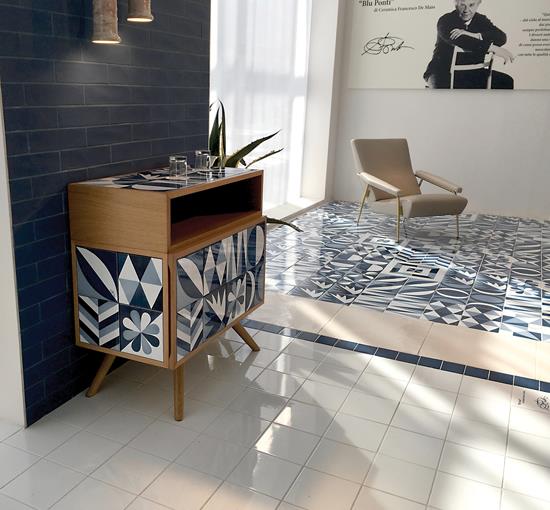
Patterns ran the gamut form bold, retro looks, to subtle designs created by texture. On the bold side, the beautiful blue and white tiles of Ceramica Francesco de Mayo’s Blu Ponti Collection were a standout. Designed by Gio Ponti between the late 1950s and early 1970s, the graphic tiles have simple geometric and naturalistic motifs in a selection of 12 designs. Colors are replicated from the original tiles in three tones of the original brilliant blue glaze.
Some of the most dramatic products at Cersaie were ceramic tiles digitally printed with fine, detailed illustrations. Tiles with the high definition of wallpaper or magazine illustrations were seen in many showrooms. 41zero42 featured Paper 41, slim porcelain tiles with a collection of ten artistic images. Sadly, these are only to be used on vertical surfaces and are not appropriate for flooring.
On the subtler end of the spectrum, interesting small-scale geometrics such as squares within a grid were seen at several venues, often designed with a different material pattern between squares and the surrounding grid. Fioranese’s Marmorea is an excellent example, as is Sant’Agostino’s Soft Gem.
Irregular triangle and rhomboid shapes were seen through the show, sometimes combined into palladiana patterns. The term palladiana refers to the large randomly fractured marble pieces used in a particular type of terrazzo. Quad + Fact, decorative coordinates to Piemme’s Bits & Pieces Collection are examples of both the inset square and rhomboid patterns. The rhomboid shape was also seen in individual tiles, which were then combined to create simple repeating patterns or optical Escher-type floor designs.
Patchwork textures of tiny geometric patterns were shown as coordinates to some of the more natural looks, such as concrete and stone. Leonardo Ceramica’s District offered the texture of metal or concrete, inlaid with tiny pressed patterns.
SIZE DEVELOPMENTS
Larger format tiles are being produced by more and more manufacturers. It almost seems rare to find a company that does not offer the jumbo tiles, which are often as large as 4’x10’. The larger tiles were typically at a thickness of 6mm to 7mm, although they may range from a thin 3mm to 2cm thick slabs. These thicker slabs are used primarily for landscaping and now allow ceramic tile to enter into the countertop market. Yet at the same time, smaller sizes were also very popular—micro mosaics and smaller subway shaped tiles were seen throughout the show.
Part of the fun of a European exhibition is the beautiful styling of the showroom displays. Vignettes create excitement, adding just a few pieces of furniture or accessories that make the vignette product pop. Sant’Agostino’s showroom was a key example, featuring engaging groupings of simply shaped furniture in cool colors along with new product introductions and a humorous faux-marble upholstered couch. Cersaie did not disappoint in this area. It was a pleasure to walk the show.
Copyright 2016 Floor Focus
Related Topics: CERAMICS OF ITALY, CERSAIE