2010 Color Trends - February 2010
By Kay Gosline
As the door to 2010 opens, uncertainty about the economy continues to impact the design industry even more sharply than most segments. Unemployment among commercial designers appears to be at an all time high as many firms that specialized in the corporate and financial markets struggle to survive. Those firms that successfully broadened their scope into healthcare, education and government fared somewhat better, but the future remains uncertain. Clients are tightening their belts and making minimal commitments as they also wait to see what happens with the global economy and important issues such as healthcare reform and climate change. The “New Economy” demands companies be more transparent to consumers and more mindful of workers health, safety and welfare.
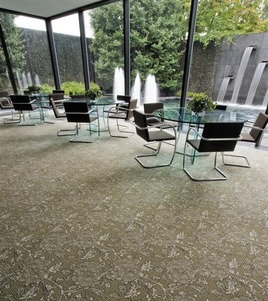
Design’s response to all this gloom and doom is to gravitate to cleaner, clearer, more optimistic colors balanced by a mid range palette of softly tinted complex warm and cool neutrals. The goal of good design is to give the environment a timeless quality that looks fresh and inviting. Little by little, grids are softening and organic shapes are starting to emerge—not circles or flourishes or vines but just rounded edges and layering of unstructured pattern on top of geometrics. For carpet it still needs to be simple and more focused on texture than applied pattern. When designers do want pattern to take center stage, the scale is getting really large, and interesting color combinations add drama.
The future may be cloudy, but most designers are embracing the challenge of making do with what they are given. Projects that have been on hold for months can suddenly be fast tracked and designers have to be ready with solutions that fit the new situation, which usually includes more value engineering. While some worry that the quality of design is suffering, I still see fabulous projects from around the globe created with imagination, creativity and a keen eye for colors that really work in the space.
What’s New In Color
Contract colors by nature are not trendy colors that appear on fashion runways or in attention getting accessories for the home, although those colors certainly push on the commercial designer’s subconscious. Contract employs dependable workhorse color palettes that change slowly over time; nonetheless, they don’t stand still! Just a slight cast one way or another makes all the difference in making a combination of colors sing or go flat.
With the advent of Internet services and even free websites on color trends, anyone can be a trend tracker. After over 20 years of doing it myself, I still find that while I learn about some trends that way, there’s also an intrinsic eye that some folks have to spot those trends that pop up out of nowhere and emerge to become important. Color forecasting is sometimes a team sport and I find some of the best palettes coalesce when designers work together, taking time to process the visuals and discussing all the implications. Yet, color is also an individual sport and making a palette that satisfies the creative needs of the artist/designer can also bring about amazing results. There is no single answer and no right or wrong colors. It’s not so much about what’s new but more about what works for the project.
Last year, I pointed out that white had emerged in importance, likely due to its association with purity and truth. More than ever, technological breakthroughs in performance allow white to be specified in a broader range of finishes. It’s showing up in unexpected places for healthcare and offices. Although there may be push back from end users about maintenance, the trend continues to grow.
That feeling of rawness in natural neutrals and unprocessed colors lend the palette freshness and subtlety. Minerals and metallics with patina are the perfect complement to these earthy, complex colors. Black is softened toward charcoal and browns are taking on a coppery glow.
A wide range of neutrals is needed for today’s projects, partially because they often act as a bridge to colors in the space that can’t be changed in the current round of renovation. Trend and counter trend show up most strongly in this area. On the one hand, designers favor “honest” colors, truer to the core and optimistic; on the other hand, chameleon-like colors that bend themselves to fit any palette are also useful. The distinction between color and neutral has blurred and almost any color can be considered a neutral in the right context.
Grey is fast overtaking brown as the new “it” color. Strongly influenced by architecture, cool greys are classic. Add a touch of purple and deepen it for delicious shades reminiscent of flannel and menswear. Soften and turn it inside out with more purple than grey and you get a muted neutral more complex than lavender.
There’s also plenty of room for the warm greys and taupes, especially the harmonious mid-value ones. Pairing these with beiges and browns provides instant sophistication. Play off of wood tones and natural hues to create toasted beige or touchable cashmere colors. These browns and beiges show no hint of green undertone but are decidedly more cosmetic base shade (not blush).
Greens remain as supporting players rather than stars of the palette. True to its environmental roots, there is continued interest in hopeful sprouts of green and the chameleon olive bases neutral greens. Newest on the scene is a happy go lucky mid-tone blue-based green. It’s a retro color but never to be used in the 80s context.
Blue, as a stand alone color in the classic sense, is joined by rich inky denim as a fresh backdrop for more lively colors. For pop, turquoise with intensity fills the need perfectly. It’s inspired by ceramics from Italy and Spain.
Reds are moving cleaner and brighter, which can be attributed to the coming influence of Latin America. The boldness of red with high chroma signals confidence. There’s also a connected need for hopeful shades of orange and copper, which have strong global support. Just as China held everyone’s interest during the Beijing Olympics, the world will turn to Rio soon. Expect more salsa inspiration and hot, hot, hot combinations.
Asian inspired gold and crème brûlée are the yellows of choice. The direction is a little more toward green. They are more organic in tone than the previous yellows that were technology driven.
The real feat is combining these colors with established palettes in a way that makes a new statement of style. Reflecting the changing tastes of the market by subtle gradations of neutrals and confident colors takes skill. Proportion and placement determine the end result. Finding new ways to delight the users of any space is always challenging, but especially so in times such as these. Color is perhaps the only thing that can elevate a value engineered project above the mundane.
Market Segments
Color trends still get interpreted slightly differently in each market segment but the lines between segments are more blurry than ever. It’s easy to understand why that should be when you consider the melding of all the creative disciplines. Architects design teapots; fashion designers produce fragrances; rap stars start their own clothing lines; celebrity chefs design kitchens. In design schools today, students are exposed to a wide range of creative outlets. Design with a big “D” is more respected and valued than ever. Simple things can become objects of desire when there’s great design in their makeup.
Corporate markets have been hard hit by the recession so most clients are ultra cost conscious. Downsizing will ultimately result in the need to reconfigure spaces but clients are also waiting to see how the commercial real estate market shakes out, hoping to hit the low point in lease rates. Interior designers are challenged to make the workplace more cost effective, which usually means more open offices rather than private offices, more hotel or touch down spaces, and less space per worker. The other challenge is the changing dynamics of the work force in terms of age as more Boomers delay retirement and Gen Z (Digital Natives) enters the workplace.
There is a confident and professional approach to healthcare today that really concentrates on using the best of color psychology married with universal design principles. Designers are not adhering to rigid formulae of the past but are forging new guidelines that allow them more creative freedom than ever. The trend toward spa-like environments is driving a palette of mostly warm neutrals and soft tinted soothing colors. Floors are expected to provide a quiet backdrop and to be easily changeable for future renovations. With all the talk of healthcare reform today, this will remain an interesting segment to watch.
Educational environments are continuing to be largely driven by the need to integrate technology. Rigid borders and cookie cutter classrooms are being replaced by high performance learning environments where design aids in creating better spaces for student interaction. Carpet tile is still expanding in this market both for practical performance and aesthetic reasons. School colors and mascots are tastefully used but the emphasis is just on creating more stimulating and fun places to be.
Stimulus money is helping keep the government sector strong. Liberal and conservative politicians still agree on traditional colors and patterns with a contemporary twist where appropriate. As LEED becomes mandatory in many places, lighter colors help to make the spaces seem larger and brighter. Natural light enhances the use of warm colors and wood tones.
Hospitality has slowed down as the business traveler travels less and vacations closer to home become the norm. Neutrals, especially greys, are an emerging color trend as palettes get more like New York than Las Vegas. We’ve also seen the return of purple recently. Borderless designs, larger repeats and very large scale mosaics are also trending upward. The term “transitional” style just doesn’t seem to be relevant anymore as the industry embraces a fresh, contemporary look with clean lines and sophisticated chic. Sustainability is gaining traction with hospitality designers and end users alike, which is driving tile usage in this segment.
Regional Differences
Travel might be less glamorous than in the past, but it still provides one of the best ways to recharge the creative batteries. True, the world is smaller in the sense that the same hotels, restaurants and shops show up all across the globe, but there are still pockets of indigenous art and culture. It’s not so much that I find different colors in various regions of the U.S. or foreign countries; it’s more that the colors are used in different proportions or in unexpected materials.
I just showed a series of new products on tour across America and then to Europe and Asia. Amazingly, the colorways were well received everywhere. The reason for this, I believe, was that there was a really nice selection of warm and cool neutrals surrounded by pops of interesting color. The lines were fresh and truly inspired by contemporary urban landscapes—concrete, bricks, ironwork, rocks, stones, street art and a mélange of people provide ample visual interest. Usually, the conversation with designers about useable colors had more to do with the particular client base than with regionalism per se.
Inspirational Narrative
The commercial market is a prime example of how our culture is now completely at peace with paradox. Clients want safe, classic environments yet they need to express individuality to stand out in their markets. Clients want all the high style they see in the media but they want it on a shoestring budget. It’s a good thing that designers are up to the challenge with colors that are reflective of hope and optimism tempered by reality. Whatever the palette might be, it’s crucial that it have a basis in an honest, inspirational narrative. It could be related to nature, brand enhancement, fashion or place but it needs to be compelling and relevant. Never lose sight of the power of a good story told well.
Copyright 2010 Floor Focus