Designer Forum - March 2013
By Tami Bopp
One of the privileges of working with a client for many years is getting to know their style and culture. However, every once in a while, the market requires that a client make a 180-degree turn to create an environment that will stir interest and stand out as its own unique statement. This is exactly what happened with Brink’s, a 154-year-old secure transportation, cash handling and security services company. Brink’s approached Hahnfeld Hoffer Stanford (HHS) and asked the design team to help create an atmosphere of learning for its Worldwide Training Center, housed within its North Texas office facility.
The company’s offices had traditionally been conservative in terms of design and materials used: blue and grey color schemes, offices along the window wall, a single pattern of broadloom carpet and two paint colors. However, changing times called for a design that would make a unique statement about the organization. Additionally, the space needed to appeal to both national and international Brink’s employees.
Brink’s is housed in a 100,000 square foot, two-story office building. The training center was established in what had been a part of the company’s call center. The 8,000 square foot space is located just off the main lobby of the building. The space includes standard training rooms equipped with state-of-the-art technology. It houses the training staff, a large reception/pre-function area, library and reference space, and a small break room. During design, there were certain parameters to work around, including an existing 6” raised floor, access to restrooms, and security issues to isolate the new training space from the rest of the office area. Goals for the space included creating a showcase for employees, creating a learning environment, and highlighting Brink’s mission, history and philosophy.
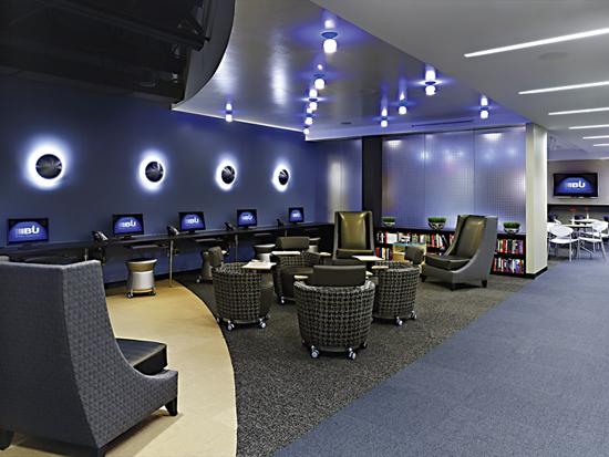
The employees that utilize the training center will come from all over the world, so it was important for this space to be not only functional but also memorable. The finish-out was an important element. Finishes needed to be both durable and elegant.
Brink’s culture is solid, stable and traditional, and the firm wanted its space to reflect that “secure” element. HHS proposed that the new space incorporate an organic feel with curved walls, a variety of lighting options and openness or transparency. The transparency was two-fold; first, it allowed the training staff to see trainees entering the space and to offer assistance as needed; and secondly, the transparent wall and open plenum ceiling created a feeling of openness, which was requested by the training director. From the pre-function/entry space, you are able to see not only the trainer offices, but all the way to the back of the space where the large training room is located. This transparency is an interesting statement for a security company and a departure from the feel of the company’s previous design approach.
One highlight of the space is a curved blue acrylic wall that not only provides a divider between staff and trainees but also acts as a large display area where inspirational quotes can be changed out, depending on classes. In addition, some of the transparent walls feature a three-dimensional bubble acrylic panel to add texture to the space.
The design team started out presenting a very colorful scheme with reds, oranges and greens; however, Brink’s upper management was more comfortable with a more traditional color palette. It was important to the company to have a space that would hold its classic look for a long time, so, as a compromise, the design team revised the colors to different shades of blue, with black as an accent, and introduced multiple textures in the carpet.
This space was an investment, and Brink’s wanted a long-term design solution. The HHS team used very clean detailing. Because of the open plenum ceiling, the design elements were slightly contemporary. Display areas contained both floating shelves and cable-hung panels. The cable-hung panels were designed so that trainees are able to write comments about their classes and share those thoughts with the next class that comes through.
To start the actual renovation, the entire space was gutted, including a portion of the existing 6” raised access floor. The raised floor was retained in the three training rooms to offer flexibility, since there was a large amount of technology, and therefore wiring, in these spaces.
In the entry, the design team felt that removal of the raised flooring created a better transition from the building lobby. For the flooring in this space, HHS specified bamboo—Green Choice Flooring International’s vertical bamboo in the colors Caramel, Cornsilk and Ebony, custom-stained on site. With its high hardness rating, bamboo was the perfect choice to withstand entry traffic while requiring little maintenance. The design team also liked the unique nature of the material and the rich feeling that it added to the space. Though Brink’s did not pursue LEED certification for the space, the design team made efforts to use as many green materials as possible, and bamboo was a good fit in that regard as well. Initially, there were concerns about acoustic issues in the pre-function space due to the bamboo flooring and open ceiling. However, after installation, the design team found the acoustics to be just right for a gathering area.
Removing the raised flooring in the entry space meant that the design had to incorporate a means of transitioning back up to areas where the raised flooring remained. Ramps were added in several locations—such as between the pre-function and library space—to accommodate this change in elevation. In spaces where raised flooring remained, HHS specified carpet tile, using seven different colors and patterns to create interest and define the spaces. This variety allowed the design team to create different patterns to help shape the design concept.
For the office area, HHS chose Masland Contract’s Arrhythmic in the Murano colorway. In the public areas, a mix of carpet was used: Mannington Commercial’s Everywear III in Shantung, Pure Contract’s The Brights collection in Umberglow, Bolyu Contract’s Glitz in Starry, and Patcraft’s Color Still Matters in its Black colorway. And for the training rooms, the design team specified Masland Contract’s Terrain and Contour, both in the Lakefront colorway.
The trickiest transition was to the restrooms, but the difficulty here wasn’t related to elevation, because the restrooms were already on the slab with ramps into the corridor. The problem here related to security, as the restrooms are located between public and private offices; so, while both sides needed entry to the restrooms, open access could not be allowed. Ultimately, the design team decided to install security doors with card reader access on both sides of the restroom corridor. Brink’s issues badges to the trainees, which are coded to allow visitors access only to appropriate areas.
Another restriction was the amount of square footage available to the training center, 8,000 square feet. With all the amenities desired, it was still important to have rooms to accommodate both large and small group training. Brink’s wanted not only to have group learning areas but also individual spaces for employees to read, check emails or individually train online. Because there will be times when multiple classes take place, the space needed to accommodate flexibility both in size and acoustics. Brink’s made a significant investment in its audio/visual capabilities because it wanted to ensure that its new space was as technologically sound as any rented space in which the firm had previously hosted training.
Because the learning center was an open concept design, there was more flooring and ceiling space, so flooring material and lighting became the opportunity to enhance the design. As mentioned earlier, the flooring selections became an integral part of the design in function, acoustics and aesthetics.
The design team decided to use the 52’ long corridor to the large training room as a walk through history to educate employees on the past, present and future vision of Brink’s, which seemed especially beneficial for new trainees coming in. This corridor displays the company mission statement and vision using key words along one side of the wall. On the other side of the wall, the past presidents of Brink’s from as early as the 1800s are honored. For this area, HHS specified carpet tile with an inset of vinyl on both ends. The vinyl tile inset from Bolyu, the Finger Print collection, has a fingerprint pattern to highlight Brink’s security business and to add a little whimsy to the design. The flooring design is varied to help create interest in the long corridor.
Artwork plays a key role in highlighting the history of Brink’s. Using memorabilia like an early 1900s uniform and historical images of armored cars and former employees, the design allows visitors and employees alike to witness a visual representation of the growth and evolution of the company.
The challenges of working with the client to create this special environment exceeded the design team’s expectations in both the aesthetics of the training center and in keeping on track for budget and schedule. According to Chuck Hazelton, training and development director for Brink’s, “The space has been a great investment and has helped us nicely with respect to the materials and furniture. We have been able to save money by not having off campus meetings and our employees have commented on the unique and energizing space.”
It is always important to make sure you have that special client that allows you to come back and work on projects for them time and time again. Interior design is not only about beautiful spaces but also that special bond that the design team and client develop. This project was a result of that type of relationship.
Copyright 2013 Floor Focus
Related Topics:Mannington Mills, Masland Carpets & Rugs, The Dixie Group