2015 Color Trends: The latest trends in commercial color - Feb 2015
By Todd van der Kruik
The U.S. economy is set to grow another 3% or more in 2015, making it the strongest it’s been since 2005. The job market is improving, with the lowest unemployment rates seen since 2008, and even impacted industries like construction and manufacturing are expanding. Consumer spending continues to grow, and after years of watching global emerging markets rise, some suggest that the U.S. may once again be ready to take the helm.
In spite of all of that good news, 2014 left us reeling. After all, the Twitter feed has been bleak: terrorism, police violence, civil unrest, Ebola, the Ukraine, Sony. Not even “America’s Dad,” Bill Cosby, could stay above the fray. Our increasing connectedness through social media has been both liberating and overwhelming. As we surge into a new year of color and design, economic growth, global unrest, solitariness and social justice have become key considerations.
The media channels are full with no sign of slowing down. Last year we discussed the rise of the selfie as an influence on color and a new take on authenticity. Everyone from Ellen at the Oscars to space-walking astronaut Aki Hoshide was sharing a close-up. It was a lot to take in. The floodgates are wide open. The constant feed of information is ever-expanding and funneling everything from images of foreign wars to photo-shares of Aunt Betty’s bingo night directly to your smartphone. It’s clear that we need to start filtering the noise.
The Y generation has already begun to do that. While some networks may seem like institutions that are too big to leave, many users opt to spend their time on smaller, pared-down social media platforms that feel more in-the-moment, allowing them to be increasingly selective of the content they receive. Terminology such as “friends” can feel awkward and imply a personal investment, where “follow” is less of an obligation. They may not want to be your friend, but could still be interested in what you have to say.
The urge to create distance feels a little cold and offers a slight shift to the color palette, taking everything marginally less red. It also signals a trend for the playful tech spaces of the last few years to transition toward more grown-up versions of themselves—still fun, but not kitsch. Greys continue to dominate the commercial palette in all forms, both warm and cool, leaving plenty of room for color to be layered above. The need to edit and simplify our lives leads to infused neutrals, where color is only a part of the story, softened by underlying tones of grey or taupe.
The economy is recovering, and we are beginning to feel more optimistic about the future. The sense that we might one day get back to normal lingers in the back of mind, but the reality of the world today keeps us grounded. We want to bring more color into the palette, but our instinct is to keep it subdued and earthy, a reminder of what’s most important.
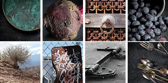
In harmony with the infused neutrals, the color story continues to be heavily influenced by nature, in particular ancient heritage colors derived from the field. Heirloom fruits and vegetables, plants and flowers offer a rustic perspective and provide the perfect companion to our neutral base. The deepest colors of the farm transition to a new, earthy rendition of jewel tone, with the richest colors now taken from eggplant, grapes, tomatoes, blueberries and other legacy varietals. Blue, in particular, has seen resurgence, with bright pure indigo finding new direction in a version that cools off with a shift toward blueberry. We see wheat, dried grain and grasses leading the exploration of neutrals, with moss and kelp appearing as more saturated alternatives.
The search for new color continues to unfold as we dig even deeper beneath the surface to find inspiration in neutral-rich tones of earth, rock and minerals. The deep brown, nutrient-laden dirt appears almost black. Dark, unpolished metals become more important, bringing iron, zinc, copper and gold into the core of the palette. The oxidization of the harvested elements brought to the surface reveals perfectly balanced and complementary hues of blue, green and rust to be used in combination. This exploration of the earth’s materials brings a simplicity and sense of calm to the palette, which we will need to help balance the noise that buzzes around us.
We enter 2015 with a sense of hopeful optimism, eager for the upswing we’ve been awaiting to materialize but awake to the reality of just how quickly things can transform. The coming year will allow us to reflect upon just how much the world has changed over the last few years. Technology that was a novelty only recently is now an integral part of our lives. How we manage the evolution will help to define who we are and impact the next progression of color and design.
Copyright 2015 Floor Focus