Residential Color Trends 2011 - February 2011
By Emily Kiker Morrow
For the past three or four years, we have been living in a world of conservative colors. Manufacturers, homeowners and designers have been playing it safe. Now, we are all hungry for something new. The year 2011 brings with it cautious optimism in the hearts and minds of consumers. We are seeing signs of improvement on Wall Street and some areas of mainstreet. With this glimmer of hope comes something very exciting: anticipation!
Expecting a slow but hopefully steady economic rebound, consumers are readying themselves for a little pizzazz in their lives. We are ready to transition our ultra neutral world into a world rich with high-definition color and to bring that into our homes. The 2011 color palette is not 100% brights but rather clever combinations of neutrals with just the right brights. Inspiration, balance and harmony are at the heart of what we will see from colors in 2011.
It’s impossible not to find stimulation in some of the world’s cities. From Dubai, Shanghai, Beijing, Bologna and Venice to Seattle and New York City, inspiration is everywhere. The fashion-forward colors aren’t just important because they are pretty or eye-catching, but also because they will be used in the products we will see in the 2011 marketplace in practically every category. Product designers know that new colors and new color combinations move consumers to purchase. Those who have the newest and most cutting edge colors will succeed. As Color Marketing Group states, “Color sells, and the ‘right’ colors sell better.”
Researching color direction is fascinating because it delves into human behavior at the basic psychological level. A person’s color preference is influenced by educational background; exposure to the world, history, current events, politics and economics; as well as cultural differences and similarities. As I poll customers and designers for what color they think is “it,” there is always lively debate about what is a “must have” color versus what is the “newest” color, neither of which is wrong. Grey, taupe, camel, chocolate, black and white were among the most-named colors—no surprise there—but some very vivid additions have made the “it” list and are now in my 2011 Shaw color forecast.
The lifecycle of colors is extended depending on the other available colors that can be paired with it. If grey, chocolate, and icy blue are current in today’s marketplace, these colors will stay relevant or saleable for a much longer period of time because they relate to one another well within an overall color and design scheme. It is quite easy to think back to all the different times that purple was the hot new color that everyone talked about. It was everywhere—on the runway, in magazines and in stores—but what colors did consumers have to pair with it? Not many options may have been available at the time, limiting its application and mass appeal.
Today we have a wide world of grey wherein many different colors like plum, teal or sunshine yellow work nicely. Sand, ochre, taupe, flax and camel all contrast in an exciting way with vivid hues like those that can be seen on the color horizon. Recently I was participating in a discussion on the “color of the month” and was moved by the images and color names given to the yellow family. It was not only the images and names that moved me, but the simple fact that the weather in my area had been particularly gloomy and that yellow completely brightened my mood. That is powerful! Color is a potent tool and one that we must use to our advantage as we move into the new marketplace where the buyers are no longer “sport shoppers” but rather well-informed consumers who happen to be looking for something distinctly different and special for their home.
Urban architecture’s use of steel, glass and cement keeps the grey all around us. It is noteworthy that greys in fashion and textiles are the go-to foundation color that plays well with the newest designs. The latest version is a warming grey that looks smart when used with deep colors but can be whimsical if paired with brights. While grey’s deep and smoky depths are both complex and fundamental, silver, nickel and pewter metallics are desirable on a more sophisticated scale.
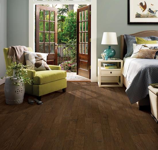
Natural shades of brown are still going strong as another color of choice for today’s interiors. What makes brown feel new today is the addition of accent colors, which have taken their cue from the natural world as well. Rose, lavender and robin’s egg blue have grown in favor as the hot combination of colors for accessorizing the home. From flooring and furniture to walls, the use of these natural neutrals grounds a space, evoking natural serenity.
There is another way of looking at color: to look at them as commitment and non-commitment colors. For example, if a color is found in tile, stone or hardwood floors, cabinets, or large pieces of furniture, then it’s a commitment color. If a color is found in window treatments, pillows, upholstery, rugs or art, then it’s a non-commitment color. Designers and consumers are constantly negotiating how to combine new purchases with existing finishes in an aesthetically pleasing way. As we examine the top selling colors within carpet, both nationally and regionally, the majority falls within the beige family.
Beige can easily be explained away as a “safe” choice for the next property owner, but there’s much more to consider. The percentage of square footage devoted to carpet and hard surface over the years has shifted in tandem with the shift in carpet color lines from more colorful to more neutral. As more hard surface has been used in interiors, carpet colors have been designed to coordinate or match the color of the hardwood, stone or tile, so that there’s a seamless transition between the two.
For every pendulum swing in one direction, there’s an equal and opposite pendulum swing in the other direction. While hard surface has influenced the colors in carpet, it can also be said that fashion-forward colors in the design world have influenced hard surface. Must-have colors have made their way into the newest wood, stone and tile product lines. European white oaks in flax or blonde colors are design-forward visuals, as well as cerused or white-filled wood grains. Dark chocolate, black, grey and taupe are also among the new color influences in wood, both for flooring and furnishing.
I look forward to watching as the new colors materialize in our everyday world, as well as seeing how some will sustain longer than others. Please watch and observe your own responses to color as you too make decisions. Whether it’s a car, a bottle of nail polish or a pair of shoes, know that you are being driven to a decision, within seconds, based on color alone.
Here’s to a happy and very colorful 2011!
Copyright 2011 Floor Focus
Related Topics:Shaw Industries Group, Inc.