




Chicago Design Week 2026: This year’s commercial design show was notable for its bigger crowds and bolder color and design – July 2026
By Darius Helm and Meg Scarbrough
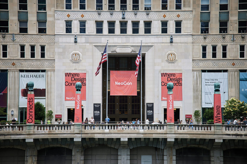
This year’s Chicago Design Week, split between The Mart’s NeoCon and Fulton Market’s Design Days, was busier than in recent years, with NeoCon attendance numbers up 9% to 55,000. NeoCon started a day earlier, adding a half day on Sunday, though crowds then were reportedly a lot lighter.
There was additional flooring showroom movement away from The Mart since last year, with Mannington Commercial moving its showroom to West Fulton Market and Aquafil vacating its space on the 11th floor of The Mart. Both brands have maintained showrooms at The Mart for decades.
Fulton Market is still expanding, with more showrooms opening up and new restaurants and retail stores getting in on the game. And the crowds keep growing. This year, streets were closed to accommodate the foot traffic and the numerous outdoor pop-ups.
The consensus at the show was that the bigger crowds and the upbeat optimistic vibe largely reflect the strengthening of the corporate (aka workplace/office) market, which is the biggest piece of the commercial pie. It’s finally showing signs of growth after several years of contraction, led by projects in Class A properties. It seems like the segment started to turn the corner last year, and this year, it is even stronger. Renovations are still outpacing new builds.
TRENDS AT THE SHOW
This year’s event was characterized by major trends in color and design, both extending trends from previous years and introducing new aesthetic directions. More than anything, this year’s new products and colorways—and showroom designs—seemed to signal that the design community was reasserting its role and expressing its aesthetic mandate, not just reacting to the shifts in the market by serving up resimercial platters.
The overarching trend was an embrace of nostalgia and authenticity, expressed through a celebration of retro designs, iconic motifs, biophilic references and, to some extent, material integrity.
COLOR TRENDS: AN OXBLOOD MOMENT
The most visible trend, and the most dramatic shift from last year, was in color. Red was the color of the show this year, and we’re not talking soft, gentle reds. Rather, the reds were mostly strong, authoritative, maximalist, often deep and dark—a glaringly strong contrast to Cloud Dancer, Pantone’s controversial 2026 Color of the Year, perhaps best described as what you’re left with when you remove as much color as you can and then say, this’ll do.
“Oxblood is having a moment,” says Cheryl Durst, executive vice president and CEO of IIDA. She notes that there’s a luxeness to it, adding that even those who don’t want to spend a lot of money can communicate “luxe” through the color. She points out that oxblood has more brown than black in it, making it more organic and earthy.
Jordan Cross, regional resource director for Gensler Chicago, says, “A lot of my colleagues and I felt like oxblood is the color of the year,” adding that she also saw a lot of notable jewel tones, and that warmer tones in flooring are still trending.
According to interior designer Christine Gachot in an interview with Vogue, oxblood is a color of historical significance with “deep roots in both fashion and interior design, making it a highly versatile color that complements a wide range of palettes.”
“In the last few years, we’ve witnessed these softer, muted warm colors slowly evolving into bolder, deeper colors,” says Sarah Kuchar-Parkinson, owner and creative director at Kuchar Studio. “At Kuchar, we’ve witnessed a shift in recent years towards warm colors, including browns and deep reds. Sometimes it takes time to convince manufacturers to use the bold ‘new’ colors.”
It’s worth noting that, even though manufacturers showcased a lot of these deeper reds in their showroom design and product highlights, the full colorways of their products are still largely in that warm, soft earth tone family—“resimercial” colors—though accent colors are moving toward more vivid hues, nudging resimercial a little back toward contract.
Another strong trend is color drenching, where an entire space is covered by the same or similar colors. And nobody is drenching rooms in taupe or ash. Rather, it’s rich saturated colors, often more dark than light.
DESIGN TRENDS: RETRO, LAYERED MEANING, CURVES
In many ways, this year’s design trends are fuller, more deliberate expression of trends going back a few years—toward biophilia, curves and soft, welcoming spaces, and also toward retro, eclectic and vintage designs.
Curves were everywhere, sometimes with Bauhaus and Art Deco influences and frequently in generous scale. Both Shaw Contract and Interface featured them prominently in carpet on the show floor. Furniture makers really leaned into curves, from sinuous sofas to curvy and rounded overstuffed easy chairs.
The retro trend isn’t just a reinterpretation of classic designs. It’s a lot deeper and more referential, expressing nostalgia through iconic images and ways of seeing the world, often layered with other imagery or with timeworn effects. So, there was a lot of intricate patterning and layering, but on the floor, it looked effortless and flowed organically. In carpet, there were plenty of woven looks and reinterpretations of classic textile patterns.
On the hard surface side, the biggest trend was in the design of wood looks in LVT. While all of the manufacturers offer plank designs, as they have for years, at this year’s show there was a lot of experimentation with parquet-inspired designs—not the traditional parquet designs, like basketweaves or finger strips, but more deconstructed designs and shifts in grain directions to add more patterning and fracture the linear flow.
EXHIBITOR HIGHLIGHTS
Shaw Contract went all in on retro in its tenth-floor showroom in The Mart this year, accenting the space with everything old school—telephone, turntable, photo booth, stereoscope, even heavy curtains at the entrance in trendy rich red, calling to mind the movie theater experience of old—to highlight its theme of nostalgia inspiring its new collections. The centerpiece was the Cult Classics collection of carpet and hard surface flooring winner of a HiP award for workplace carpet.
Cult Classics includes multiple carpet tile styles, along with broadloom, rugs, LVT, and porcelain floor and wall tile—“an ecosystem of products,” as Jeff West, vice president of marketing and design for Shaw Commercial, puts it. Many of the carpet styles call to mind classic woven textiles and iconic patterns. Remaster is a patchwork of small-scale structured grids in shifting scales and dimensions. First Edition is a textural carpet in a geometric array of irregular laddering that hints at film reels. Grid Line, a broadloom, is a crisply textured small-scale grid with highlighted horizontal and vertical lines for an overall elevated and vintage visual.
The firm also added four styles to the Curate line to coordinate with Cult Classics, including Typology and Vibes, both of which feature trendy curved geometric motifs through color-blocked neutrals.
The porcelain offering brings a wide range of floor and wall tiles to the collection, including colorful subway tiles. And the wood-look LVT mixes linear graining with perpendicular and angled strip for a patterned parquet effect with an irregular organic flow.
Beyond Cult Classics, Shaw Contract introduced its Format + Fragmented porcelain floor and wall collection, comprising a solid color matte rectangular tiles with low-key textures and a small-scale terrazzo look available in both subdued tonal and more colorful aggregate.
Shaw Contract also partnered with Shaw’s higher-end residential brand, Anderson Tuftex, for a line of wool broadloom, including Veranda, a woven herringbone look, and Tactile, a hand-loomed product with an overall organic look.
At the back of the space, the firm previewed its Bold Moves carpet and porcelain collection, targeting the education market—another HiP award winner. The porcelain comes in 20 saturated colors. The carpet, a largely neutral tight linear zigzag, is highlighted with accent striping of vibrating colors, available in a range of colorways, which for education could show school colors.
This year, Shaw Contract also had a presence in Fulton Market, hosting its A&D guests at a speakeasy at the back of a classic barber shop on West Fulton close to the Design Days welcome center.
Mohawk Group stole the show with Hero Rubber, its recycled-rubber flooring platform made in part from repurposed Nike athletic footwear. Originally developed for sports and active environments, the collection is gaining traction across healthcare, education and corporate interiors, with the company reporting strong demand since the launch. The line won numerous awards, including multiple best of NeoCon awards—People’s Choice, Sustainability and Gold Winner in Hard Surface.
While Mohawk’s main showroom was in Fulton Market, it did maintain a presence in The Mart this year on the seventh floor, where it hosted a Golden Hour event on Tuesday of the show, featuring cocktails and hors d’oeuvres. Booking this space also allowed Mohawk to enter the Best of NeoCon competition, since technically it was a temporary tenant.
Back at Fulton Market, the company displayed a range of new flooring solutions centered on accessibility, flexibility and sustainability. One of the most notable introductions was Guidelines, a patented carpet tile wayfinding system developed with architect Chris Downey, who lost his sight as an adult and continues to practice architecture while blind. The collection incorporates tactile navigation cues directly into carpet tile, helping visually impaired users navigate spaces without relying on traditional hard-surface warning strips. The company also highlighted Hero, its recycled rubber flooring platform made in part from repurposed athletic footwear.
Mohawk also expanded its Assemble platform with new Assembled Travertine LVT and Assembled Threads carpet tile collections, building on the success of the Assembled Woods LVT collection through modular combinations of planks, squares and carpet tile that allow designers to create custom floor layouts.
Additional introductions included Adaptive Alliance, a coordinated flooring program designed for senior living and healthcare environments, and new PVC-free resilient flooring options that replicate existing visuals and colorways to simplify specification. Throughout the showroom, Mohawk Group emphasized customization, circularity and design flexibility, while also highlighting partnerships that support emerging artists and broader accessibility initiatives.
Mohawk was honored with several HiP awards this year, including winner, Health + Wellness: Flooring, Adaptive Alliance; honoree, Workplace: Hard Flooring, Assembled Travertine and Assembled Woods.
Interface’s showroom across the street from The Mart featured bold colors, biophilic designs and installations, and one of the most vivid and dynamic collections at the show—Forest Within by David Oakey—which leverages the crispness of its carpet constructions in expression of biophilic designs targeting a range of budgets. The seed of the inspiration comes from birch bark. Quiet Grove is the most literal and most vivid style from the collection. Elevated by detailed pattern articulation from the firm’s advanced tufting technology, each carpet tile is like an eye-level window into the densest grove of silver birch. It comes in four neutral colorways.
Also from Forest Within is Shifting Seasons, an abstracted but linear bark-inspired design that mixes neutrals and more vivid hues in four colorways, one for each season. There were also some tonal or near-tonal designs. First Light, a linear bark pattern fractured by meandering branch designs, comes in eight neutrals. And Spruce It Up features a similar design expressed in eight rich, tonal colorways—shades of high chroma green, red and blue, along with other darker, earthy hues.
On the vinyl side, Interface introduced the Cut & Form LVT collection, eschewing typical wood plank design for a deconstructed parquet visual of narrow strips combined in linear, perpendicular and angled combinations in each 50cm x 50cm tile. The collection comes in ten wood tones, from ash, blonde and honey tones to warm midtones to darker cherry, coffee and walnut colorations.
The firm also had a major introduction in its Nora rubber program, Noravant Timber. Like VCT, rubber is typically a homogenous product with limited design capabilities. Noravant, however, uses a polypropylene film to convey wood looks with the same precision as is found on LVT wood designs. The planks are topped with a wearlayer and special chemically resistant coating, ShieldForm, designed for easy cleanability and chemical resistance to ensure its suitability in healthcare environments, a major market for Nora products. The collection comes in ten wood colors, including a pale and cool option, warm naturals, some midtones and a few richer, deeper hues.
AHF Products’ seventh floor showroom in The Mart offered convincing demonstrations of the performance of Diamond 10 technology, the patented stain-resistant, scratch-resistant, non-porous finish that Armstrong introduced back in 2015, which is made of cultured diamond nano-particles in an application that coats the surface of the firm’s commercial LVT and sheet products.
Under the Armstrong Flooring brand, the firm introduced Conjunction, a 4.5mm looselay LVT with a Diamond 10 finish and 20 mil wearlayer, designed to withstand impacts from everything from rolling loads to high heels. It comes in 20 SKUs: one textile look, three stone looks and 16 wood designs. According to the firm, Conjunction delivers four times the indent- and impact-resistance of typical products, and, thanks in part to the thickness and construction of the product, that includes residual indent healing.
The firm also showcased its Kaleido Color Lab, soft-launched last year. Kaleido, a HiP award honoree this year in the health and wellness flooring category, comes in three abstract designs with textile, geometric and organic elements, each in two
neutral base tones that can be customized with 28 accent colors and three sizes. Kaleido is also designed for walls, and this year the firm added fire-retardant chemistry to meet the specification demands for vertical installations.
On the Crossville porcelain side, the firm displayed Cleve, a quartzite visual with the firm’s proprietary FeatherSoft finish, ultra-smooth to the touch but instantly slip-resistant when wet. And it previewed Reunited, a collection of three warm, refined stone visuals, also featuring FeatherSoft.
AHF is the only domestic producer of VCT, and the firm reports massive gains in the category over the last year or so, as end users that had originally deselected VCT in favor of LVT are now returning to VCT for its performance characteristics and durability. Across all categories, AHF manufactures 98% of what it sells to the market.
From its tenth floor NeoCon showroom, Patcraft racked up more NeoCon and HiP awards this year with its innovative design in both carpet and resilient flooring. Kent Clauson, vice president of marketing and operations for Patcraft, and his team wore T-shirts emblazoned with “Impact Beyond The Floor,” which Clauson explained signals the firm’s mission to deliver the outcomes its customers seek through design, sustainability, longevity, recyclability and performance.
On the carpet side, Within Walls, designed by Grace Sizemore, won a NeoCon Gold in the carpet category and was a HiP award honoree. Inspired by water marks on highway walls and the way the organic edge bleeds across the structured surface, the four complementary styles—covering multiple price points—range in scale and texture, with the larger-scale Taking Shape conveying the vision through organic irregular brush strokes expressed through a subtly linear structure. In fact, the team developed a unique tufting innovation, patent pending, to convey the nuances of the design. The collection comes in five neutral colorways with contrasting pale and darker tones.
Wanderwood 2.5mm and 4mm LVT, made at Plant RP in North Georgia, won a NeoCon Silver award in the resilient flooring category and was the HiP winner in the workplace carpet category. The End Grain style took a terrazzo motif but instead of aggregate, designer Mada Jones used chips, bark shavings and cross-sectional slices of oak, maple and walnut branches, along with some rock chips, creating sample materials by hand, then working with Interprint to create the print films. The result is a riveting, elevated design, available in ten colors with neutral bases flecked with wood debris. The companion line, Saw Grit, a textural concrete design, comes in ten colorways, including rich tones, like a grey green and a moody brown.
Also, Patcraft introduced its Timber Grove III collection of more traditional wood looks in a range of colors that coordinate well with Wanderwood.
Tarkett debuted its “Express Freely” showroom concept, built around the company’s claim of offering one of the industry’s broadest product portfolios. The colorful installation highlighted coordinated solutions across the rubber, resilient, linoleum and carpet categories, anchored by new Johnsonite Colors of the Year inspired by natural dyes derived from materials such as indigo, turmeric and botanicals. Interactive palette-building stations encouraged designers to explore how products coordinate across categories, reinforcing Tarkett’s “Solution Spectrum” message and focus on customization.
The company also launched an amazing number of new collections, including Transcribe, a flooring collection inspired by the evolution of communication, from ancient hieroglyphics to modern language. Available in both carpet and LVT formats, Transcribe features multiple patterns and customizable colorways designed for workplace and education environments. Additional introductions included Living Contours, a nature-inspired collection geared toward senior living, and In the Making, an education-focused collection that draws inspiration from the artistic process. Across the showroom, Tarkett emphasized customization, coordination and color flexibility, while showcasing hospitality, healthcare and commercial solutions that can be tailored to individual project needs.
The Wild Runway and Transcribe collections were also finalists for a HiP award.
Mannington Commercial debuted a new showroom at Fulton Market this year, marking the company’s first year exhibiting at Design Days. The move reflects a broader strategy to establish a year-round presence in Chicago rather than focusing solely on Design Days and NeoCon week. Built around the theme “The Long View,” the showroom showcased coordinated flooring systems that connect hard and soft surface offerings while emphasizing design flexibility, performance and ease of specification for commercial interiors.
“This showroom is part of the long view for Mannington Commercial,” said Cindy Kaufman, vice president of marketing. “It gives us a permanent home in Chicago to connect with the design community, support our teams, tell deeper product stories and continue building the brand in a way that feels intentional, relevant, and lasting.”
Among its new product offerings, Mannington highlighted Studio Loop, a carpet tile collection inspired by 19th-century craft of punch needle rug hooking.
The company also received several honors during this year’s event. Studio Loop earned both a MetropolisLikes award and a HiP Award finalist designation, while The Light That Binds Us received a HiP Award in the Hospitality: Flooring category. Color Collective and Stepping Stones were also named HiP Award finalists.
J+J Flooring showcased a range of new introductions spanning carpet tile, broadloom and LVT, with a strong emphasis on color, texture and customization. Among the highlights was Ume, a new 24”x24” Kinetex carpet tile inspired by the Japanese textile art of Sakiori, launching in August with 17 colorways and expanded options aimed at healthcare and senior living environments. The company also introduced Echo, a collection inspired by the movement of sound featuring the patterns Harmonic and Resonance, and Zen Garden, a three-pattern collection designed for senior living but generating interest across hospitality and workplace segments. Throughout the showroom, J+J emphasized warmer palettes, biophilic influences and textile-inspired visuals.
The company also highlighted its growing customization capabilities, including its CustomWorx rug program, which allows designers to create bespoke shapes, patterns and color combinations through an online design tool. On the hard-surface side, J+J previewed Mythos, a new LVT collection that expands its coordinated stone-look offering with multiple formats and colorways designed to work together within a space.
The big introduction at Bentley Mills’ showroom on West Kinzie just outside The Mart was Land/Mark, a carpet tile collection designed in collaboration with Neutral Haus’ Todd van der Kruik, who was Bentley’s vice president of design from 2012 to 2018. “The inspiration came from thinking about how the spaces we spend time in leave a mark on us and stay with us long after we’ve left them,” he says. “Memory is a lot like the surface, in that it’s layered. And on the surface, as layers begin to wear away, new colors and patinas come through.”
The collection, in a 9”x36” format and using Aquafil’s 100% recycled Econyl nylon 6 face fiber, comes in 16 colors and three styles. Like many Bentley products, lustrous fibers add a subtle sparkle to the designs.
Displayed along the back wall of the showroom in a dramatic darker colorway was Land/Mark’s Where We Met, a richly layered design of pale fractured mid-scale grid lines rising up through the contrasting darker field, Land/Mark’s conjuring the feel of a timeworn cobbled path. Old Haunts is reminiscent of worn plaster walls with the lath showing through. The most abstract pattern is Know By Heart, with striations and ombre effects giving the impression of distressed wood.
Bentley’s showroom this year also related to memory, in the form of references—including a wagon wheel and a Pac-Man machine—to historic and iconic moments and collections across the years mounted and inset in a patterned art wall designed to echo The Mart’s façade.
Launched a couple of years ago, Bentley’s Prima Vista bespoke hand-tufted and hand-loomed wool rug program has been a big hit, offering over 50 standard patterns that can be customized in size, shape and color. This year’s new designs include Bloom, an organic watercolor visual that looks like colored dyes dreamily unfurling across a pale canvas medium. Also new is the España collection of earthy heathered yarn styles and Parade of Plaid, a heathered field with velvety bands running across the warp and weft.
Milliken used Design Days to spotlight Gilded Stitch, a new commercial flooring collection built on the company’s innovative HybridForm platform. The collection combines the aesthetic warmth and acoustic comfort of carpet with the durability, low profile and easy maintenance of luxury vinyl tile with a woven face. Made with mono-material construction and 50% recycled content, the fully recyclable platform is designed to support circularity while offering a softer underfoot feel and strong performance for commercial interiors. Milliken also introduced New Ground, a modular carpet collection designed to offer hundreds of color and pattern combinations, along with additional products featuring biophilic influences, layered textures and expanded color options.
Milliken also highlighted its new Style Shop digital customization platform, which expands access to the company’s PrintWorks technology and allows designers to more easily create custom flooring solutions. Beyond products, the showroom emphasized Milliken’s broader innovation and sustainability story, including its long-standing focus on recycled materials, circular design and environmental stewardship. Representatives reported strong engagement throughout Design Days, citing particular interest in HybridForm’s combination of comfort, performance and recyclability, as well as the company’s expanding customization capabilities.
At HMTX’s showroom on the 11th floor of The Mart, the Connecticut-based firm previewed a large LVT collection called Agility that will launch later this year under the Teknoflor brand. In all, the collection is made up of 30 SKUs, including six oak looks, six maple looks, six stone visuals and 12 linen designs. The stone looks are sophisticated and low key, with just enough random inclusions and subtle washes of color to elevate the design.
However, it’s the linens that steal the show. The tiles come in three styles: a linear vertical, linear horizontal and a style with both, and shimmering color variations add visual interest. Also, the colorways—Plum, Maize, Blue Jeans, Tangerine and Emerald—are rich and vibrant. And there’s some interesting color coordination, like how the Blue Jeans color in Linen matches the color of the aggregates in the Alloy stone look.
The LVT line is 5mm, a new thickness for HMTX’s Teknoflor brand.
Dal-Tile showcased several product initiatives while welcoming architects and designers to its annual “Parked at NeoCon” luncheon at the company’s Chicago Design Studio. Among the highlights was Multimedia, a new PVC-free resilient flooring collection made from recycled plastic bottles. Available in five coordinated visuals—fabric, terrazzo, wood, concrete and stone—the collection is designed around modular sizing and a unified color palette that allows designers to blend multiple looks within a single space. The company also previewed its upcoming Ultimate Advantage program, which highlights the benefits of sourcing across Dal-Tile’s family of brands, and introduced the Panoramic Shower System, a new offering that adapts its large-format porcelain slab technology into shower-friendly formats that simplify installation. Representatives also highlighted Colorology, Our Promise and additional product launches planned later this year for the Marazzi and American Olean brands.
Gerflor took a different approach to Design Days this year, hosting a pop-up activation in the heart of Fulton Market rather than a traditional showroom experience. The outdoor space gave the company a visible presence amid the district’s heavy foot traffic while showcasing its portfolio of specialized flooring solutions. Visitors were invited to explore products designed for a wide range of environments, including sports, education, healthcare, life sciences and high-tech facilities, with an emphasis on durability, sustainability and performance.
Among the highlights was Taraflex, Gerflor’s flagship indoor sports flooring and one of the most widely specified athletic surfaces in the world. Alongside Taraflex, the company used the activation to introduce designers and end users to its broader commercial flooring portfolio and technical capabilities. Located among Fulton Market’s restaurants, galleries and showroom destinations, the pop-up provided Gerflor with a highly accessible platform to connect with architects and designers while expanding awareness of the brand during Design Days.
Once again, Gerflor hosted its floating showroom/city cruise on Tuesday of the event.
In its space on the seventh floor of The Mart, Florida Tile showcased its new domestic capabilities with Dry-Fix technology that digitally applies grit, developed by Italian parent company Panariagroup, to create lappato 3D finishes on its Eclipta and Pagosa lines. Pagosa is a travertine-inspired visual, while Eclipta is inspired by the carved stone landscapes of Matera in southern Italy.
Florida also unveiled Threadscape, a mesmerizing textile collection in eight designs for floor and wall applications, with shifts of color and intensity in linear banding across the width and length, including subtle plaid designs, creating a low-key yet dynamic visual. And it can be installed in a linear format for a quiet monolithic look or quarter-turned for a vibrant effect, and it comes in 12 colors, from pale greys to warm neutrals and deeper colors with hints of blue and red.
Also, Florida Tile is opening up its 21st branch location this year in the Chicago metro market.
In its second year on the first floor of The Mart, MSI expanded its displays this year, showcasing not just porcelain but also hardwood flooring, countertops and wall tile.
Designed to coordinate with its McCarran Wayland engineered wood offering, the firm came out with McCarran Herringbone 5”x24” engineered wood planks in three warm, neutral tones, with the firm’s CrystaLux Ultra finish for enhanced performance. The firm also offers wood-look LVTs.
Also on display was the Elbe collection with a lappato finish and proprietary TileTouch surface technology, “enhancing its visual depth with realistic graphic-aligned dimension,” according to the firm. The refined stone-look line comes in a wide variety of colorways, from a creamy off-white to warm beige and warm grey to Obsidian black.
Tate came to the show this year with a space in Metropolis’ sustainability lab on the 11th floor of The Mart. The raised access flooring firm has seen sales more than double over the last couple of years with the explosive growth of AI data centers, which have substantial wiring and cooling needs best served by raised access flooring. In fact, growth has been so rapid that the firm has basically split into two divisions, one that serves data centers with raised access flooring and structural containment systems, and another that serves the rest of the market with raised access products.
Doug Evak, regional sales manager, noted that Tate’s systems are also fully reconfigurable for redesigns, upgrades or even new tenants in a space with its systems in place. He notes that, while Tate’s systems have always been reconfigurable, in today’s market it’s more important than ever.
Schluter Systems, a manufacturer of installation systems and accessories, unveiled a noteworthy innovation in its seventh-floor space in The Mart this year. My Design digital printing technology enables Schluter to replicate the visuals of surface finishes, from wood and stone looks to custom designs, on a range of Schluter aluminum profiles for commercial wall applications. And it also now offers 190 classic RAL colors—RAL is the European color standard for commercial and industrial applications—on select profiles and shelves.
In the Material Intelligence space on the seventh floor, Virginia-based Zandur showcased its Nitria rubber flooring program. According to president and founder Rob McKee, Nitria is not styrene butadiene-based like typical rubber flooring. Rather, it’s a nitrile made of acrylonitrile and butadiene.
McKee notes that Nitria does not use plasticizers and oils that migrate out of standard rubber, reducing the maintenance profile and enabling specification in a broader range of applications. The firm also makes products from rapidly renewable and recycled cork. McKee formed the firm in 2004.
Cyncly, a global software technology firm formed through the merger of Compusoft and 2020 in December 2021, had a space on the seventh floor of The Mart to showcase its continuously expanding program offerings for end-to-end software solutions for the built environment.
This year, associates were on hand to discuss Insight, which offers kitchen, bathroom and furniture manufacturers end-to-end solutions from order configuration and manufacturing to installation and beyond. Another focus was on 3CAD, the firm’s versatile 3D visualization offering.



Join Our Newsletter
Get the latest flooring industry news delivered weekly.