The New Age of Airport Design - November 2013
By Jessica Chevalier
Alot has changed since the early years of commercial flight, when traveling by airplane was considered glamorous and exotic. Parents would take their children to the airports to watch the planes take off, stroll through the terminals and dine at airport restaurants for the unique, modern setting that they provided. This open access helped generate a passion for air travel. And those fortunate enough to be able to afford it dressed up in their best for the occasion.
Though commercial air travel was possible as early as 1911, when Burgess Co. began manufacturing commercial airliners, it didn’t take off until 1925 when the Air Mail Act made it legal for the postmaster to contract with private fleets to deliver mail, leading to the development of the airline industry. That same year, the Minneapolis-St. Paul International Airport became the first airport in the U.S. to open for commercial service. In 1933, United Airlines began flying coast to coast, a flight that lasted almost 20 hours, and by 1935, modern-day airlines like United and American had already emerged as major players. The early thrill and glamour of air travel faded in the subsequent decades as it became more mundane and accessible to the masses, and airports followed suit, becoming mainly functional spaces where a traveler could pick up a newspaper and spend a few minutes reading or grab a bite to eat before departure.
The attacks of 9/11 had a significant impact on the airline industry and, as a result, on airport design. In response to the terrorist activities, security was tightened, and these measures require that travelers arrive at airports in greater advance of their flights. They also prevent guests from entering the gates with travelers, meaning that travelers are now left to spend hours in airports awaiting their departures, alone.
Though 9/11 happened more than 12 years ago, some airport terminals are just undergoing their first overhaul since that time, and they must now provide more than a grouping of chairs and a snack bar for travelers. Customers need the ability to make the most of their time in the airport, provided with a means to work or relax, according to their choosing. To that end, Wi-Fi access and workspace, along with retail stores and concessionaires, have become more important elements of the airport experience.
In addition, the best airports supply the traveler with an aesthetically pleasing environment, abounding with interesting finishes, art and natural light. Airports are often emotional spaces, filled with travelers excited about an upcoming vacation, sad to be leaving loved ones, anxious about catching a flight, or frustrated by delays or cancelled flights. A design that exudes calm and offers an intuitive experience can help soothe travelers, making both the wait and the journey more pleasant for all.
In short, airport environments must be all things to all people: a workplace for the business traveler; a place of entertainment for the pleasure traveler; a child-friendly space for parents en route with young children; a universally-accessible place for those with differing abilities. And, in addition to all these, an airport has to be easy to navigate for the busy traveler, with cues that communicate even to those who aren’t native speakers. They must provide comfort for those on long layovers and efficient wayfinding for travelers sprinting from one flight to the next.
The airport design projects featured below, San Francisco International Airport’s Terminal 2 (T2) renovation and Hartsfield-Jackson Atlanta International Airport’s Terminal F construction, domestic and international, respectively, are examples of this new approach to airport design: spaces that set a new standard in how they use flooring and finishes to create a hospitality-inspired environment that functions efficiently for child-traveler and business-traveler alike.
SAN FRANCISCO INTERNATIONAL AIRPORT, TERMINAL 2
When the San Francisco International Airport (SFO) called on Gensler to renovate its Terminal 2, the space hadn’t been an active terminal for a number of years. Built in the 1950s as a domestic terminal, the space was remodeled in the ’80s to serve international flights. In 2000, when a new international terminal was opened, Terminal 2 was converted to office space. Now the new edition of the space has returned to its roots as a domestic terminal for American Airlines and Virgin America.
Melissa Mizell, senior associate at Gensler, says that one of SFO’s goals with the renovation of Terminal 2, a 640,000 square foot space, was to bring back the joy of flying. The airport was driven to make the experience as pleasurable as possible.
Gensler’s design team set out to create a design that would speak to the values of the city of San Francisco and of the airport, knowing that, for some, the airport would be their first impression of the city. The cost of the project was $383 million.
Mizell and her team, which was comprised of designers with a range of backgrounds, including retail and higher education, began the design process by conducting a visioning exercise with the stakeholders in the project to get a feel for how they pictured the finished terminal, specifically asking where they saw the design on the spectrum between international and local. The consensus was that the design should fall in the center, leaning a little towards local. The Gensler team considered the elements that make San Francisco unique—the microclimates of its neighborhoods, its arts and culture—and that started to manifest in how they treated the ceiling and flooring finishes, says Mizell.
Another important element that the design team mined from the visioning exercises: “People felt strongly that Terminal 2 should feel like a first class lounge wherever you are,” says Mizell.
Next, Mizell says, the team stepped back out of its design role and considered the space as a customer, “You take yourself out of the role of designer and put yourself in the shoes of the five-year-old or the eighty-year-old traveler, channeling their needs and desires into every step of the journey through the space. What is it like when they arrive? Or when they go to ticketing? How does the physical space—the art, furniture and finishes—impact the experience?”
Mizell and her team began working with finishes during concept design, but in a general way, creating a snapshot of what they might want the space to feel like, rather than identifying specific finishes. Says Mizell, “We work holistically from the beginning, starting more conceptually as we develop the idea for the space and show it to the client, getting more specific until the point where we write the technical specification. It’s a very gradual process.”
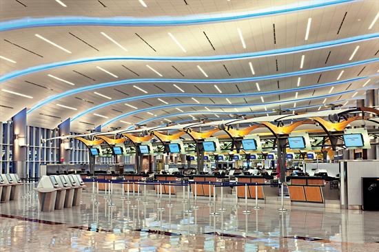
In the ticketing area, the folded wood-look metal ceiling is a strong design element used, in conjunction with the flooring and other finishes, to create a space reminiscent of a hospitality setting. Artemide’s modern Mouette light fixtures are suspended from the ceiling. It is the Gensler team’s hope that the space sets a different tone from the typical airport ordeal and sends the message that this is going to be a different experience, creating a space that people want to enter.
Terrazzo and carpet tile are the two primary flooring types of the project. Four different colors of 3/8” epoxy terrazzo, by American Terrazzo and Associated Terrazzo, were used in the main circulation area to help wayfinding and add texture. A darker grey band of the material acts as a path through the terminal, changing shape along the way and creating a different feel in each space. This band is set in a field of lighter-toned terrazzos. The material creates a classic look in the space, and its durable quality makes it an excellent fit to stand up to the high abuse that the main circulation path of an airport endures from foot traffic and wheeled luggage.
Though hard surface materials like terrazzo present challenges due to slippage, Mizell reports that this danger can be mitigated by how the flooring is finished. The finish that the Gensler team chose isn’t particularly high-gloss. In addition, long permanent grills were installed at the airport entries to help eliminate grit and moisture from the soles of travelers’ shoes.
A custom carpet tile by Tandus was specified in the security checks, departure lounges and baggage claim area. The Gensler team debated whether to use hard or soft surface flooring in the baggage claim, as that area endures quite a lot of abuse under feet and luggage, but determined, ultimately, that comfort underfoot was paramount for the travelers who would be standing and waiting for their bags. Mizell and her team referred to the tones in the custom tile as gutsy neutrals, very warm colors mixed with very cool and dark colors. “The pattern feels like rays of light across the floor, which is, of course, a nod back to flying.”
The color and pattern also helps hide abuse and stains, which are numerous in this type of setting. “In a high traffic space, a good carpet specification is critical,” says Mizell. “All the technical components have to be right so that the carpet performs.” Mizell says that performance, visual quality and long-term sustainability are her three most critical considerations in specifying flooring for a high-abuse space.
Red egg chairs by designer Fritz Hansen act as a foil to the neutral toned flooring, punctuating the space with their vibrant curves and offering travelers a more intimate space to curl up and work or read than a chair in a row might. In addition, the modern styled wingbacks are on swivels, so travelers can turn to view the planes as they arrive and depart or face the interior of the terminal for people watching. Cushioned ottomans provide a space for travelers to put their legs up and relax. In addition, T2 offers a multitude of elevated laptop workstations, along with free wireless and recharge stations.
Crossville’s Color Bloc EC tile was specified for the floors and walls of the restrooms. The restrooms exhibit an attention to detail that sets Terminal 2 apart. The Gensler team chose well-designed sinks that won’t drip on travelers’ clothes and Dyson Air Blade hand dryers, installed places for travelers to hang their bags rather than placing them on the floor, and specified flattering lighting, all to enhance the pleasure of travel.
At the start of design process, SFO hadn’t yet selected specific retailers or concessionaires, but it knew what mix it wanted ultimately. Mizell and her team communicated with the retailers and concessionaires, as well as their designers, to ensure that the entire terminal would have a cohesive design at completion.
Napa Farms Market, which carries products from San Francisco artisan food purveyors, was one of the vendors selected for Terminal 2. In conversations with Napa, Mizell referenced the light, airy quality of San Francisco’s Ferry Building as inspiration for T2. Napa ran with that concept and created a modern take on a market that integrates beautifully with the Terminal 2 design.
Another nod to San Francisco culture can be seen in the two children’s areas in Terminal 2, one for active play and one for quiet play. Both feature interactive art pieces by local artists. In the active area, hand cranks are used to pull dichroic glass butterflies (which show different colors depending on the angle of view) to the top of a glass case. The butterflies then flutter down, another allusion to flight. A local artist and science exhibit creator named Charles Sowers developed the piece, called Butterfly Wall. Cranks were placed on both the side of the case facing the children’s area and on the other side, so that the installation can be accessed simultaneously from both sides. The flooring in the active area is a cushioned rubber tile product by Dinoflex to create a safe area for play.
The quiet play area has an organic feel, achieved through the installation of Tandus’ Grid Overlay carpet tile in the color Total Eclipse and a bird mural called San Francisco Bird Encounters by another local artist, Walter Kitundu. On his website, Kitundu describes the piece: “The mural features a large golden-crowned sparrow that doubles as a musical instrument. The wing feathers are xylophone tines and are tuned to the notes of the sparrow’s song. The benches are also instruments in the shape of wings, also tuned to a scale created from the notes of the golden-crowned’s song.“
SFO is the only airport in the country with an accredited museum. In addition to the art installations for the children’s areas, T2 is home to several other works. Two large forms of white cloth and metal piping are suspended in the departure lobby. The piece in two parts called Topograph, 2011, is described by the artist, Kendall Buster, as “fragments of a kind of ephemeral landscape.” And, just past security, travelers encounter Janet Echelman’s Every Beating Second, a cloud-like form of net and twine that changes color from indigo to orange. Computer controlled airflow gently moves the piece, referencing local weather. T2 offers a cell phone audio tour through its displays.
T2 isn’t just about putting on a pretty face; it was the first LEED Gold certified airport terminal in the U.S. While flooring and material choices played a role in achieving that goal, sustainability is more visible to the traveler in the hydration stations, which encourage visitors to refill water bottles rather than buy single-use ones; paperless ticketing; composting and recycling stations; and preferential parking for hybrid vehicles. In addition, the facility has energy efficient air filtration and water treatment systems as well as low-flow bathroom fixtures.
By all accounts, the project’s initial goal of creating a pleasurable experience for travelers has been achieved. Since the renovation, Mizell says that she’s heard reports of travelers arriving earlier than necessary to spend time in the space or staying after their flight for dinner. She believes the varied backgrounds of the design team played a role in this success, a space that feels different from a regular airport: a beautiful, grand location, full of natural light and wonderful architectural forms.
HARTSFIELD-JACKSON ATLANTA INTERNATIONAL AIRPORT, TERMINAL F
Hartsfield-Jackson’s (ATL) $1.4 billion new international Terminal F, officially named the Maynard H. Jackson Jr. Terminal, is 1.2 million square feet. Design of the new five-level terminal was complex, as it included working at the busiest airport in the world (by annual enplanements), constructing a new exit off the interstate, aligning the new subterranean tunnel and train system with the system already in place, and diverting a small river. All that said, even for a designer like Gresham, Smith and Partners’ Julia Bradley Rayfield, a senior interior designer who specializes in high abuse space like airports, this was a large project with a lot of moving parts.
Rayfield explains that airport work, at its very core, is a different animal from other design work. For one thing, there is not one client but many: the airport owners (which may be any number of public entities); the airlines; the Transportation Safety Administration, which is in charge of security; for international terminals, Customs and Border Protection; and police. On top of that, you have to consider the needs of the tenants, retailers and concessionaires that will be renting space. Each of these agencies has unique needs that are paramount to the successful operation of their business. And all their desires must be accommodated.
And then there’s the public. Atlanta is a hub, a place where many people make transfers. Says Rayfield, “The big thing with a hub is that the vast majority of passengers don’t live in the city where the airport is located, so there’s no ownership. They’re just passing through. When there’s no ownership, it tends to lead to more destruction. When I plan an airport space, I put the spring break test on the design. Can the flooring, finishes and furniture withstand the hijinks of 20 spring breakers headed to Cancun? If so, then you’ve put enough thought into the durability of the design. On the flip side is the 78-year-old grandmother on the way to visit her grandkids. She takes longer to move, her eyes aren’t what they used to be. She may get confused a little more easily. For her, there’s a different set of needs. The flooring design can’t create the appearance of a step. It can’t be slippery. Wayfinding has to be intuitive because she may not be able to read signs from a distance. There are multiple levels of multiple users’ needs to serve before you even start to think about aesthetics.”
Airport planning begins ten to 15 years before construction begins. Those planning years involve a lot of projection, predicting how many annual enplanements occur, what the market will demand and what business will be like, seeing how current trends will manifest in the future. For instance, it’s likely that the row of smiling airline employees that greet travelers at ticketing—already shortening—will almost disappear, to be replaced by check-in kiosks. That sort of change impacts design significantly, so designers must see it coming years before it’s actually implemented.
As the busiest airport in the country, the stakeholders at ATL believe that it functions as a gateway to the South and, more broadly, the U.S. for international travelers. In the years just before Terminal F was built, new design-forward terminals had been added in major airports in Singapore, China and the Middle East, and the stakeholders at ATL wanted Terminal F to be at the same level design-wise.
Before Terminal F’s opening, Terminal E served as Hartsfield-Jackson’s international terminal. Terminal E had been built largely to support the 1996 Olympics. Unlike the pre-existing terminals at ATL, F essentially functions as its own self-sufficient airport, which afforded Atlanta Gateway Designers (AGD), a joint venture between Gresham, Smith and Partners and the Duckett Design Group, a unique design option. “The fact that it is a vertical self-contained airport is unique,” says Rayfield. “It allowed us to achieve something not seen in ages. When you step into ticketing, you can see aircraft activity through a wall of glass. A rare thing today. We clung to this design feature, believing that it’s pleasant for passengers to see daylight and views.”
After ticketing, Rayfield and her team sought to funnel travelers where they needed to go through a fairly intuitive process that minimized the use of signs, something especially important in a terminal frequently used by non-native speakers.
In addition, Terminal F was to solve a major problem of Terminal E, the double-checking of bags for incoming international travelers with Atlanta as their final destination. In E, travelers were forced to pass through immigration, retrieve their bags, go through customs, re-check their bags and reclaim them again at domestic baggage claim.
To achieve this intuitive wayfinding, the AGD team began, in the conceptual phases, sketching fluid, flowing flooring patterns reminiscent of game trails in rounded, gentle curves that would lead travelers through the airport. Rayfield says that her team considered the idea of motion and that everything—be it traveler, baggage or sandwich—was in motion at an airport and, from there, a gentle curve became a theme for the design.
With its long lifecycle and the creative flexibility it offers, epoxy terrazzo was the clear choice to achieve these long, meandering curves. However, when the construction documents were nearly 60% complete, the AGD team got word that the budget for Terminal F was cut by about 25%. Reducing the size of the facility wasn’t an option and functional elements like plumbing, HVAC and electrical systems couldn’t be altered very much, so a lot of the cuts had to come out of finishes.
The terrazzo, with its hefty upfront price tag, became an impossibility, so granite tile, which is used throughout the other terminals at ATL, was selected. The problem, however, became how to use the square tile to achieve the undulating trails that the design team desired without cutting the pieces, which would result in a great deal of waste—the AGD team was hoping to earn LEED Silver certification for the space.
Rayfield’s team decided to use a stair stepping pattern to achieve curves over a great distance. In total, the team specified five different colors of granite (Luna Pearl, Santa Cecilia, New Imperial Red, Sienna Gold and Baltic Blue) in two different sizes (18”x18”, which was the primary size, and 9”x18”) and two finishes (honed and polished). Rayfield says that there is only a slight difference in slip resistance between the two finishes; however, the honed, which has the greater resistance, was used in vestibule areas on stair treads.
The granite was installed with the narrowest grout joints that could be achieved, and, though tile does produce a bit of click-clacking under wheeled luggage and the like, the narrow grout lines keep it to a minimum.
Though hard surface flooring creates a greater slip and fall risk, there is really no way around using it in the most well-traveled areas of an airport that sees as much traffic as ATL does and where wheeled transportation (wheelchairs, Segways and golf carts) frequently run. Says Rayfield, “This is the harshest environment that you can install flooring products in.” Though walk off mats, which Rayfield prefers for an environment like Atlanta’s (grills are better for sand or snow), are fairly effective at removing dirt from traveler’s shoes, wheels trap grit, so as luggage is pulled from the outdoors through an airport, the grit in the tires will have an adverse affect on the floor.
Still, Rayfield knew that she wanted some soft surface flooring for its acoustic properties, comfort underfoot and the possibilities it offers in patterning and color. Because of the team’s sustainability goals, it determined to purchase its carpet from a Georgia mill. After conducting performance tests, the team decided to go with Interface products and worked with the company to create six different custom products—some cushion-back and some hard-back—for Terminal F.
Cushion-back tile was used in arrivals, where travelers sometimes have a longer walk and may have to stand and wait at passport control. Three different products were used in the arrivals area, large-scale patterns that didn’t disappear in the substantial space. The use of the different products created visual interest. Because the hard surface flooring was mostly cool tones, a palette with greater depth was selected for the carpet: blues and blacks with accents of gold and red.
Hard-back tile was specified for the departure lounges where customers are often sitting, rather than standing, meaning that not as much comfort underfoot is needed. Hard-back tile is also less likely to indent under chair and table legs.
Where soft surface abuts hard in the flooring design, Rayfield uses a sacrificial border. Because cleaning products from the hard surface flooring always slosh over onto the bordering carpet, those tiles are the first that look bad and need to be replaced. In fact, they often have half the useful life (around five years) of the carpet in the middle. The same tile is used as a divider in other areas as well.
Camouflage is Rayfield’s top criteria for flooring in high abuse spaces. Often, because of arrival and departure schedules, maintenance is unable to clean areas for long periods of time, so whether a floor cleans up well isn’t as much of an issue as how it looks when it’s not clean. Irregularity in patterning and a mix of colors play a significant role in hiding stains, as does surface texture, which is why Rayfield chose a multilevel loop product for Terminal F. After camouflage, Rayfield prioritizes durability for high-abuse space flooring. For soft surface flooring, Rayfield expects a product to last for seven to ten years, depending on its location and how well it’s maintained. While terrazzo is expected to last about 30 years, Rayfield has seen airports with good-looking terrazzo that has been in place for 40 to 50 years. Hard surface flooring, like the granite used in Terminal F, generally performs for 20 to 30 years, though areas that endure the abuse of delivery traffic will show cracking earlier. In restrooms, the grout often breaks down before the tile, so replacement is needed every ten to 15 years.
Lastly, Rayfield considers what flooring offers the greatest benefits for public health and safety. While soft surface flooring is obviously safer in reducing slip and fall accidents, issues with soiling and odor make it a poor choice in many instances.
For the back of the house, linoleum was selected over VCT for a couple of reasons: first, because linoleum does not need waxing; and second, because its sustainable profile yields LEED points. Recycled rubber was used in the back of the house as well.
Terminal F has two large, ceiling-mounted art installations, both of which are enhanced by the abounding light in the terminal, admitted through the glass walls, skylights and clerestory windows in the space. A Swarovski crystal chandelier by Donald Lipski called Rebilace hangs from the ceiling just past the security checkpoint. The conical piece, which funnels inward, reflects light across the space, patterning the floor and walls. And in the atrium, where travelers await their flights, hangs Airfield by a team of artists called Uebersee, which is made of almost 1,500 liquid crystal disks, the illumination of which is run by software that is synched to the flight schedule.
Amy Landesberg’s installation Veneers, which divides arriving from departing passengers in the connector that runs between Terminals E and F, is a 640 foot long laminated glass piece with a woodland theme in striking, saturated colors.
In the immigration area, 108 high-definition screens loop a video installation called American Tapestry by Mark and Donna Tuttle, which is meant to act as an introduction to the country. And lastly there is Light Waves: Atlanta by Christopher Janney, a visual and aural presentation of colors and environmental sounds.
Each of the art pieces was selected for its ability to act as a positive distraction for travelers who often are, for one reason or another, slightly anxious. This purpose reflects Rayfield’s goal for the entire design, which is to promote calm. “We have done our jobs,” Rayfield says, “if we haven’t added to their anxiety, if travel through the terminal is intuitive, if we have created a pleasant experience for the traveler.”
Though Rayfield and her team set out to achieve LEED Silver certification for Terminal F, they were pleasantly surprised when the project earned LEED Gold.
Copyright 2013 Floor Focus
Related Topics:Lumber Liquidators, RD Weis, Crossville, Interface