Ted Moudis Associates Designs OrbiMed's Offices: Designer Forum
By Michael Sinkew
OrbiMed is an international healthcare industry investment firm that searches across the globe for innovations to help ensure that people live healthier, longer and more productive lives. When the firm began the dialogue with Ted Moudis Associates, its offices were comprised of multiple office suites on two floors that had been haphazardly combined as their needs grew. The resulting space was functional but very fragmented and not as efficient as it could be. It also lacked appropriate facilities to support both internal and external meeting requirements.
As OrbiMed began its search for new space, it looked for an inspiring new office that would provide both a modern, progressive workplace for its team members and an elegant meeting place for clients and guests. After looking at both built-out spaces that might require minor modifications and fully demolished spaces, OrbiMed selected the
demolished 54th floor of 601 Lexington Avenue in midtown Manhattan. The position of the building and the high floor create a panoramic 360? city view that includes not only all the landmarks of midtown but also Central Park, Lower Manhattan, both East and Hudson River views and the skylines of Long Island City, downtown Brooklyn and Jersey City.
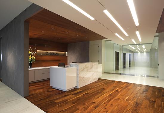
During the programming process, it became apparent that like any truly global company, the diverse nature of the OrbiMed staff would become a driving force in the design of their new space. The resulting design is a decidedly contemporary, slightly European aesthetic with a transparency and ease of navigation that supports its highly collaborative work styles. Early in the design process, OrbiMed decided to dedicate the Central Park views to their guests. This decision dictated the placement of the large, front-facing reception and conferencing requirement along the north side of the floor. The elevators are located too far from the building exterior to allow the view to play a part in the initial experience as one enters the floor, but the introduction of a simple yet strong ceiling element captures the eye and draws one into the reception area and beyond. Setting this element on a slight angle focuses the attention in the desired direction, while adding a degree of interest to the simple yet elegant elevator lobby. The flooring patterns follow this same angle, reinforcing the visual draw into the reception area.
The conferencing requirements included small, medium and large formal conference rooms, as well as a less formal lounge meeting room. Support functions for this area included an executive pantry, a guest toilet room and a telephone room. The design team grouped these support elements with the reception desk and three small conference rooms to create an enclosed volume, sheathed in textured paint, that separates the conference center from the general office space. The elevator lobby ceiling element cuts through this volume at the reception desk and culminates in a contemporary chandelier of lit bronze fins over the guest seating area. Elements of this light feature are mimicked in the handcrafted cocktail table that anchors the seating area.
Further accenting the guest seating is a custom, hand-knotted viscose area rug by Odegard. The construction of this rug allows it to “react” to light level changes, allowing the color to subtly change throughout the day. The amount of daylight and exposure to views is increased in the seating area by the fact that the flanking conference room and lounge are enclosed in floor to ceiling glass. A level of visual privacy is provided in the conference room by motorized sheer drapes, and the lounge glass is also textured. The dynamic angle of the ceiling element is carried through in the shape of the conference room, as well as the flooring, creating a forced perspective that culminates at the entrance to the main boardroom. The stone floor even continues on that same angle into the boardroom itself, providing delineation between meeting and service areas within the room.
To further emphasize the special function that the support volume serves, the design team created a wooden interior skin that wraps the interior spaces of the volume in a warm and welcoming envelope. At the reception desk the flooring changes to hardwood, which wraps up the walls and becomes the backdrop to the desk and the doors to the guest closets, and is capped with wooden acoustical tiles on the ceiling. In the adjacent executive pantry, a wood-look textured porcelain plank from Stone Source, called Stalatitti Gold, is used on the floor to continue the theme in a more maintenance-friendly way. The backsplash is a veneer laminated to clear glass, allowing the wood theme to continue in a wet area.
In the telephone and conference rooms, in order to provide a less acoustically active space, we switched the wood flooring to a broadloom carpet, Agave from Milliken’s Constantine Collection. This mimicked the wood floor in color, with the striation picking up the linear quality of the wood grain on the walls and ceiling. As designers, we can create amazing looking spaces, but, whether it is an office or a restaurant, if your end-users cannot conduct a constructive conversation in the space, it cannot be considered a successful design. Our responsibility as designers is to fully understand the performance specifications required for each and every space we create and only put forth design ideas that will support those specifications.
In the general office space, we installed clear glass partitions, allowing the entire staff to experience and appreciate the dramatic views. The design in the general office space further emphasized the minimalist European aesthetic. Extra wide aisles between the workstations and private offices add to the open feel and support the ease of mobility throughout the office. The workstations are comprised of low panels clad in a white laminate with frosted glass “stack-on” panels to provide seated height visual privacy. This same simple approach to the furniture and finishes is repeated in the private offices, with the only wood being the shell of the guest chair. The introduction of glass fins along the perimeter of the floor, above the convectors; expands the view for each office beyond the demising walls. To play off of this language of transparency, the carpet is the same throughout, visually tying the offices and open plan together. OrbiMed wanted the flexibility of carpet tiles but desired the seamless aesthetic of a broadloom, so the design team selected a subtle striated tile that, when laid in an ashlar pattern, provided the appropriate look. Working very closely with J+J/Invision, the design team developed a custom coloration of J+J’s Mosaic modular carpet line that became the perfect complement to the open office design.
By placing the staff pantry/café into the core on the opposite side of the elevator lobby from the reception area, the design team was able to carry the angled ceiling element and angled stone floor into this area, tying together the front and back office spaces. A similar chandelier of lighted bronze fins highlights the staff seating area, which is further accentuated by a rich midnight blue textured wall covering, creating a central, warm and welcoming area for the staff to congregate.
The resulting design provides OrbiMed with a timeless, bright, open work environment comprised of all the elements required for them to perform at maximum efficiency. Physical spaces flow from one to the next in an effortless manner with architectural finishes transitioning in such a way that the office is a holistic experience, avoiding a sense of front office versus back office.
Copyright 2014 Floor Focus