2012 Color Trends - February 2012
By Ruth McRae
I knew there had been a change when I fought for pink. Not your bold acidic or 80s pink. A soft almost flesh tone. Light. Clean. I did not win, of course. I was participating in a group of color experts, selecting 12 colors to represent color direction for products in the commercial market. Just twelve.
So how could we include this oddball color? But the passion of my position made me think. What did pink represent? The attributes of this particular hue are representative of the overall palette.
First, a description: this shell color is closer to white than the traditional pink (or the hot pink that was Pantone’s 2011 Color of the Year). It could function well in a commercial interior; for example, it would add humor and interest to hard-edged contemporary furniture.
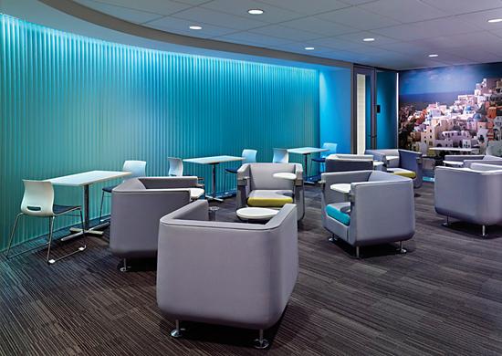
We certainly won’t be using pink in the design of floorcovering. In contract flooring we are still going to use primarily neutrals, due to the function of the floor in a space. It is the envelope or surround, anchoring and balancing the interior. But we are going to add interest with small amounts of very fresh color in counterpoint to the neutrals. Colors create emotion and atmosphere. There is a craving for light, fresh color now. The source of this is a need for pleasure in our environment, a desire to appreciate the present moment. It also may be a reflection of a cautious optimism. Heavy colors just don’t seem right currently, even though in the winter months we typically crave warm, rich colors to balance the coolness of the season. Right now, we intuitively feel a need for freshness and clarity.
This trend can be seen in other arenas, such as a desire for open spaces, and a preference for light colored woods. All of the fresh colors in the palette—think butter yellow, pale sage green, soft greyed lavender—must work with neutrals. Clear colors, whether soft or bright, are balanced in combination with crisp charcoal. Chocolate brown is another great mixer with these hues.
In addition to these re-invented pastels, there are other specific colors that are directional:
• A rich mid-value green is coming to the contract palette from fashion. It is not as earthy or yellow-influenced as previous trend greens. Think of the color of grass after a storm.
• Classic tomato/mid-century red continues to work as both an anchor and as a familiar neutral. • Warm colors from butterscotch orange to a rich luggage tan add character to our palette.
• A fresh, light, creamy neutral functions as a great foil.
• Blue enters the world of fashion and interiors after a long hiatus. Many tones feel directional, from cool navy to celestial; all are bold.
• Neutrals may be both warm and cool, and always very clean. A light creamy neutral functions as a great background. Grey continues to be important. A layered palette of greys has a sophisticated, urban appeal. As a neutral that is both warm and cool, a purple-influenced taupe also feels very current.
Layering of colors is key, especially neutrals. Color effects are complex and modulated. Color schemes may include many analogous colors (colors in the same segment of the color wheel, such as jade/turquoise/blue) to create an overall effect. Ombre effects also feel current.
TEXTURES AND FINISHES
Metallic finishes have evolved. White nickel and softened, dulled golds create a new warm range of metallics. Even within materials, there is a strong influence of warm and cool metallic tones in combination. Metallic effects influence many of the most interesting neutrals. For example, light warm tans and soft golds are often enhanced with the addition of luster, whether in fiber or metallic finishes. Pewter greys may also be augmented with glints of shine. A very dark, cool, subtly lustrous grey is a softer replacement for black.
Texture is important, as it has been for many years. But instead of one overall feel to the texture, as in “this year textures are chunky” or “this year textures are more refined,” we see a complex blend of textures, each with different characteristics: level of texture, luster and surface.
THE MERGING OF TECHNOLOGY AND SUSTAINABILITY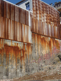 Technology, as always, is a key influence, yet now it is converging with sustainability to produce complex new ideas and materials. One exciting aspect of this trend is the repurposing of materials in surprising ways.
The effect of time on materials continues to be a driver of color and finishes—old and new, crisp and soft combine to create interesting environments. Colors need to appeal to more than one sense, be multi-sensual. Materials may be distressed, aged, salvaged and re-used, linear, brushed, scraped.
FARMERS’ MARKET INFLUENCE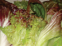 \As a counterpoint to the trend for light, fresh hues, the direction of colors for materials includes harmonious cross-color mixtures. The trend for locally sourced and crafted foods is congruent with this color trend. Think of the type of color in a vegetable garden. Visualize the complexity of color in heirloom tomatoes, not just the red ones, such as the Cherokee Purple, a species that combines soft red, green and a brown/purple hue.
The Slow Food and Slow Design movements* continue to be an inspiration. They support the value of the iterative process and the wisdom of collaboration. Considering the challenge of our times, this emphasis on process is a corollary to a personal attitude of patience and, more germane to our discussion, a need for spaces that have the longevity of classic and flexible design. Mixtures of color that do not go out of style, yet feel fresh. Although for years we have said that color is evolutionary, not revolutionary, the feeling of newness in color combinations is key.
And this feeling of newness is what brings us back to my craving for pink. We need a color like this in our palette, something surprising and fresh that wakes us up, simultaneously bringing us to the present moment and making us aware of new and unexpected potential.
*The Slow Movement “emphasizes slowness in the creation and consumption of products as a corrective to the frenetic pace of 21st-century life.” This began in the Slow Food Movement, as a desire to use local ingredients harvested and put together in a socially and environmentally responsible way. From The Slow Life Picks Up Speed, NYTimes 1/31/2008
Color in residential design
By Emily Morrow
Boring beige is out this season, and 2012’s neutrals are anything but blah. This year’s array of colors is lively. Dior-inspired grey, rain blue, persimmon orange and essential neutral colors provide inspiring design options for the home. Consumers are hungry for these fresh tones, and they need the energy these colors can bring to their lives. I have distilled the year’s palette down to the ten strongest interior design colors trends.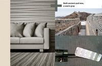 CLOUD GREY: The absolute perfect grey is comparable to the color of the clouds just before it rains. It’s warmer than it is cool, never boring, and offers an “architectural” element allowing for definition of the space. Sometimes grey requires some seasoning in order to satisfy the human appetite for color. Sunshine yellow is one great color addition that can keep a grey interior lively.
Restoration Hardware’s name has become synonymous with an industrial or reclaimed design trend. In recent international markets and shows, many companies have devoted entire collections to similar looks with a reclaimed visual—ranging from grey to taupe wood finishes, aged zinc and galvanized metals—and paired them with woven Belgian linens of the same color family. Grey has also made inroads into many of the newer collections of hard surfaces and is easily found within the softer side of flooring as well. Suffice it to say, grey will stay.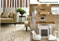 SAFARI TAUPE: Classic taupe is the stepping-stone between the grey trend and its predecessor, the chocolate brown trend—it’s best described as a greyish brown or a brownish grey. Taupe can be found in nail polish, couture, ready to wear, active wear, and accessories, and is well represented in the home furnishing markets. When the taupe trend is translated into furniture, it often manifests in the very popular reclaimed look.
IVORY COAST: Today we are seeing two distinctly different influences on our neutrals. The first influence is a warm camel color, while the other is cool flax. Whites and off whites continue to expand and grow in lockstep with the brightening of the vivid colorations. White performs as the ideal backdrop for a showstopper piece of art to really stand out. White is elegant; it is high tech; it can be as casual as a white t-shirt or as formal as a tailored tuxedo shirt.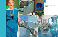 PLUME: Teal is being used today in textiles for both fashion and interiors. Teal and grey are among the most prevalent color options available today and they were key trends in the early 1980s as well, when we also had discouraging unemployment rates, an energy crisis and a weak economy. The richness and flexibility of teal, which pairs beautifully with many colors, allows one to not only be fashionable but also practical.
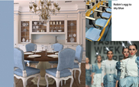 AQUAMARINE: Known for its profound soothing and calming effects, aqua has evolved beautifully from its early days, enjoying long-standing partnerships with chocolate, lush greens, creamy whites and silvery greys. Designers use color not only for the human response to color but also for the design statement it makes. For homeowners who are drawn to living near the water, aquamarine infused interiors are very coastal, tranquil, and certainly aqueous in feeling. This color goes with almost everything.
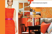 PERSIMMON ORANGE: Running the gamut between a juicy tangerine and a spice-colored persimmon, this tangy color adds energy to any interior. With implications of international design influence, orange is often used as the signature color for a key piece of furniture within several stunning all-white showrooms and show houses.
SHUTTER BLACK: No interior or wardrobe is complete without a touch of black. Black creates a much-needed sense of depth and gravity. Black is basic and easy while being elegant and timeless. No other color can do so many things; black trumps all the others with its style and versatility. 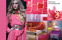 POWERHOUSE PINK: The warmth and passion of pink has long surpassed its expected shelf life. During NeoCon in 2004, Maharam included pink in the fabric line for the very first time, and since then pink has grown from symbolizing baby girls and ballerinas into a color that is couture-worthy.
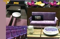 MEDITATION PURPLE: Renowned for its boldly colored textiles, the fashion house Missoni treated attendees at the 2010 Milan Furniture Fair to the most expressive use of color: silver, purple and pink. Their space was divided by draping purple and pink strands of yarn, with color pops from hanging drum shapes in vivid purple. The color purple of today is regal when blue-based, and mysterious when red-based. Both are stunning and are over-the-top when paired together.
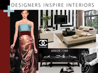 CONVERGING WORLDS: Over twenty-five years ago, fashion designers and interior designers, led by Ralph Lauren, merged inspiration from two different worlds into one, creating innovations and inspiration that wouldn’t have been otherwise possible, paving the way for many others to follow. More recently, interior designers have removed the boundaries between residential and commercial interior design. “Nothing endures but change,” according to Heraclitus. The world of color, style and design has definitely changed from 2011 and is a brighter, happier place than before.
Copyright 2012 Floor Focus