Revestir 2016: Show Report - Apr 2016
By Ruth Simon McRae
The 14th edition of Expo Revestir was held in São Paulo, Brazil in early March, attended by 63,000 visitors, up from 61,000 in 2015, including a record number of international attendees. A total of 235 exhibitors showed their new products, primarily wall and floor tiles, with a bit of sanitary ware thrown in.
The expo also sponsored the International Forum of Architecture and Construction, with five days of lectures and programming, which attracted more than 3,000 people and featured presentations from prominent experts, such as architects Ron Arad from Israel and Stephen Barrett from England.
São Paulo, Brazil’s largest city with a population of 15.2 million people, is known for its diversity and its intense traffic. Brazil ranks second globally in both production and consumption of ceramic tile. The three largest manufacturers in Brazil are Eliane, Portobello and Portinari. Of these three, only Eliane has warehousing and a distribution center in the U.S. American consumers can purchase products from the warehouse as needed, or from Eliane’s full portfolio, by container, from Brazil.
Optimistic about increasing their exports to the U.S. due to the lower value of the Brazilian dollar and the strengthening of the U.S. economy, some Brazilian tile manufacturers have set aggressive export goals for themselves. As a step in that direction, many Brazilian companies will be showing at Coverings this year for the first time.
First Impressions: Revestir 2016 had a dramatic, sophisticated look and feel. Some large displays featured dimensional architectural elements with pulsating lighting. Others had dynamic activities, like the huge permeable maze at Docol. The feeling of theater was increased by the packed, constantly moving crowds.
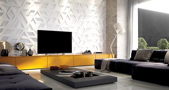
From a styling perspective, much of the visual impact and product excitement at Revestir came from the innovative dimensional wall tiles, used for wall cladding and free-standing structural features. Castelatto was just one of many manufacturers showing exquisite products for vertical surfaces, such as its Infinity line.
Wall tile is a smaller part of the Brazilian tile industry and market, making up just 23% of total production. Flooring accounts for 74%, with ceramic tile for facades trailing at 3%. On the facade, Eliane featured its CleanTec self-cleaning technology. This technology is becoming accepted in interiors as well as outside on buildings, particularly in healthcare environments.
Color Directions: Color palettes consisted of primarily subtle neutral tones at this year’s expo. As expressed at Portobello, “All colors are more neutral this year. People are more conscientious. Consumers are not buying trendy items; they want things that will last. And when all colors are neutral, it is easy to mix styles.”
Color lines in ceramic tile were typically short, with as few as three or four colors. Many companies featured products with a palette of light warm neutrals and some greys, with one aged-metal color in the rust/brown family. An excellent example was the Marmi range from Portobello, a marble design with interesting veining in six sophisticated and pretty tones.
There were two interesting exceptions to the natural palette. One was the blue color story at Eliane’s Décortiles division. A rich smoky blue color was the inspiration for its new collection and was featured prominently on the floor with its S.O.H.O. tile installation. The other, bolder exception was seen at ColorMix, a company known for stylish looks and interesting tiny mosaics. Focused on the Brazilian consumer, Estamparia is a collection of many individual tiny detailed patterns, colored in an intense palette. After the sea of tasteful neutrals, it was refreshing and fun. Estamparia will most often be used on walls, although it could be installed on the floor in an accent area.
Patterns: Textural looks dominated the show, a change from more explicitly patterned designs of the recent past. The trend of Spanish and Moroccan type patterned tiles seems to have passed. When there was a specific pattern, it tended to be tonal and visually rising from and fading into the field. This look was in evidence in a subtly patterned coordinate, the Shotcrete series from Pavigres, a glazed porcelain tile for both wall and floor. The basic product, Shotcrete, has a variegated, stone-like texture, and Shotcrete Décor has an overprinted damask-type pattern that appears intermittently, either due to a distressed design or to color values that merge with the shifting base colors.
Some of the traditional wood and aged metal looks also had a single coordinate design with the same base texture, such as Portinari’s Rusty and Rusty Décor, a geometric design with small dimensional diamond shapes.
A few bolder 1970s patterns were in welcome contrast to all this subtlety. With a slightly vintage feel, Portobello showed the aptly named Rio, a design that echoes the traditional walkways of that city. This low contrast yet graphic design was featured on the booth exterior, in coordination with an interesting texture, Portland Stone, a hybrid design described as “stone-like with a concrete vibe.”
Also inspired by the 1960s and 70s, ColorMix’s Nineteenth Century Series had some simple and dramatic graphic patterns on a polished porcelain surface, offering the designer lovely, fresh design tools for creating a wall or floor.
Textures: Floor tiles are often available in three textures: satin, which is somewhat matte and looks more textural due to the cleverness of the print design; polished; and exterior, which is rough. Some manufacturers offer many styles in at least both a relatively smooth interior and a rougher—for slip resistance—exterior surface, in order to offer an opportunity to run seamless flooring between the interior and exterior spaces.
Certainly this is important for Brazil in terms of the export market. Brazilian consumers tend to prefer a highly polished finish, equating the look with cleanliness and luxury. Yet North American consumers prefer a more matte finish and an overall more minimal approach.
Formats: Eliane is one firm that develops some special products specifically for the U.S. market in 12”x24” and 18” square standard sizes—these size tiles are not sold in Brazil. The U.S. market has only recently begun to accept the larger format 36” squares that are so popular in Brazil and other major tile markets.
Eliane has big expectations for its new Munari tile, a “clean cement” visual in six rich neutrals. Developed for the U.S. in typical American sizes, Munari is now also being introduced in the 34” and 36” squares and 24”x48” rectangles needed for the Brazilian market, and is offered in satin finish for walls, facades and floors, as well as a rough textured surface for exterior flooring.
Even within Brazil there are size challenges. The trend toward bigger tiles is compatible with commercial and high-end residential projects. Yet living spaces in South America are typically small, and the higher volume middle to lower end of the residential market needs smaller formats.
Wood: As in the U.S., wood looks are still among the best sellers in Brazil. Wood patterns at the expo tended to be refined and realistic, with fewer multicolored distressed looks. The one exception to this was a painted wood effect that looked as if it has been painted in blocks, with different applications of paint applied over a series of years. A great example of this dramatic and very modern look was seen at Itagres in Historic Natural HD, a distressed wood look with bold painted areas.
When more realistic, wood tones tended to go to lighter values, such as Guardino from Portinari. This wood tone is a lighter and more modern oak, with an almost handcrafted feel, a change from the earlier darker-toned oak looks. Guardino has a tailored coordinate geometric style named, naturally, Guardino Décor.
Décortiles also featured an interesting distressed wood, Blackwood, designed from actual wood that designers distressed by lighting wooden boards and letting them smolder, in order to create an inkjet image of the charred remains.
Marble: Clean marble looks continue to be popular with Brazilian consumers, particularly in large formats. In addition to the standard square meter size, some are being offered in jumbo sizes, such as 1m x 2m or larger. Fiandre, an Italian company, featured Maximum Marmi Calacatta Statuario, a marble look available in very large sizes, 3m square and 1.5m square. The product is made up of 30 individual marble designs, yet with such large and simple veining that some lines looked as if they continued from one tile to the next, creating the appearance of an even larger monolithic surface.
Corten: The look of corten steel and oxidized metals was seen all over the expo. Many were offered in short lines of three colors, a light grey or white, mid-tone to dark warm grey and a rust color. At Portinari, this style is actually called Rusty. Many of the booths featured this corten product on their exterior walls. This design makes sense in a matte finish, yet due to the extreme preference for shiny finishes in Brazil, a few styles were produced with a high luster finish that seemed at odds with the look.
Brick and stone: Brick type products were everywhere. As one attendee put it, “The brick trend came from nowhere and it has exploded!” Both rough looking stone-like tiles and brick looks were featured throughout the show.
Some tiles were actual bricks, and there are potential problems here with staining, although manufacturers such as Lepri claimed that brick and ceramic have equal resistance to heat, and when it comes to freezing, brick outperforms ceramic tile. Mostly, though, ceramic or porcelain brick looks were shown.
Textures in brick looks ranged from rough-hewn to refined. Often, a brick appeared to have a rough texture but was actually fairly smooth. These bricks had interesting color effects, with some showing a contrasting color softly bleeding in around the edge of the tile. One visitor suggested that this look is an imitation of the effect created from the old beehive kilns, where more oxidation on the edges and uneven heat thoughout the kiln creates mottled or edge color-change effects. Also seen were large rough floor tiles in terracotta tones with crumbly edges and a rustic finish, harkening back to a ’60s and ’70s aesthetic. These tiles were displayed installed on floors or stacked on walls without grout.
Lepri and Portobello showed interesting examples of these looks, although almost all manufacturers showed at least one brick-look tile. And Palimanan featured Travertine Anticato, a collection of interesting rugged floor tiles with irregular brick-like edges.
ColorMix’s Linha Landscape collection featured materials sourced worldwide, including brick and slate types, pebbles and other time-worn looking materials in a longish brick format. In some cases, surfaces on the wall tiles were so rough that they seemed impractical. How could you possibly clean them?
Hybrid materials: These designs could be called abstract looks, except that they reference specific materials. Merged material looks such as stone and concrete, spackled surfaces, even concrete plus wood, created interesting textural effects. It was refreshing for the ceramic tiles not to be such literal imitations of other material and instead function just as a beautiful textural surface. One fine example was Ceusa’s Ferrugem, a concrete visual that seemed to be stained around the edges, appearing as if distressed due to moisture and age.
A pristine look is no longer desired. Images including defects are now routinely included in designs, even in some of the marble looks. Portinari’s Sonata has a classic marble look, yet with a slightly duller surface, showing intrinsic staining.
Details: Many companies featured accessory pieces as line extensions, such as Portobello’s Geppeto group of products. These are actually made of wood, yet they coordinate well with Portobello’s Ecolution and Ecodiversa, both collections of ceramic wood looks. It was interesting to see that the Brazilian companies included different types of materials in their lines where needed to complement the overall portfolio. There also seemed to be a merging of manufactured and sourced materials in many displays. For example, some of these wood-based accessory products at Portobello were also seen at Decopanel, in its hugely innovative line of mostly wall products.
Other exhibitors: A small number other flooring materials beyond ceramics and stone were on display at Expo Revestir, with companies featuring LVT planks, laminate flooring, even carpet tile. Still, their materials had a similar look to some of the ceramic products. For example, Tarkett Brazil featured Ambienta, LVT wood-look planks that can be installed with tiny vinyl “grout line” accessories in a contrasting color. Expanding on the vintage 1970s theme, Tarkett’s Paviflex—incidentally the oldest flooring style from Fademark, a company purchased in 2008—offers a bold and graphic retro feel.
Copyright 2016 Floor Focus