Designer Forum - July 2011
By Mark Herman
Flooring plays an important role in achieving a safe and educational atmosphere for visually impaired children at the Delta Gamma Center for Children with Visual Impairments, a 60 year old nonprofit located just outside St. Louis, Missouri. In designing the Delta Gamma Center, design firm MArK sought not only to create a warm and functional space for the visually impaired children who would use the facility, but also to provide opportunities for the kids to use their senses. The flooring serves as both a wayfinding device and as a plane upon which an experiential palette of textures, Braille and decorative elements provide occasions for the children to learn and explore.
MArK recognized how important this project would be not only for the kids and their families but also for the center’s therapists, educators and administrators. Our typical process begins with an inclusive, weeklong interview session that also includes extensive documentation of the client’s existing facility.
We interviewed all of the staff to learn more about their hopes and needs, and also to better understand how we could create a facility that would truly address their special requirements. Through this process, we gained a clear understanding of not only what works and doesn’t work, but also an intimate knowledge of everyone’s roles and responsibilities. The center’s staff is dedicated to providing the children and their parents with the tools they will need to be successful. Their detailed knowledge of the special needs of the visually impaired is equal to their passion and dedication. Through the interview process, we also were provided with an indepth understanding of the vast range of visual impairments, as well as other challenges these children can face. It became clear that we would need to include all of the aspects of universal design into the center’s new facility. The re-design of the building started with the incorporation of the center’s logo in stained glass on the western side. This can be seen from the prominent redevelopment of Hanley Station.
Based upon our interview findings, our design concept for the center was to create an environment that would not only provide functional learning spaces for the center’s staff and their families, but would also provide a series of sensorial opportunities/destinations that are meant to excite and also act as primary wayfinding elements. The team felt it was important to keep the classrooms simple, so that they could provide the flexibility for the center to evolve as educational theory and therapy styles progress.
Several finish concepts evolved from these initial interviews and continued to evolve as the project developed. First and foremost, based on our research, we learned that patterns tend to be hard for the visually impaired to navigate—the greater the contrast the better, and the fewer the patterns the better. Thus, floors and walls were kept simple, and we relied on textures to bring visual interest.
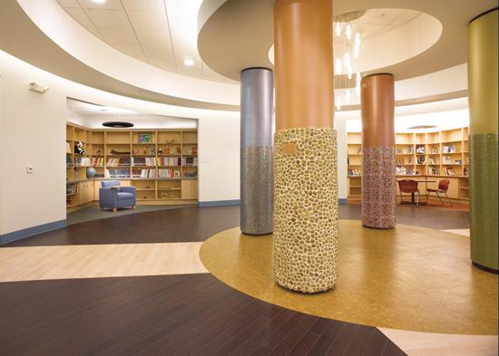
It was clear that the horizontal plane, the floor, would play a major role in the design of the new environment. Light maple and espresso vinyl plank flooring from Amtico was used for all of the circulation area; the dark toned espresso was chosen as a border along the maple colored walkway to create a high contrast path, distinguishing the edges and transitions to help with the use of canes and to facilitate those children that have some percentage of sight. This design maintains a level of neutrality with a minimum of distractions.
We also introduced a system of deep contrasting color at each classroom entrance, using additional Amtico products. Not only did we change the color and texture at the floor, but we also used the same color system on the vertical entry plane as well. The majority of walls are warm white with contrasting mocha stained doors and frames to provide maximum contrast.
Shaw carpet tile was used throughout the facility because of its monochromatic characteristics and the range of colors in which it is offered. We used shades of light gray and brown at the building’s entries in a pattern similar to how we employed the Amtico wood look vinyl. Contrasting color tiles were used at the classroom entries and within the different quadrants of the central rotunda.
In the classrooms, we stayed neutral, utilizing the brown and gray tile with Mannington VCT accents in the craft areas and pantries. Carpet tile was selected over broadloom for its durability as well as its usefulness, and because it enables the center to change tile out as necessary.
DESIGN FOR ALL THE SENSES
In addition, we incorporated several types of “touch” elements to facilitate physical wayfinding. Iconic panels were introduced at all major intersections. Each panel has a unique three-dimensional pattern and helps to create a sense of destination for the children. Similarly, adjacent to each classroom entry we installed decorative wall appliqués that are dimensionally representative of the different activities the center provides. A local artisan was commissioned to install the trailing rails, which incorporate a series of inspirational messages translated in large die cut stainless steel Braille panels.
The center’s director wanted to create a central space that would not only accommodate family activities but also act as a hub for the center’s vast collection of learning materials. We created a centralized interior rotunda, into which the four wings open, that incorporates the center’s goal of connecting the families, children and community. Each of the areas utilizes a similar system of contrasting floor color/texture and is anchored by a matching colored column accented with a unique tile texture/pattern.
Lighting was another of the key elements to creating a successful center. We used a number of different types of indirect fluorescent lighting, including continuous linear fluorescent fixtures in the circulation paths and classrooms with soffits and accent fixtures at entrances and main intersections to reinforce the wayfinding. The majority of the lighting in the rotunda and adjacent libraries is indirect soffit mounted fluorescent with the highlight being the central chandelier, which can be seen from all main circulation intersections and the center’s main entrance. In the large multi-purpose room, we used recessed indirect fixtures with switching systems to allow for multiple light levels. The fixtures chosen for this project were specifically chosen to provide even light levels. Since glare can be a difficulty for those with visual impairments, high quality ballasts were also specified to reduce the risk of ballast feedback.
The facility also features a sheltered exterior learning space that is one of a kind, made using the bones of the former loading dock. The outdoor space is accessible from the classrooms via oversized glass garage doors. The shape of the building isolates the space from the sounds of vehicular traffic.
The exterior space continues many of the design concepts developed inside the center. The concrete entry points at the outdoor wall of each classroom are stamped with a different color/pattern, and the walls at the entries are color coded to match the rooms’ interior entries. There are two exterior pathways. One provides a variety of everyday obstacles for people with visual impairments, including train tracks, curbs, slopes, a parking meter and a wooden garden bridge, all in a meandering path. The center also incorporated a variety of play stops on this path, including a musical fence, a sensory wall, a small recirculating bubbling fountain and chimes. The second simpler rectangular path contains the alphabet in inset stainless steel Braille sidewalk panels.
Besides providing a unique universally designed facility, finish and material selections were made based upon the needs of the children, as well as the center’s need to have maintainable and cleanable surfaces. The lighting fixtures were specified using an edited number of different lamps to minimize inventory requirements. Furniture selections were made with the same guidelines for flexibility, functionality and maintainability. Stack chairs and lounge pieces incorporated the same color palette and match their corresponding areas. Desk chairs and conference chairs are interchangeable, so they can be used together for larger gatherings.
The space has proven to be very successful. The center’s children enjoy the variety of non-visual elements incorporated throughout, and the families also enjoy the color and texture, as well as the functionality of the libraries and learning spaces. The simplicity of circulation and the central location of the rotunda make the center easy to navigate and friendly for children with visual impairments.
Copyright 2011 Floor Focus
Related Topics:Mannington Mills, Shaw Floors, Shaw Industries Group, Inc.