Color Forecast 2020: The new decade brings a reflective take on familiar scenes - Feb 2020
The new decade brings a reflective take on familiar schemes.
By Ginger Gilbert
For all the eyesight puns associated with 2020, it’s ironic that, color-wise, most people don’t have a clear vision of what’s ahead, and the first year of the decade seems to evoke a much stronger sense of reflection than aspiration. It’s this thoughtful contemplation, however, that will hopefully allow us to recall the lessons we’ve learned from the past and apply them to a new dawn of self and social wellness.
Instead of looking to others to address the big issues that have taken hold, 2020 promises to bring out the “fixer” in all of us. As we look back, we realize that if we simply focus on our individual environment versus uncontrollable issues outside of our boundaries, we can make positive, impactful and lasting changes to our immediate surroundings and those who share that space. It’s the idea of community and having a strong personal grasp of the concept that will bring all of us the clarity that we desire to repair where needed and confidently set a new course for social engagement and advancement.
OM
Some may say that there’s no better way to right ourselves than to examine the balance of our individual chakra points. For 2020, the chakra color that rises to the forefront is that of the third eye. Representing intuition and conceptual awareness, indigo plays an incredibly important role in grounding our internal environments.
Instead of relying on basic black as the classic go-to color, blackened indigo emerges as a more energetic and enlightened option. This chameleon color allows us to insert a relaxed sophistication to stark, conservative interiors and functions as a stable canvas for more spirited and engaged spaces. It is a color that aligns with any warm or cool palette to provide a sense of harmony and familiarity that awakens our higher senses.
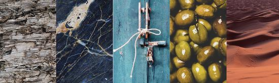
THE OLIVE BRANCH
Tired from years of local and global contention, the need for unity and reconciliation can be subconsciously seen in the use of dark olive green. Derived from the symbolic olive branch, this color has depth beyond its surface. It’s not simply the hue on its own but rather the medium in which this color presents itself that can cast it as a neutral.
Not to be confused with olive drab, this lush, opulent color operates best in the form of luster or texture. Used as a flat infusion, it can often work against a palette, but explored through a mica or mohair expression, it can be alluring.
MIDDLE GROUND
Contrary to the verb form of the word mushroom, this color didn’t take off as much as one might expect. The interiors world has been toying with this color for almost five years now, but 2020 proves that its time has come. We’ve finally realized that we need to take a slight step away from grey but are still cautious about returning to the bland, beige world that we worked so hard to escape.
This is where mushroom hits the mark. Leading with a warm base, mushroom’s subtle slant to grey makes it the perfect neutral that will cast to either shade and easily work across the spectrum. Its creamy warmth evokes a natural light that centers us and delivers a stable, soothing platform to build upon.
This color doesn’t discriminate. So, whether your space is old or new, corporate or hospitality, mushroom is the middle ground that embraces any space. Isn’t it finally time to embrace it back?
WINDS OF CHANGE
Don’t be fooled by its charming warmth-sirocco is a tumultuous color that swirls somewhere between orange, red, pink and brown. This deeper version of blush is a more versatile addition to a palette of natural accents, as it changes direction with each step in value. Because of its versatility, sirocco is a color that morphs to represent its immediate environment and envelops you in a state of heightened accord.
Not only are we drawn to this color because of its earthen connection to nature, we also have a comfortable association with its ability to complement a diverse mix of skin tones. Looking good in a space is simply an added bonus to feeling good in a space. With sirocco, wellness whirls all around.
DON’T BE BLUE
As nature continues to influence and direct our interior built environment, we no longer feel the pressure to add the obligatory true green or true blue to our spaces. Instead, we’ve migrated to a beautiful amalgamation of the two. Turkish blue is an aged mix of blue and green that evokes an old world feel that supports quiet reflection.
Though often utilized in its brightest form, a modern, dusty version will peacefully invade virtually all market segments and disciplines. We no longer have to choose sides. We can blissfully linger between two of nature’s most prominent colors and feel confident that we’ve made a healthy and lasting commitment.
Overall, 2020 will embrace many more amazing colors; however, it’s predicted that we’ll see many of them take a turn in tone. Look for purple to move to aubergine, orange to russet, and red to brick. This year is all about understanding that our world is not black or white but, instead, a wide variety of shades and values. These values will deliver a nod to familiarity and connection and will lead us to healing environments for all.
Anderson Tuftex: 2020 Color Outlook
By Lisa Lux
As we ring in a new decade, we’re reminded of trends gone by, and we look forward to what’s to come in the next decade. Against a backdrop of the unpredictable, consumers seek respite in their experiences, both within and outside of the home.
For 2020, the Anderson Tuftex design team was inspired by various world designs and cultural exploration, gathering artifacts along the way. Focusing on the wonders of the world, both natural and manmade, we garnered a rich source of inspiration; we opened our eyes to new influences and found a deep appreciation of people and cultures in other parts of the world. Though we found that there were differences in heritage and history, we also found that there were many commonalities. We identified three major themes-calming neutrals, warmer shades, drama-that defined our color and pattern design for 2020 collections. We took a bit of the beauty we found along the way and instilled our products with inspired design.
The Terra collection was inspired by the warm colorscapes and earthy textures of Mexico, from natural woods, fibers and clay to breathtaking patterns inspired by thousands of migrating butterflies. The designs sit alongside artifacts-artisan pottery, perfectly imperfect straw art and brass plates-that lend casual character and bring the narrative to life. The result is a collection defined by inspired neutrals; raw, earthy tones; and natural, sun-baked hues.
Earth tones-such as Desert Beach, Broken Arrow and Fallen Timber in our products Ario and Diego-exemplify this top 2020 color trend towards warm shades. Olive-tinted grey-greens are a true nature-inspired neutral that will work with a range of color combinations. This moody hue brings quiet elegance into the home. Transitioning away from the cool grey tones of the past few years, sun-baked tints-such as Cream Soda, Coastal Home, Cocoa Sand and Parchment-continue to evolve as the appetite for calming neutrals gains momentum.
Our Kindred collection was influenced by the footsteps of thousands to the top of Machu Picchu, and the unforgettable richness that is sown in the foothills beyond. Legacies woven into a shared narrative inspired the abundant visual texture in this collection.
History and heritage shaped the design and coloration. Mystic, a warm gold, pays homage to maize grown in the region. A softer more muted shade of gold, this color has broad appeal, adding warmth to interiors. Mystic taps into the appeal of blond woods and natural fibers, working well with crafted design themes. Verona, Lemon Ice and Almond Latte continue this trend toward warmer neutrals, new for 2020.
Colors that round out the collection are muted shades of taupe, grey and beige, all communicating a sense of tranquility. Fossil, Upward and Trail Dust mimic the natural variations of the stacked stone structure and surrounding hillside. Soothing shades of blue and dusky teal-such as Marina, Blue Spruce and Glass Tile-have an organic quality. Trends for 2020 see blues continuing to emerge.
Infinite inspiration can be found in depths and shadows, softness and stillness, mystery and intrigue. The Yin collection is defined by drama of all types, from subtle to striking. Grandeur casts a vision of luxury and memorable moments. The collection makes a lasting impression, just like the everlasting quality and durability of the materials used within it. While earthy neutrals continue to be a lasting design trend, there are those searching for bolder, deeper looks. Precious jade, lacquered finishes and 6,000-year-old red plum trees that have outlived entire empires inspired this collection’s dynamic color palette.
The carpets in this collection are patterned, statement-making and luxurious. Inspired by neatly lined roof tiles of traditional Chinese architecture, traditional lattice and organic movement from a snowy scene of mountaintops close to the Great Wall of China, the neutral colorways keep with today’s trends with the exception of unexpected pops of glamorous red or dramatic black.
Red hues are growing in popularity and are an important color driver for the upcoming year, continuing the exploration of deeper, more enhanced tones. Heritage colors that express culture and identity comprise this collection, adding a bold statement to all interiors, from accent materials such as velvets to brushed sheen finishes. Cherry Blossom celebrates the importance of red in the Chinese culture. This rich red hue is a contemporary expression of the traditional red shades symbolizing luck, joy and happiness. Red is found everywhere during the Chinese New Year and other holiday celebrations and family gatherings. A red envelope is a monetary gift that is given during holiday or special occasions, with the red color in this case symbolizing good luck. Red also represents the summer season and the element of fire that comes with it. Cherry Blossom is perfect in accent applications as a contrast to lighter colors and warm metals.
Soft whites in varying shades and depths balance the color offering in this collection. Inspired by the mystical snow-covered landscape of the mountainside surrounding the Great Wall, these colors work to create a relaxing environment. Light buttery tints light up interiors with a soft glow.
Copyright 2020 Floor Focus
Related Topics:Anderson Tuftex, Tuftex