Acute Care Design: Case Studies - Oct 2016
By Ruth Simon McRae
Hospital design is a complex process, with facilities conceptualized and built over a very long period of time—four to eight years is not uncommon. Each hospital and system is unique, requiring a large team of people with different skills and perspectives to come together and make important choices. Since flooring is expected to last at least 20 years in a hospital, selecting the right flooring is a critical decision.
Key trends are impacting interior choices at hospitals today. One is that hospital systems are consolidating more than ever. So how do you create a cohesive visual brand for the hospital group out of individual hospitals and yet still maintain separate identities for each?
Cynthia Hubbell, director of healthcare strategy and development at Tarkett NA, points out that 15 years ago, healthcare design was hospitality driven, and designers were looking for a combination of an upscale hotel and spa look and feel. She adds, “Today, we are not patients; we are healthcare consumers. And health systems are competing against one another for our business. As a result, retail trends are coming into play. Facilities now use their branding colors to create their interior finishes, a gentle reminder to the healthcare consumer of which system the facility belongs to. Like retail, healthcare systems want their facilities to look the same, sound the same, smell the same and also offer excellent service—all to reinforce their brand.”
Flooring for acute care has stringent requirements, since the environments in which it is used need to be clean and often entirely sterile. Two impacts of these requirements are particularly important: one, that carpet is increasingly deselected for use in hospitals; and two, that maintenance regimens are becoming both greener and simpler. Also, there seems to be less and less place for a flooring material that requires waxing.
INOVA FAIRFAX WOMEN’S AND CHILDREN’S HOSPITALS
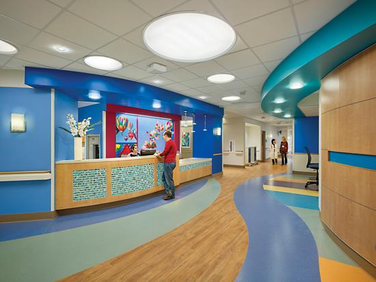
Inova Fairfax Medical Campus in Falls Creek, Virginia is the largest women’s hospital in the Washington, D.C. metro market. Its new patient tower for Inova Women’s Hospital and Inova Children’s Hospital is 660,000 square feet and includes 310 private rooms and 33 labor and delivery rooms, as well as 14 operating rooms, 26 pediatric ICUs and 108 neonatal ICUs.
Flooring is a key part of the innovative and highly functional new facilities. In bold colors and interesting shapes, the floor is an integral element of the vibrant interior space. Su Kim, vice president of Wilmot Sanz Architecture and Planning, the firm for the Inova projects, comments on flooring’s important role, noting, “Flooring is one of the critical design elements in healthcare facilities, enhancing design, aesthetics, infection control, longevity, cleaning and maintenance.”
Terrazzo flooring is the standard for all lobby areas in Inova Fairfax, including the ground and first floors of the new tower. Terrazzo was chosen for both its durability and upscale look. Overall, the flooring designs are large scale and flowing, incorporating simple shapes such as circles and curves.
The Women’s and Children’s hospitals are separate hospital units. Although they share the same tower, they have different and distinct lobbies. A fundamental design challenge was to create separate identities for the two hospitals and still keep a cohesive look and feel within the tower.
Inova Children’s Hospital has its own entrance, which is connected by a concourse to the Inova Women’s Hospital and the South Patient Tower. Each floor has a nature-related theme, such as Ocean/Water, Sky and Land/Mountains. The client and design team chose to focus on these universal themes of healing and nature rather than something child-centric and topical, such as a children’s character, both for aesthetic reasons and also due to the wide range of ages served by the children’s hospital. Designers explored different colors and patterns to support each theme, developing elaborate designs in the floor, emphasizing architectural features with brilliant color, and creating design elements on walls and other surfaces. A digital wall behind the main reception desk expresses the theme of each floor.
Although the flooring design is complex, the same pattern and flooring is used throughout all children’s floors. Colors can be changed out through paint or furniture, but the flooring will stay constant. The flooring design highlights each patient room with a colored bulkhead above and a curved pattern on the floor in front of the entrance. An arrangement of stripes in the flooring flows into each patient room. Designs for the corridor and all patient rooms are created out of seven fun colors from Mannington’s BioSpec sheet vinyl, which allowed designers to create the curved designs. Kim notes, “BioSpec has a great color palette with broad subtle ranges of color along with bright, colorful hues. Mannington also offers excellent coordinating weld colors for seamless transition between different flooring. Some areas in the design also include Mannington Realities, a wood series to add warmth to the overall color scheme.”
The wood look flooring on the NICU floor is Toli’s Mature Select sheet vinyl, installed with a rubber cove base. Toli’s sheet and tile is installed through the Fairfax hospital. All of the floorcoverings on the NICU floor, even the patterns, feature this wood visual.
The Women’s Hospital, as one would expect, offers a more subtle and visually quiet environment. Toli’s Linotesta, a marble-look 18”x18” homogenous tile in a light neutral color, is installed throughout corridors and patient rooms.
Operating rooms have Stonhard RTZ rubberized resin flooring in a subtle, neutral-toned terrazzo look with a seamless integral base. The rubberized resin offers a comfortable feel and also reduces foot and leg fatigue for the staff. Inova’s maintenance people love it because it is easy to clean and sanitize between operations.
WESLEY CHAPEL MEDICAL CENTER
Wesley Medical Center is a hospital established in the early 1900s, based in Wichita, Kansas. The hospital encompasses several buildings; it is a great example of creatively integrating new design into a historical campus. Gould Turner Group has a long relationship with Wesley Medical Center and has been working there for 30 years. Tiana Lemons, director of interior design, has been designing these projects for 15 of those years.
In order to renovate one building into a children’s hospital, the architectural team at Gould Turner Group began with the façade, cladding the brick building with metal panels and glass fins that change colors. The children’s hospital has a new dedicated entrance and a new lobby. One renovated floor of an existing tower became the pediatric unit, with pediatric ICU, patient rooms, play areas, spaces for nursing staff, a teen room and a Ronald McDonald room. Designers, contractors and vendors volunteered the services needed for the Ronald McDonald room.
The client’s key issues concerning flooring for this project were that it should be durable and easy to maintain, and create a fun, playful environment for children. In terms of maintenance, it’s not just cleanliness, but perception of cleanliness that is important. As Lemons notes, “Clean and well-maintained facilities enhance perception of care.”
Nature seems to be a universal theme for hospitals, to establish a calm and relaxed feeling that supports a healing environment (with three of the facilities profiled in this article using elements of the natural world as the basis for their hospital design). It was most important to staff and designers at Wesley Medical to bring nature inside. There are images of trees and birds—as well as real birds—in the main lobby, and also a “tree ceiling.” Soon, a natural tree trunk will be brought in to go under it. Wall photography in the project is all based on animals. Each room is identified by a different image of an animal that is inserted in signage outside the door for identification and wayfinding.
All corridors and patient rooms have LVT from Mannington’s Amtico line. “When it comes to LVT,” Lemons notes, “I am looking for product that looks like a natural material. The increased use of LVT has come about because of the rich and varied looks that it provides with easy maintenance and economical cost.” Wesley Chapel prefers to have one maintenance regimen for all flooring products; this makes it easy to turn rooms.
Neutral colors create the background or overall floor, due to their timelessness. Patient rooms have neutral flooring, with color in artwork and painted surfaces to engage and distract the children. Even in the playroom, staff requested that the flooring be a neutral tone so that children are not over-stimulated. Regarding the extensive use of neutrals, Lemons says, “As a healthcare interior designer, I want to design with planned obsolescence in mind. I want to provide an environment with a neutral palette and background, and introduce color with items that can be changed. In pediatric design you want to provide that backdrop but also keep in mind it needs to be whimsical, distracting and a playful environment.”
The most exciting design feature of the Children’s Hospital—in addition to the exciting interior colors and nature imagery—is the explosive insets of colored circles in the floor. Set within a neutral background of Mannington’s Biospec homogenous sheet vinyl, inset interactive circular shapes offer the children both a fun experience and a distraction from the hospital. Some of the circular and curvy shapes are created with primary colors from the Biospec line; and the other circles, which respond in swirling patterns when stepped on, are made of Liquid Motion from B. Lab Italia. This new, innovative material is composed of a high resistance polycarbonate material outer layer with a colored liquid interior. Because of this liquid the tiles cannot be cut, and are installed out of the box in the sizes specified. Liquid Motion has a track record of performance, and has been installed in many high traffic commercial applications. Bonitz, the contract dealer with operations in the South and East, did its own extreme testing to make sure this material would be durable and safe.
Mannington Commercial’s Link Chroma and Loop Chroma carpet tile are installed in hospital waiting areas, offices, family sleep and consultation rooms, in a brick ashlar format.
JOHNS HOPKINS HEALTH SYSTEM
Johns Hopkins Hospital is part of a large and forward thinking hospital system. Typically its Architecture + Planning department performs rigorous testing to determine materials to be used in their many buildings. It would be an understatement to describe the JHHS facilities as merely large. Comprised of six academic and community hospitals, four suburban healthcare and surgery centers and more than 30 primary healthcare outpatient sites, the facilities encompass well over 98,000,000 square feet of flooring, based on a JHHS white paper by Teri Lura Bennett.
Bennett is lead interior designer for Johns Hopkins Health System Facilities Architecture + Planning. Her first career was nursing, including working at Johns Hopkins Hospital. She studied interior design because she believes it is important that someone who knows how it feels to work in those spaces should have a hand in design. She makes sure that anything she specifies does not make the staff’s work more difficult.
“I understand that the nurse’s priority is the patient,” Bennett says. “The nurse doesn’t need to be spending time on the flooring, moving around tiles or dealing with cleaning issues.” She wants the staff to be able to focus on their work.
Two years ago, while selecting flooring for one of its major facilities, a consultant recommended a new product. JHHS decided to do its own analysis and set up a real-world flooring test in order to determine the best flooring options. A multi-disciplinary team organized and performed the testing over a 90-day period from November 2014 to February 2015.
For the test, the team chose a concourse between the main hospital and an outpatient building in the East Baltimore facility that also connected to the city subway. This area gets a minimum of 20,000 footfalls per day. In all, 16 strips of flooring were installed across the full width of the corridor—eight were resilient and eight were carpet alternatives, ranging from J+J Flooring’s Kinetex and Forbo’s Flotex to recycled rubber products.
The main purpose of the floor tests was to establish generic models for resilient tiles and sheet goods. Yet they also discovered important hidden benefits to this process, including enhanced internal collaboration and the establishment of great relationships with manufacturers.
One goal of the test was to find alternatives to carpet. JHHS determined that carpet could not be used in clinical areas due to infection control issues, as there is no EPA approved method to clean carpet of blood-borne pathogens. In addition, carpet requires more time and effort to clean and requires downtime while carpet is wet.
Acoustical issues were also part of the flooring test; all of the products that were carpet alternatives had some acoustical abatement properties. The design team also looked beyond flooring to address acoustical issues. They explored the functioning of the whole building envelope. Additional methods used to improve acoustics included ceiling and wall finishes, white noise, and changing the places where people congregate to areas away from the main corridors.
Three of the most successful products determined from the comprehensive flooring test were Tarkett’s Azrock Azterra, a VET (vinyl enhanced tile); Mannington’s Paradigm, a sheet vinyl; and Ecore Commercial Flooring’s Terrain RX, a sheet vinyl with a recycled rubber back. All floorings selected fit the no-wax requirement and have sustainable, multi-purpose cleaning protocols.
One key issue for the design team was to find a standard to replace VCT. They had tried a bio-based resilient tile, but it required so many layers of finish that traffic patterns were visible. The facility migrated to VET and has now standardized on Azrock Azterra, a coordinated line with a broad color palette for the corridors and clinical locations. Neutral colors are used throughout corridors, broken up with large format rectangular grid patterns in two or three colors. Tarkett’s Color Essence VET is used in specific spaces, such as in front of nurses stations and waiting areas, in order to create wayfinding cues.
Sheet vinyl with sealed seams and an integrated cove base is a key product for hospitals. The Hopkins design team selected Mannington’s Paradigm, a collection of styles with softened material looks, for secondary clinical spaces, administrative areas and offices. One issue with sheet vinyl can be visible seaming. Designers at JHHS created product changes at some seams in order to minimize this. (Note: Life Safety Codes require the use of sheet vinyl with sealed seams and integral cove for certain areas, such as isolation rooms, treatment rooms and pharmacies.)
Ecore’s Terrain RX, a heterogeneous sheet vinyl fusion bonded to a recycled rubber backing, is an exciting new material with excellent acoustic and performance characteristics. It is being used in inpatient rooms, waiting lounges, auditoriums, breakout areas and multipurpose conference rooms—many of these areas were once carpeted. Terrain has a neutral, non-directional texture, which was installed in two shades of gray within a simple large format rectilinear design.
Johns Hopkins has established a recognizable neutral palette to help brand the facility. As described by Bennett, “There is a cohesive feeling when walking through a Hopkins space. The overall feeling is very light and neutral, and there is the same look across all clinical areas.” Geometric grid patterns along the corridors support this cohesive look and feel.
UCSF MEDICAL CENTER AT MISSION BAY
UCSF Medical Center at Mission Bay in San Francisco, California is a combined family of three hospitals and one outpatient facility: Bakar Cancer Center, Benioff Children’s Hospital, and Betty Irene Moore Women’s Hospital, and the Ron Conway Family Gateway Medical Building.
Each hospital entity has a separate mission and all are together in one tower. The challenge from a design perspective was to have a cohesive building, yet keep each hospital’s individual identity.
A second key theme of the project was to create design that embraces diversity. The design needed to address patients of all ages and everybody who supports these patients, such as staff, doctors, physical plant and community members, as well as every ethnicity and sexual orientation. And thematically it was important to integrate the diversity of environment in the Bay Area.
The hospital is in a very urban location, balanced by connection to nature. A city street was closed to create the hospital’s beautiful central plaza. Taking advantage of its site, each side of the building looks out to natural views, either the San Francisco Bay, neighboring hills or the hospital’s 60,000 square feet of garden space.
Within the overarching design concept, “The Story of Land, Water and Light,” designers included elements from the whole Bay Area. This concept became a great guideline to developing interiors and the visual organization of the building. It also influenced how they played with color and pattern in flooring.
Graphics were designed in the flooring, with visuals of Sutro Tower and other local landmarks. Nora rubber sheet with welded seams was the material of choice for both corridors and patient rooms, selected because it met toxicity and durability requirements and needed the least amount of care.
As many as three dozen accent colors were used for the rubber flooring, primarily in the children’s hospital. Only three basic neutral flooring colors were used throughout the whole facility, in varying proportions. Each of the three hospital units had different neutral backgrounds. The children’s accent colors, which are brighter, work best against a lighter, brighter background color. Adult areas have more subtle, spa-like accents; these are set against a warmer, medium neutral background. And in adult areas, designers used a lighter hand on imagery than in the children’s areas.
All public space areas (lobbies and the first floor) have porcelain tile flooring; the hospital wanted a product that is non-porous, with consistent height and tight joints. The porcelain tile unifies the whole medical center visually. Chosen in a dark slate grey due to its versatility, the color works well with both the bright accent colors of the Children’s Hospital lobby and the more subtle accent colors in the adult areas. Lynn Befu, principal at Stantec Architecture and lead designer on this project, explains that both the umbrella identity and separate identities were important to each hospital, adding, “The accent colors were already different. This material binds them all together.”
The outpatient facility has its own set of finishes. The first floor is porcelain in primary corridors and other well-traveled areas, a continuation of hospital finishes from other buildings in the system. Forbo’s Marmoleum linoleum sheet with welded seams is used upstairs in corridors and exam rooms.
Unlike the other hospital case studies, at UCSF Medical Center carpet fulfilled an important role. Carpet came into play when they wanted to soften a space, either aesthetically or acoustically. These were typically lounge areas and waiting rooms, with the exception of offices on patient units. Carpet was also used behind reception desks in order to help with noise and provide comfort to the staff. Another area where designers felt it was important to use carpet—“addressing human needs and a sense of humanity over infection control”—was the children’s surgical waiting room. Patients’ families wait in this area for a long time, while feeling highly stressed.
UCSF chose carpet tile for the facility’s carpeted areas. It was selected for its flexibility—the ability to change the carpet out if an area became stained—not based on its inherent aesthetic possibilities. Pattern making options with tile were not even considered. The resilient flooring design was so complex that designers wanted the carpeted areas to be simpler.
Operating rooms are rubber sheet. Stonehard’s Stonres RTZ urethane flooring system is used in some back-of-house areas. It has a similar look to terrazzo yet is less expensive and easier to maintain—and designs are getting better. As Phillips noted, “Stonhard flooring started out as a material that was primarily used back of house, in areas such as animal facilities and central sterile, where they do sterilization for operating rooms. Yet as with resilient, pushing the boundaries of design has resulted in changing paradigms concerning where a material can be used.” New design results in new opportunity.
UCSF worked with McDonough Braungart Design Chemistry as this project was developed to fine-tune its sustainability goals and to determine which goals of the hospital dovetailed with LEED goals. One objective was to minimize the use of PVC in all finishes—flooring, furniture, upholstery and wallcovering.
Copyright 2016 Floor Focus
Related Topics:Mannington Mills, Tarkett, Lumber Liquidators, Coverings, RD Weis