M Moser's project uses Interface, Ecore and Nydree products
By Bill Bouchey
To global advertising and PR giant WPP, a co-location of its three downtown New York City creative agencies on a single floor at 3 Columbus Circle was an idea with plenty of possible upsides.
The benefits could potentially go far beyond merely simplifying the firm’s real estate footprint in the city. Bringing three agencies—The Brand Union, Peclars Paris and Team BAC, with their own brand and distinctive personalities—under one roof could also give rise to a new creative hothouse, with interaction among staff members generating a stream of fresh new ideas and approaches.
There was, of course, one possible catch: it could easily go the opposite way—chaos rather than creative friction, or three formerly distinctive agencies devolving into little more than three different logos fronting one watered-down work culture.
When WPP engaged with workplace specialist M Moser, led by project leader John Kuehn with Bill Bouchey and Rebecca Wu Norman, to develop and deliver the project, both firms realized that the design of the new office would be just one key to avoiding the pitfalls of co-location and achieving consensus. Another would be managing the change from three offices to one.
EVOLVING THE DESIGN COLLABORATIVELY
M Moser’s first step actually addressed both challenges, with the design team facilitating a visioning session and members from each agency participating. As well as giving the designers a much more nuanced and detailed understanding of the agencies’ respective characters and needs, the process gave the agencies an opportunity to influence the shape of their new work environment. The more input each agency contributed to the evolving design, the more they bought intoå the project. “Keep, Toss, Create” was a key topic of exploration and debate in this session.
Additional inspiration came from the design team’s tours of the raw project site as well as the agencies’ previous workplaces, giving them insight into their desirable qualities and shortcomings.
The program for the new office took shape, continuously informed by infusions of insight and hard data gained during the discovery phase, and by WPP’s established cost parameters, occupancy space metrics and global guidelines for future growth.
Broadly, the aim was to create a warm and welcoming work setting, with a design that references the office’s location among turn-of-the-century industrial loft buildings.
Conceptually, each agency’s distinct character would be retained, with each brand expressed as a menu of individual treatments within each area. However, their dedicated zones would be complemented by a common open space where staff could casually collide and spark off unexpected interactions and new creative tangents. The latter space—with shared amenities such as reception, break-out and meeting spaces and alternative collaborative work settings—would be aesthetically neutral of agency brand association.
Offering 35,000 square feet of floor area, the footprint at 3 Columbus Circle lent itself well to the concept. The desired central arrival and reception zone fell naturally into place in the middle of its “H” shape, while its outer extensions allowed each agency to be physically separated yet open within its own area. Various nooks and crannies in the floor plan became enclosed offices and private collaborative lounge and meeting zones.
FLOOR TREATMENTS TELL THE STORY
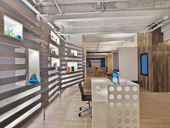
The intended effect of the space planning was reinforced by the office’s detail design, and particularly by the choice of flooring treatments. Flooring, in fact, was vital in telling the story the client wanted at 3 Columbus Circle: vintage building sensibilities, hints of an urban environment with richly patterned building façade views, and modern brand expression.
A guiding design principle was to use durable hard surface materials such as ceramic tile and wood to define heavily trafficked public spaces at arrival, entry, reception, café breakout and corridors. The office’s eye-catching combination of smooth wood planking and honed concrete tiles evoke the gritty, industrial feel of loft floors. The wood strip flooring from Nydree, a textured plain sawn white oak, 4” wide in 4’ to 5’ lengths, was laid randomly, abutting a 4”x24” concrete tile plank, Solana from Concrete Collaborative, installed in an ashlar pattern. Where the floor design angles, the two products remain aligned to maintain continuity.
The office’s industrial character is further expressed by carpets with textures and patterns reminiscent of pavement and by the use of hard-wearing engineered woven materials in the scheme. For this effect, we employed Interface’s Urban Retreat in a one-meter plank with a mid-grey value. Accents in the open area come from the same Urban Retreat line in shades of greys and blues.
Transitions from public to agency areas are defined by a group of products repeated throughout the floor to create a universal flooring pattern. Within the agency spaces themselves, softer materials, such as carpet tile and woven vinyl, create a more subdued acoustic environment, as well as an immediate visual and tactile contrast to neighboring agencies and public areas, the latter being achieved with the high contrast Chilewich weave of Ikat.
SHIFTS OF TEXTURE AND COLOR FOR SHIFTS OF FUNCTION
Flooring and color were also used to make even more subtle functional distinctions within the space—a vital concern in an office that not only hosts three distinct agencies, but supports them with such a wide variety of public and private work and social settings. These settings range from open breakout lounges and semi-enclosed booths to enclosed meeting spaces, client-facing presentation rooms, team rooms, war rooms, phone enclaves, and even a games room featuring a foosball table and widescreen media. Differing flooring types and variations in color and texture help emphasize individuality. In the game room, Eco 98 felted floor tile by Ecore was custom cut by a waterjet process to create a triangular layout in dark and light grey colors.
The floor plan was further exploited to accentuate wayfinding through the circulation areas that connect the operating agencies. Changes of color, pattern and texture not only demarcate the circulation paths, but also echo the angles of the building shape itself, creating a stimulating visual interplay of space and architecture. The delineation in the corridor flooring scheme in circulation areas is complemented by a corresponding angled ceiling element above, which incorporates a linear light accent.
Within the agency areas themselves, teams work from an open-plan benching environment with the floor featuring a carpet tile layout installed in a regular chevron motif. In addition to serving as a basic visual identifier of these work areas, the motif is non-directional, allowing the space to be re-planned and reconfigured without disturbing the flooring. Interface’s Urban Retreat modular carpet in a plank format worked well for this large-scale pattern.
All the flooring choices considered for the project were made from renewable sources, and their sustainability contributed to the office’s LEED Gold certification. For carpets, the final selection came from Interface. Concrete plank tile came from Concrete Collaborative. Reclaimed wood was used for the wood floor surfaces—a sustainable choice that also lent the office the rich character of a well-worn oiled factory floor.
DEFINING AREAS WITH ACCENTS
Like the office’s planning and key design features, inspiration for the project’s colors and textures grew from the project team’s close collaboration with WPP and its agencies. The visioning sessions produced keywords to describe the office’s desired look and feel. Collaboration also came in the form of a shared Pinterest page, on which agency staff and designers could contribute mood images and evocative hues.
In the final product, color accent insets were used strategically to punctuate and define floor areas, complemented with additional accents in the office’s furniture, walls, environmental graphics and branding. The flooring accents act as one of a number of these economical yet high-impact treatments that are easily changed, providing flexibility in a kit form. One of the more prominent examples of this flexibility is found in the reception area, whose centerpiece is a neutral slat assembly element featuring custom vitrines with embedded LED lights. The arrangement enables each of the agencies to express their identity signage or, alternatively, to display themed objects acknowledging an individual client visit or event.
From a functional standpoint, open collaborative areas in the public hard-floor space have ceilings to address sound isolation and support intimacy, while collaborative areas in the agencies’ carpeted zones have more open ceilings. All of these areas also serve a secondary purpose as alternative workspaces and thus feature interactive wall treatments, such as writable paint, magnetic writable glass and tackable surfaces, which support ideation activities like brainstorming and storyboarding.
At 3 Columbus Circle, our design goal was to provide an agile workplace where the process of collaboration among the three companies on the design united them as good neighbors in advance of their occupancy and fostered a shared connection through teamwork. The result—from the floor up—was an environment that reflected the unique vibrancy of three fast-growing, dynamic agencies.
Copyright 2014 Floor Focus
Related Topics:Interface