2009 Color Trends - February 2009
By Kay Gosline and Emily Morrow
There’s little need to point out the obvious link between the global economic crisis and changes in the commercial interior outlook. Of most interest from a color standpoint, however, is the notion that underneath the surface of gloom infecting the market there’s still a sense of optimism arising in design that’s not necessarily shared by the client base. Yes, many design firms have downsized and are preparing for a tough 2009, with scores of projects on hold and very tight budgets, but the work being done right now is both highly creative and distinctly optimistic. We may be powerless over shrinking investments or global economies, but there are areas where we as individuals do have complete control, such as color in our environments.
During the 1930s, the Great Depression forced consumers into frugality and a “make do” attitude. Hard choices had to be made about what things were truly essential. Women stitched clothing out of flour sacks and bonded with neighbors over a quilting frame. In architecture, the highly decorative Victorian style and Art Deco of the Roaring 20s waned as Modernism began to emerge in popularity. All those swirls, embellishment and intricate patterns gave way to simplicity, clean lines and soft, clean palettes.
In 2009, perhaps the attitude will be much the same in interior design. No doubt, designers will be asked to do more with less and all of us must make difficult decisions about what we really value in an uncertain world. Designing spaces that reflect compassion for individuals, respect for our rare resources and balance of family versus work is challenging and the right colors can make all the difference.
What’s new in color?
Contract colors change relatively slowly, of course, compared with home fashion trends. Trends tend to be formed from slight shifts, such as nuances of shading, that are not that apparent taken day by day. It’s amazing how all those subtle differences really do add up over time and how before long it becomes a really noticeable trend. At Milliken Contract, the design team recently got to start from scratch with a new solid color coordinate product that is designed to bridge existing lines to new introductions. It was a great exercise that pointed out just how far color had come over the past few years. It also pointed us in the direction that we think color is moving in the future.
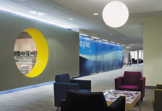
Before beginning to talk about the specific color families, it’s important to understand the impact that white has had on corporate interiors. With the advent of technology, many finishes now actually work in white so it’s showing up in work stations, board rooms and reception areas all over the world. It’s now an accepted business color in matte or shiny, smooth or textured finishes. Since white is emblematic of purity of thought and motive, it’s sorely needed by businesses struggling with ethics issues and loss of market trust.
Black and white is another significant color combination. The vivid contrast represents the extremes that exist in our society. Always classic, black and white looks forever fresh.
As always, contract work requires a wide range of neutrals. Greys have cooled down and show up as light tints of pewter or crystal clear water on a moonlit night going all the way to deep metallic grey and inky black, which round out the cool range. Blue is a powerful earth force across the palette.
Grey spills over and mixes with brown for sophisticated taupes, and brown continues as a story all by itself. On the warm side of the neutrals, Tuscan sun drenched colors provide perfect accompaniment for almost any color scheme. There are brown undertones to many colors and a plethora of hues of caramel to khaki to rich cocoa. Brown has become a staple of contract because it works so well as a bridge to other color families or with other neutrals.
Greens take up less room in the palette lately, but they appear as a few well chosen clean midtones, complex olives and a classic but very blue Norwegian pine color. As sustainability has become a household motto, blue is becoming the “new green.” Blue is very much about trust, honesty and reliability—things that are greatly in demand today. This year, we’re seeing more interest in teals, from warm to cool, and rich blues, from denim to sapphire.
Reds are intense and still needed in both ripe tomato and deep chili pepper, leading into the spice colors of gold and oranges inspired by the Middle East. Think of China, Turkey and India, where mosaics tiles and ornate textiles abound and these spicy colors mix with turquoise, blue and teal at every turn. The world is indeed a smaller place and these countries are enjoying renewed attention from designers in fashion, home furnishings and commercial interiors. China, in particular, has embraced its historic past but opened its doors to influences from other cultures. What’s emerging there is a distinctive style that does not seek to emulate the West but to forge a whole new aesthetic of its own. The Beijing Olympic venues are a great example of how the Chinese are redefining themselves in global terms.
Intense yellow provides one of the best accent colors for interiors because it is ever hopeful, optimistic and energetic. Vivid, bright yellow has a techno edge without alienating humans.
And finally, add just a touch of purple as long as it’s dark aubergine or greyed out violet for accent or as a neutral. Purple is emerging as a strong direction but will take time to develop and really make an impact in contract. Colors like purple usually push their way into the palette by melding themselves into other colors before they emerge to stand on their own. There’s still a lot of purple that was installed in the 80’s that has to be replaced before the mainstream is willing to embrace it again! The same is true of mauve, which appeals to younger designers who didn’t live through the era of mauve and teal. It will come back into the palette as a dusty violet but it must be used in the right context to be acceptable to clients.
More important than the movement of each color family is how the colors work in combination. Longer color lines are needed to accommodate more complex color schemes. Slightly jarring the norm takes skillful handling but can create tension that energizes a space and pulls it out of mediocrity. Allowing the occupant to be surprised by discovering colorful elements in stages is another way to add dimension to the interior.
Market segments
It’s been said that fashion is not the trend leader that it once was and that individuality is far more valued than in the past. Today’s hot looks are really pulled from the best of the past and melded into a personal statement of style. Look at the revival of Coco Chanel. Today contract interiors don’t follow fashion color trends but have been influenced by fashion’s mix and “don’t match” attitude. After 9/11, many design firms made an effort to diversify their practice so as not to rely on one market segment (especially corporate). With that, the whole notion of healthcare, education and government, which was already in flux, really began to change. Designers who specialized in these segments have steadily been breaking paradigms of the past and creating a fresh approach using colors that were unthinkable before.
Color psychology is being used in healthcare more than ever but it’s more complex in interpretation. Reds and yellows, once taboo, can be used to stimulate blood flow, and greens/yellows are cheerful and optimistic. Designers are really delving into the specific needs of each area and examining the use of unexpected materials. Combining simple patterns with lots of texture evokes a spa like environment. The trend is moving away from trying to make spaces look “homey” to concentrating on healing spaces.
Educational environments reflect today’s technological era in which students, teachers and parents expect high performance learning environments. Kids today need more stimulation of color and pattern but they also have some sophisticated tastes. Everyone has an opinion these days about design and that’s especially true when dealing with school boards. Rigid borders in corridors are giving way to dynamic flow that leads the eye forward. Classrooms are drenched with natural light and colors can be more subtle. Budgets in higher education have been shrinking so finishes must do more work with less, and practical color is the key.
Nowhere is the overall level of taste and sophistication more evident than in government. Whether the politics are liberal or conservative, the aesthetic has been traditional. Today, classic modernism is widely embraced and spaces are more about people than monuments. Fiscal responsibility requires low maintenance and an emphasis on performance but not with the loss of style.
Hospitality is just beginning to feel the effects of the downturn in the economy, especially in gaming. Throughout 2009, midrange chains are expected to flourish as rack rates teeter in full service. Refurbishment will provide the opportunity to differentiate and get more of the business dollars spent on travel. Hospitality is the most custom market segment and no one palette is adequate. Designers must rely on telling a great story with color and pattern to please the client and the guests.
No segment of the commercial market will go unscathed in the next few months but color will continue to evolve. Colorful solutions to client issues are what keeps designers motivated.
Regional differences
Regional color preferences seem to be as engrained as taste in cuisine but even more influential is the client’s culture. If nothing else, the latest financial debacle highlights the interconnectivity of businesses across the world. Many multinational corporations have global standards with a small amount of customization to reflect the specific locale. Branding consistency is the goal but it needs to be locally relevant, which is usually done with materials rather than color. The same is true of geographic regions in North America, which have their unique identities.
Light dictates how color is perceived and used around the globe. We’ll never have just one color palette for everyone because the quality of light in northern Europe is so different from the sunny shores of Italy. Phoenix is not like Chicago and never will be! How boring it would be if every market liked the same colors. Most travelers bemoan the homogenization of retail and the loss of sense of place. Indigenous color is one thing that helps give us visual clues about location.
Composition is everything
The commercial market segments continue to seek clean, clear optimistic colors paired with browned greys and cooled off neutrals. Balancing of warm and cool is almost a given for every market segment. The palette runs in contrast to the gloom of the media and even of personal realities.
One thing I’ve learned from photography is how composition is everything. Even the humblest materials become exalted if they are shown in the right context. Color takes the lead when budgets are squeezed and designers can’t afford all the changes they’d like to make. The game becomes one of finding the right finishes and colors, then arranging them in such a way that the whole environment is greater than the sum of its parts. That’s the challenge designers will optimistically face and conquer this year.
As 2009 commences, there’s almost a stubborn sense that design will not give up its colors of hope, prosperity and happiness. Clients may not be able to afford the most expensive finishes but the right color can make all the difference.
Color in residential design
The world of color, style and design has taken a turn toward comfortable, sensible sophistication for 2009. It’s no secret that our economy has been weighing heavily on the minds of consumers not only in the U.S. but around the world. The result of that has altered every single decision that we as consumers make today. It’s a series of split second gut checks. Each of us questions almost every purchase we make, asking, “Do I really need this, or can I make do with what I have?” “How can I make this look new without spending much money?”
Once the decision to buy is made, the next questions are “What’s my best option…What’s the best quality…What has the longest lifecycle for the money?”…in other words, “What’s my best value?” Value can be defined in many ways, but let’s put it in the context of quality, luxury, comfort, performance and style. As consumers seek out the best value there still remains the innate need to be comforted and to just feel good about the selection.
Colors have been proven to create a physiological response that affects breathing, pulse rate, blood pressure, mood and even appetite. It’s something we humans have known since prehistoric times, but today it’s something that we use to enhance our quality of life. The act of coming home from a busy day can and should be designed to evoke feelings of relaxation, anticipation or freshness by color selection.
A perfect example is something we do here in my office on a monthly basis—we change the bound carpet in our lobby. Each time it has been changed, visitors comment on the color. The comments have made for interesting discussion among our color, style and design team, each of us sharing our own personal experiences.
By far, the soft aqua carpet was the most favored color due to the feeling of “ahhhh” as we rushed hurriedly to various meetings. The most dramatic selection was a fashionable two color pattern in soft ivory and black, which caused visitors to ask if we had put in new furnishings to which the answer was “no.” These are interesting yet obvious responses to those of us who study color.
Research shows that 2009 will prove to be the year in which we will see grey grow in all segments. It emerged in 2007’s couture colors from the runways of New York, Paris and Milan. Speaking of the runway…the grey trend was most notable among the Christian Dior Fall 2007 Collection where model after model pranced down the runway in lustrous grey silk dresses and suits with classic detailing. The following year, paint companies noted colors such as “Weimeraner,” “Ice Cube Silver,” and “Dior Grey” in their color palettes.
Designer fabric companies launched collections featuring silvery ice blues and silvery beiges. In High Point and Las Vegas at the Home Furnishing Shows, many manufacturers exhibited grey upholstered groupings, grey wood frames, silvered edges, and mirrored accent pieces. It’s looking to have long lasting effects, where we see the color continue to wick into similar industries and products.
Grey stands alone as a classic traditional color choice that states “I mean business while being modern and stylish.” Grey works perfectly with the addition of the flair colors such as red, gold or even plum. The economy is part of the reason grey is selling, but not entirely. Grey is such a big story because it represents so many things. Grey is synonymous with architecture, sophistication, technology, and urban industrial-commercial structure, and offers the ideal backdrop for a variety of accent colors.
Familiar colors also feel comfortable, hence the return to the traditional colors from 25 years ago. Aqua and teal led from the early to mid-2000’s and served as the prelude to navy blue and true blue. Feelings of patriotism revolving around the presidential election and the need for stability in an uncertain world serve as additional catalysts to push true blues well into 2010. Blue iris, royal purple and reddish plum evolved from European fashions, royalty, mystery and sacred art. Purple and plum are ideally used as accent colors, adding a lot of pop but in small quantities. Purple is beautifully paired with grey, gold and even apple green. Red varies only in how much it’s used within a space. Red hasn’t varied in being “in”…it is “in.” When one lives in a beige world, red’s power, drama, and passion feed the hunger for excitement.
A color story is not complete without some serious remarks on “green.” Green, both as a color and as a mission statement, has been the number one talked about trend in 2008. Green has become an over used word, desensitizing some of us to its true meaning. Green is life, green is sustaining, green is nature, and green is healing. This color and statement have never been more important than they are today. In a time when wastefulness and excessive spending should be considered not only to be in bad taste, but also bad for the economy and all consumers, green as a color is something with which we need to surround ourselves. Green is smart, green is efficient, green is security, and green is the better future we all hope is just around the corner.
So, how does this apply to floorcovering? Let’s begin where many home-owners begin, which is in long term investments. Wood, stone, tile, laminate floors, walls, countertops and cabinets are generally the big-ticket items within an overall interior budget. From this point, the palette doesn’t range far from the natural neutrals to dark rich neutrals, with a few exceptions. Consider this as the canvas from which many consumers either deliberately or subconsciously work as they build their interior color palette.
Grey, dark brown, black and white are what we find most prevalent among the hard surface colors. These are the most basic yet classic and elegant neutrals from which to choose as a beginning. From there you will discover that the newest carpet styles are using these same rich neutral colors, considered no-brainers but appropriately supported with a cast of other vibrant colors from the fashion/interior world, offering the consumer the choice of using color as pop or color as canvas.
Where do we go next with this knowledge? It would be easy to sit back and assume that 100% of the color selections will be beige because of the economy, or that they would be the lowest face weight product in the line, but that’s not exactly an accurate assumption. While we find ourselves concerned and a little anxious about the world, we also find ourselves searching for something special to catch our eye, to change our mood, and even to divert our attention to more positive things. What’s more luxurious than coming home to something as warm, soft and quiet as a favorite blanket, and it’s carpeting your entire room? What’s more breathtaking than an expanse of wood floors, with the same rich color gradations and dimensional textures, all created by the human touch?
Flooring today is given the same consideration as ready to wear apparel. When a high level of attention is given to the styling, details and quality of the materials, then one’s need for value, self expression and comfort will be more easily satisfied. There you have the ultimate answer as to how best improve your life in 2009: Color as you crave it, comfort as you need it, value as you demand it, style as you want it, i.e. self-expression…home!
Copyright 2009 Floor Focus