Trends in the Corporate Market - Feb 2013
By Jessica Chevalier
The corporate workplace used to be defined by a particular look, a buttoned-up image that conveyed tradition, stoicism and repute. With flooring, this translated to dark hardwood, neutral shades of broadloom and stark hard surface materials such as ceramic tile, stone, marble and terrazzo.
But things have changed. Today, companies are more interested in conveying their own unique brand image than some generic interpretation of the corporate persona. For designers, this calls for more conversation with the client to determine how they envision their business and how to communicate that vision through finishes.
In addition, the idea of who benefits from a dynamic workplace has changed. No longer do firms simply put on a pretty face to attract a client and their dollars, with worn broadloom spanning the back of the house. Today’s forward-thinking corporations are considering how their office environment impacts employee happiness. A dynamic workplace helps attract and retain talent, and it speaks to the culture of a company—both what it will be like to work with and work for.
Atlanta-based Rabaut Design Associates, founded by Jo Rabaut 24 years ago, is a boutique-style design firm in Atlanta. Rabaut currently has five designers who work in the corporate, residential, education and retail sectors. In addition, Rabaut Design has joint ventures with architectural firms that do not have in-house design departments.
The design firm was hired to complete projects for two Atlanta corporations that were trying to freshen their space without breaking the bank. Rabaut reports that a $75 to $100 budget per square foot “makes me smile.” Both of these projects came in under that.
Due to these budget restrictions, neither of Rabaut’s clients prioritized sustainability in their office designs. However, Rabaut reports that, when given the option, the clients chose the green product if it was offered at the same price as the conventional one. This is reflective of what is heard across the board. Unless a company has a stake in the sustainable world business-wise or is a high profile corporation with a budget to match, it is likely to see green and expensive as synonymous and default to conventional, except when presented with two comparable products—one green, the other not—and given the choice on a case-by-case basis. Using this strategy, designers are able to work green materials into a design for a company that may be, for financial reasons, turned off to the idea of sustainable design. In addition, customers may also make green choices based on the fact that the green product has other benefits or is inherently stylish. Since carpet tile is the corporate sweetheart of the moment—and also generally a greener choice—customers may choose the material for its other benefits and end up with a greener result than they had anticipated.
Says Rabaut, “Clients often don’t believe that design can solve problems until after it is finished. Our goal is to make things pretty but also make sure that the space works.” The clients featured here believe that their newly designed spaces have helped achieve both aesthetic and functional success.
FINANCIAL SERVICES CORPORATION: THE PROJECT
In 2010, Rabaut Design Associates was called upon to redesign a space for Financial Services Corporation (FSC), an Atlanta-based financial investment firm. Rabaut had worked with FSC previously, designing the same space ten years earlier.
This time around, however, FSC wanted to diverge from that traditional corporate look, which it had insisted on previously, and create something that would make the firm look fresh and relevant, to elevate the design from somber and stodgy to crisp.
The budget for the project was limited, and no changes were to be made to the architecture of the space. This was a finishes project, and the majority of the 65,000 square feet was workstations, though some enclosed office space existed.
FSC’s suite featured a two-story atrium, a stunning architectural feature, but the general work areas were not dynamic or interesting in any way. Neutral broadloom was used throughout, and the workstations were an uninspiring black and grey.
Rabaut met with FSC in a visioning session to identify the company’s goals. What are your problems? What do you want to achieve? Then the firm stepped back to think and reemerged with design solutions for the client, asking again for feedback. This engaged the sides in a sort of collaborative push-and-pull. Of course, on Rabaut’s end, the team was considering the technical aspects of finishes as well. Is it good quality? Does it have a warranty? What maintenance is required?
Along with updating the finishes, Rabaut was committed to improving the employee breakroom situation, which consisted of two small rooms with no windows.
FINANCIAL SERVICES CORPORATION: THE DESIGN SOLUTION
As Rabaut puts it, with its new office design FSC was hoping to straddle a line. Companies with a traditional look can give the impression that they are in the dark ages, outmoded. In the age of the Internet, even companies with traditional roles, like FSC, need to appear current and forward thinking, but not go so far as to seem frivolous or silly. The design should make the firm seem trustworthy and thoughtful, inspiring confidence in clients.
As Rabaut began, it was evident that for some elements to remain would require a facelift. The Herman Miller workstations needed to be addressed, as replacement simply wasn’t in the budget. This time around, Rabaut sought to integrate them into the design in a more meaningful way. With their black frames and crepe-paper textured grey tiles, the workstations were very vanilla. To create depth, texture and motion in the space, the Rabaut team strategically re-cladded some of the workstation accent panels with a textural, geometric fabric that incorporated the colors of the project. They also replaced the teal chairs, which matched the previous color palette, with a more current, ergonomic red chair for a pop of color.
FSC is situated on the 11th and 12th floors of a large office building, so Rabaut was not concerned about the impact of weather-related detritus on the flooring. Grime would likely be walked off before it reached the FSC offices. Similarly, slippage was not a concern under normal circumstances.
Though it was unwilling to consider carpet tile a decade before, FSC was comfortable choosing it for the work areas this time around. Rabaut felt it was the best solution for the large, open space because it is easy to change out if damaged or worn without halting work in the spot. Rabaut wanted a design that would help create architecture in the space. It was also important that the product be forgiving—not too dark or too light—to hide both dirt and dust. Lastly, the carpet tile had to coordinate well with the workstations and furniture.
From Milliken’s Constantine Collection, Archetype Chroma in red and Archetype Neutral in brown added texture to the floor and also integrated color. The tile was installed monolithically in corridors to create linear direction and installed quarter turn in the atrium. Rabaut regularly orders 3% to 5% attic stock when specifying carpet tile to use as replacement for damaged tiles.
For the boardroom, reception and executive areas, FSC wanted broadloom. Rabaut was able to achieve a refined (but not dowdy) look by choosing Constantine’s Litterae in the color Edgar Allen.
To achieve her goal of creating a place of reprieve for the employees, Rabaut repurposed the windowed mailroom as a breakroom and chose Armstrong VCT in bright apple-y green and geranium tones as a foundation for the cheerful setting. To create architectural interest, Rabaut painted the column along the window wall the same red and built a soffit dropped ceiling with pendant lights, painted in green. She mirrored these ceiling details in the VCT, which helped create zoning in the space.
Along the window wall, Rabaut built a counter at window height so that employees could sit and enjoy the view. The square tables in the breakroom were designed to be pushed together to accommodate groups or create a buffet for a company gathering.
Overall, FSC’s new offices have a feeling of structure and order but with crisp pops of color that provide release. The project was completed in phases, so that employees could be relocated throughout the office during renovation.
Rabaut feels that the FSC end-result was a nice surprise; the company allowed the design to be more progressive than she had anticipated at the front end.
SAGEPATH: THE PROJECT
SagePath bills itself as an interactive advertising agency that works in websites, mobile apps and social media. The young, growing company was relocating to a larger space in the same building after undergoing a painful remodeling process of its previous space. SagePath, based in Atlanta, found Rabaut because the firm had designed a space for another tenant in the same building.
At 9,000 square feet, SagePath’s new space was almost double its old. For the initial meeting with Rabaut, one of the owners of SagePath brought a stack of design books with tags marking looks or ideas that he liked. However, these high-design styles also came with out-of-reach price tags. Rabaut worked with the client to articulate goals and come up with a design solution unique to the company’s needs, desires and budget.
SagePath wanted to use the space to define itself as hip, casual, cool, young and creative. But, it didn’t want to stray too far into the sort of self-referential coolness that comes out as cheesy or comical—a trap that many young technology companies fall into. And SagePath most certainly wanted to look established. Young, but not too young. Hip, but not too hip. SagePath, too, was hoping to use design to straddle a line and communicate its distinct brand.
SAGEPATH: THE DESIGN SOLUTION
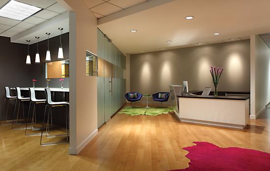
SagePath’s suite is on the fifth floor of an office building, right off the elevator. Due to its high traffic location, Rabaut and SagePath liked the idea of creating a glass front, so that passersby could peek in and see the cool space—a kinetic, buzzing workspace instead of rows of cubicles. The window overlooks the welcome and break area, a large centralized hub that accounts for about one third of SagePath’s total space.
When it came time to choose a flooring material for the hub and breakroom space, one of the SagePath principals expressed his desire to give a nod to New York City ad agencies by mimicking their hard, stark entrance style. Ultimately, this became one of the guiding principals of the design.
Stone and marble were out of the question because of the budget. But hardwood was the perfect choice. The team selected Shaw’s open grain 5” Modern Hickory in the toast tone, a solid hardwood. The hard surface material, with its light tone and warmer feel, communicates SagePath’s relaxed yet serious approach.
Though the company has a color as part of its name, it did not want to use sage tones in the space. Throughout the office, Rabaut chose values of whites, blues, browns and greys. As a rift off of the indigo used in the logo, a blue-purple was used as a pop of color, along with apple green and fuchsia. The result is calm but vibrant.
In fact, the most stunning splashes of color in the space come from the Edelman leather rugs that adorn the hardwood in the hub. These were not part of the initial design. However, after the project was completed, Rabaut just wasn’t fully satisfied with the result. She felt like it needed another layer of interest, something to add dimension, like adding the “jewelry on the dress.” The hide rugs bring an organic shape to the space as well as a luxurious, upscale feel, but their bright, saturated tones keep them lighthearted.
Because Rabaut limited the amount of sheet rock in the hub to create an open space and used hard surface flooring, it needed an element that would help absorb sound. The banquette in the break room, in addition to adding seating, color and texture, helped neutralize acoustics in the area.
Carpet tile was installed in the conference room, offices and corridors. One SagePath partner voiced a strong affinity for conservative grey, so two Shaw carpet tile patterns in that color were chosen, Hybrid and Catalyst (each in the Dapple coloration). Both patterns have linear qualities, but Hybrid has an organic feel as well, a soft, sandy quality. The pattern of the tile breaks up the grey tone, creating dimension.
The conference room sits just off the hub, and the Catalyst tile used there provides a more tailored feel, almost in contrast to the voluminous light fixture over the conference table that is, as Rabaut puts it, nearly a hair too large. This is an example of how Rabaut was straddling a line with the SagePath space, choosing a fixture that serves as a canopy over the space, not quite playful in feel but almost.
Hybrid tile was chosen for the corridors leading to the workstations, which are all white with indigo accents. This same blue was used as an accent in the executive offices.
SagePath’s space was completed at the beginning of 2012 and won the American Society of Interior Designers Georgia Chapter Design Excellence Award for a singular space.
Copyright 2013 Floor Focus
Related Topics:Armstrong Flooring, Shaw Floors, Shaw Industries Group, Inc.