Designer Forum - October 2011
By Andrea Hartley Bishop
When Atlanta based Venadar hired Rabaut Design Associates to design its new workspace, it issued a challenge: create a culture that will cultivate inspiration, encourage creativity and promote collaboration. The client, which works to connect emerging companies, products and services with market opportunities, asked Rabaut to design an innovative new space for its expanding business, while also providing an environment that improves the way the company functions.
Our solution to that challenge: gleaming white interiors that are free of any aesthetic preconceptions or influences. We created a clean architecture with contrasts of brilliant color to show off the firm to its best advantage. The flooring was designed to be a tailored backdrop for the overall crisp design.
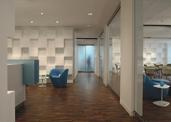
The space was designed to communicate an orderly, forward-thinking organization. We sought functionality as well as visual impact. Artistically arranged dimensional cubes showcased on the walls of the more public spaces of the floor plan are a primary design element. They are used as textural art, when left unadorned, and become part of the design story when meeting with and presenting to clients. The white backdrop not only puts the client front and center, but it is also the perfect environment in which to present concepts and designs.
As a full floor tenant, the space was organized to have the existing elevator lobby feel like a part of the space. It was critical for the space to flow as soon as the elevator doors slid open. Granite pavers existed in the elevator lobby/public space of the office building. Against the white walls, the granite pops with contrast. We wanted to bridge the absolute black of the granite with another flooring material that was something a little different than expected in an office building, but we wanted the flow between the areas to be seamless.
Cork was selected as the design element to create that bridge because of its design and color, and because we were looking for a product with a good sustainable story. We chose Capri Cork’s Mediterra Rigato in a 24”x24” monolithic module. Rigato means “pinstripe”—which is in line with the tailored look we were seeking—and the cork came in a dark color, to work with the adjacent black granite, but with lighter contrasting color strips. The cork floor ages over time and develops a rich patina that is hard to duplicate in manufacturing.
The cork was used in the public spaces: the reception area, conference room and corridor, as well as the ideation room. With all the hard surfaces within these rooms, noise and reverberation were a concern. Since cork is soft and sound absorptive, it is a great solution for these spaces.
The reception area was intentionally left unadorned. The ideation room, off of the reception area, is modern and rectangular, but the hard angles are softened by the flowing organic shapes in the furniture, from the oval patterned and egg shaped seating to the organic multipurpose tables. The ideation room was developed for think tank sessions, presentations and in-house company collaboration. The palette of the space pairs crisp, solid, saturated colors for a rich result.
Natural lighting and glassed offices create a feel of openness, transparency and luminescence. All offices are outfitted with streamlined white desking systems and a minimal approach to seating. Magnetic dry erase boards are installed in the offices and throughout the whole space for freethinking and spontaneous collaboration.
The workstations are designed efficiently but with flexibility. Again, clean, crisp white is used for the furniture, but we added translucent divider panels and fun graphic patterned desk chairs for the staff. The space is designed with tables clustered within the workstations to provide temporary additional desk layout space or team meeting areas. These can be changed daily according to each individual’s needs.
In the general office and open office spaces, we installed InterfaceFlor carpet tile. Carpet tile was selected for its design qualities and ease of maintenance. The tile pattern that was specified is called Syncopation. This cut and loop product has a great plush, silken, textural finish. The color, called Lagoon, is an intense aqua tone on tone that emphasizes a textural variation rather than contrasting color. The carpet, installed in an ashlar configuration, created a sculpted, patterning effect. The color and texture of the carpet tile was important because the space required a sophisticated look; this was integral to maintaining the restrained design of the space.
We also added InterfaceFlor’s Superflor product, which was installed monolithically in accent areas. Superflor was selected for its rich textural violet color and was used for contrast and as a companion to the Lagoon color. It was important that the product was a solution-dyed yarn system for hassle free maintenance.
The central hub is more than just a place to have lunch. It is located near the rear door and close to restrooms, supplies, printers and copiers. It is the hub of daily activity. From the stand up tables to the company information board, which highlights everything from new employees to the latest by Oprah, the central hub provides a place for firm-wide events and encourages socialization and informal knowledge sharing. This is the one location in the office where the clean white walls are patterned; bright overlapping circles in saturated tones surround the information board, aligning with the intense colors used in the flooring.
We selected sheet vinyl flooring for the central hub area of the office because we needed something that would be easy to clean. The Lonseal flooring we chose, from the Lonmetro UV line, is a pattern called Metro Blue. With so many hard finishes in this portion of the space, acoustics were a concern. Sheet vinyl was selected over VCT for that reason. The sheet vinyl was designed in a 6”x6” module, so we reinforced the grid with contrasting orange welding rods. The graphic grid is repeated in the lighting layout above. The strong color, as well as the shiny textural sheen, was a desired element in the flooring selection.
The space is the most talked about within the office building, and the staff is pleased to work in such a great space. In fact, Rabaut Design Associates won the Georgia Chapter of ASID, Design Excellence Award for Venadar.
It was clean, crisp and collaborative effort!
Copyright 2011 Floor Focus
Related Topics:American Society of Interior Designers (ASID)