Designer Forum - Aug/Sep 2013
By Anne Elizabeth Hamilton
When the Laveen Elementary School District (LESD) in Laveen, Arizona set out to build a new elementary school, the community made it clear that finishes used within should reflect local culture. LESD and Orcutt/Winslow have enjoyed a long-term relationship since their first project together on the original Maurice C. Cash campus in 1978. The recent MC Cash Elementary School was the third ground-up K-8 school designed by the Phoenix, Arizona architectural firm for the district in the past ten years.
The project replaces the existing school with four new buildings, designed to serve up to 850 students. Although the design was completed in 2009, the project went on hold due to funding challenges and was finally completed in December 2012.
The design team sought to create an identity expressive of the existing culture and community in place at the school. Dr. Bill Johnson, current superintendent of the district, likes to tell the story of when he and his wife were relocating in Phoenix. They based their decision on where to move by doing some “secret shopping” of area school districts. They were looking to move to an area where the schools created and nurtured the surrounding community, and that is what they found when they did their tour of MC Cash Elementary in 2005. As a result, they settled in Laveen, a city within the Phoenix metro area, where Dr. Johnson and his wife have been a part of the Laveen Elementary School District for the past eight years.
The MC Cash Campus
Community meetings revealed the pertinent values the community holds for the campus. Located in an economically challenged area in South Phoenix, it was important for the neighboring families to continue to have access to outdoor playfields as a safe place for their children to play after school hours. Because the core curriculum includes outdoor learning segments, it was also important to maintain a welcoming courtyard central to the campus that would allow for classroom use. In addition, the community required access to the multipurpose building and gymnasium. Overall, the community wanted the school to reflect the demographic of the area, which is 90% Latino, with happy, uplifting colors that would encourage children to be excited to go to school and inspired by their environment.
The core concept of the design was to call out the “front door” of each building by crafting a volume of color at building entry points, accented with white metal entry canopies. Campus functions are divided into four buildings that circle a large courtyard. The administration building acts as the entry to the campus and houses the library. The pre-K and kindergarten building is to the south of the administration building, since it was important to the principal to maintain segregation of the younger children. The multipurpose building and gymnasium form the back side of the courtyard, while the elementary and middle school grades’ classroom is located to the north of administration. Each building is defined by its own color, to create building identity on this large, 92,400 square foot campus. In the building interiors, these bright colors were used in combination with neutrals to break up space and create classroom identity and wayfinding.
Invigorating the District Standards
Although many districts in the Phoenix area are using ground and polished concrete as a new standard for their flooring for ease of maintenance, LESD was determined to keep its existing standards of VCT in the corridors and carpet in the classrooms, feeling that these materials keep the school feeling warmer and maintain parity between the schools in the district. The other standard that is often compromised to lower costs in the Phoenix area is to minimize the tile in the toilet rooms. LESD wanted to maintain full height tile in all toilet rooms. The interior design was required to meet the budget with a simple tile installation that could also meet the design goals for the project.
Daltile’s standard 6”x6” glazed ceramic wall tile fit the budget. Daltile Festiva 3”x6” tiles, installed vertically, bring in the bright colors of the design concept in a simple band of multiple colors. The tile starts in the vestibules leading to the toilet rooms, helping identify their location.
The district carpet standard of Interface Cubic was maintained in the grades classrooms, but the pre-K and kindergarten classrooms utilized Interface Equation in a custom color chosen from the running line Cubic Colors. In the Library, Cubic Colors was used in conjunction with Interface Santiago and Santiago Colores from the Cartera Collection to break up the floor and provide some direction to the traffic flow.
Previous prototypes for the Laveen Elementary School District housed the grades classroom in a two-story building. Due to the more pedestrian feel the team was trying to create for this campus, the grades building at MC Cash is all on one level, which created very long corridors. The interior design takes advantage of these long corridors by turning them into a design element, working with a combination of neutral and bright colors. Because the previous schools in the district maintained subdued color palettes, Orcutt/Winslow pushed the comfort zone of the district administrators by suggesting such bright colors. In the end, it was the combination of and balance between neutrals and brights that won the day and made the project a success.
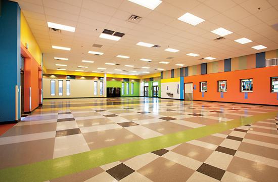
The corridors maintain an active feel with a large-scale checkerboard pattern in three neutral tones set on an angle. The same pattern is used in a different scale at major transition points in the corridors. Bright colors in the floor and on the walls call attention to classroom entry vestibules, and vary from classroom to classroom along the corridor, assisting in wayfinding and creating a sense of identity for differing classrooms.
The cafeteria utilizes the entire color palette to create a dynamic and active space. Daltile City View is used in the servery.
The multipurpose space includes a gymnasium and a frequently utilized stage space. In this area, school colors are emphasized. The school logo was waterjet cut in VCT for the center court circle. Acoustic wall panels continue the checkerboard pattern used in the flooring in the classroom building to maintain a consistent design language.
The multipurpose building was packed with a standing room only crowd to celebrate the opening of the new MC Cash campus. Although the staff and students were still settling in to their new buildings, the reaction of the community to the bright colors was enthusiastic. The school has already been nicknamed fondly “the Skittle school.” Community feedback describes the patterns as reminiscent of a serape, a brightly colored blanket-like shawl that is a traditional garment worn in Mexico. This is right in line with the goal for the color scheme: to infuse Latino culture in an environment that inspires pride of place for students, families and staff.
Copyright 2013 Floor Focus
Related Topics:Fuse, Interface, Daltile, Fuse Alliance, Mohawk Industries