Color Trends 2013 - February 2013
The U.S. has experienced a great deal of change over the past years, both economically and socially, creating what is often referred to as “the new normal.” Generally, it is in the commercial market that we see the most movement in regard to color and design. However, every now and then cultural trends run deep enough to shift the predictable and conservative direction of residential interior design, and it looks like we’re in the middle of just such a trend. Now that homeowners are planning to stay in their homes longer and are viewing them as long-term commitments, rather than investments that they will trade up, they are using the interiors to express their own tastes, rather than considering how the property might fare in resale; this may speak to the trend as well. Both markets, residential and commercial, are expressing greater optimism in their palettes, though restraint still remains.![]()
 Who knew that the new normal would actually begin to feel normal? Fiscal cliffs, storms, shootings, and wars have become the wallpaper of our lives, yet there is an emerging sense that if this is as good as it’s going to get, then maybe we should make the best of it. Spending time with family and friends is becoming more of a priority than ever, so there is an emphasis on making our homes safe, comfortable places. It’s not so much about the cocooning of the last decade, because we understand clearly that the world cannot be shut out. The idea is about creating an emotional experience at home that we enjoy and can share with others.
More than ever, people feel the need to express their individuality. In each of us, there are competing desires to fit in and to stand out. Whether one belongs to a street gang or the country club, we all enjoy the feeling of being part of something bigger than ourselves. On the other hand, at our core, we all need to feel that we are special and to be recognized for our uniqueness. While there are many ways that this dynamic tension plays out, fashion for apparel and home furnishing are the most apparent. Think of it as a continuum: at one end, soldiers in basic training, dressing alike and living in the same barracks; at the other end, people living in cave-like homes or tree houses (think HGTV’s Extreme Homes), dressing as if they are starring in a Broadway play. The rest of us fall somewhere in between, and we slide up and down on the scale as a function of age, life experiences and mood changes.
So if indeed, as a society, the whole continuum is shifting more toward the need to creatively express our individual style, how does the consumer do that? Discretionary spending on technology, cars and travel is profoundly driven by economic realities, but what people choose to wear or to buy for their homes is a colorful collage driven by emotions as well as money.
It’s an exciting time for home furnishings and particularly for floorcovering, because there is so much pent up demand. When you change the floorscape, it forces you to take stock of the furniture and accessories in that room. Just changing a few of those components or getting rid of some of the clutter can freshen the home quickly and affordably. Add a fresh coat of paint. One room can lead to another, and suddenly the home is more a reflection of the owner’s aspirations and dreams.
If you asked consumers if they want to be trendy, especially when buying durable goods for the home, most would say no. An accessory that’s the latest rage is fine, but they don’t want be stuck with a fad on the floor. What they do want is to make their home look fresh and to be in a place that suits their distinctive needs, both practical and aesthetic. Paradoxically, the collective response of people striving to be unique does eventually lead to the emergence of certain trends.
What makes something a fad or a trend? A fad is here and gone, just a flash in the pan. It caught the eye for a moment but had no relevance to things of lasting value.
A product or a look becomes a trend by using elements from nature, history, cultural icons or classics but adding a fresh twist, often a new way of combining the components. In other words, the relationship to enduring things of value resonates in our psyche, connecting us on a deeper emotional level. Color, texture and pattern play key roles in expressing these emerging trends.
Trends move slowly and evolve over time, but, at the moment, here are four themes that continue to capture the mood of consumers.
The New Traditionalist
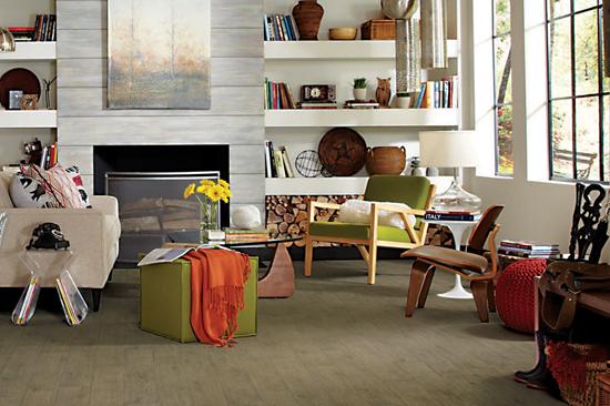
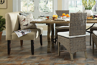
The popular transitional theme continues to gain supporters in an evolution called New Traditionalist. Hardcore traditional styling, where everything must match and be symmetrical, is giving way to softer, cozier environments with less clutter and rigidity. Transitional looks are also appealing to those who are growing tired of the sterility of modernism and want to add some softer, warmer touches with a sense of heritage. Today, the pendulum is seeking rest at midpoint, where tradition and modern coexist with ease.
Grounded firmly in timeless architecture and art, this consumer values quality and historical reference, yet the materials and finishes of this trend take full advantage of state-of-the-art technology. There is richness to their interiors, inspired by European design and embellished with opulent yet refined details that reflect couture fashion. They mix elegant heirlooms with contemporary art to create comfortable, uncluttered spaces where the past is reinterpreted for a gadget-driven culture. Cold contemporary spaces are warming up with comfort and functionality in mind. Craftsmanship and beauty are valued over disposable convenience.
Probably the biggest movement in this trend is the mixing of historical saturated colors like anthracite, deep amethyst and brocade gold with soft pearlescent tones of mint, peach, sand and cream. The palette is a bit more muted, but the pastel candlelit colors lift the spirits. Black and white, of course, are classics, but the twist here is to take them less seriously. The obligatory splash of color on white might now be gold instead of red. Blue and red are less important in this colorscape, making a departure for more traditional color palettes.
Textures for this trend are lace and cutwork for the romantics and padded quilted textiles for urban armor. Embellishment is back but with enamel sheen, chunky texture, embroidery and metal work used in an edited style. Gold, bronze and copper work well in this style when whitewashed for a patina of age effect. Sensual surfaces are derived from a love of lavish overabundance pared down to its essential core. Larger scale designs, realistic wide format woods and classic stones appeal to the New Traditionalist as a backdrop for creating a home that reflects their joy in heritage with a futuristic bent.
The Naturalist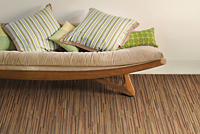 Beyond sustainability and the desire to bring the outdoors inside, the Naturalist celebrates the forces of nature. It’s about embracing the imperfections of natural materials and using them in abundance to create a folksy feel that is rustic and cozy. These consumers insist on quality, and they also want to know about products’ origins. The Naturalist is deeply passionate about reducing their carbon footprint and seeks innovative products that offer more than just beauty and functionality. It matters to them that materials are made in ways that respect the earth and human life.
These trendsetters walk the road less traveled to seek out the unknown and unexpected. They like the science behind how nature works, but they want their home to seamlessly incorporate technology with homespun relaxed style. Inspired by flora and fauna, the trend goes beyond simple green to digging deeper for enlightened design elements. Perhaps man-made materials that age as gracefully as woods and stones to create renewed interest over time?
Motifs in this range are inspired by lava flow, oceans and shifting sands. They are organic, loosely structured and coarsely textured. Metals add a raw edge to earthy neutrals. Although we are still deeply in love with stainless steel, copper is perfect to add to a classic woodland palette for a lift. The evolution in this trend is toward more layering and going a bit more decorative.
Here’s where the greys thrive, mirroring the storms of life and the fertility of black soil. Mysterious darkened hues balance soft greyed-over neutrals. The accents in this palette come from warm toasted tones like coconut or pecan and classic deep sea blue. Also, this palette is filled with every shade of natural green, from the emerald that Pantone declared the color of 2013 to more acidic shades mined from the past. Greens add harmony and prevent the greys from taking over. As in nature, the idea is to create a space in harmony with its surroundings, a space for rejoicing in the diversity of our world and envisioning a better future.
Floors for this trend are rustic, reclaimed looks in wood and stone with character and an aged quality. Bamboo and rapidly renewable resources or sustainable practices are of special interest to the Naturalist. Smooth and rough textures can be mixed to make the floor a more interesting indoor landscape.
The Eclectic Optimists at heart, these consumers love to tinker in an eclectic style, playfully mixing old with new, simple with complex, and humble with grand. They are constantly reinventing themselves and their spaces, perhaps with the change of season or just to shake off the doldrums of the day. Flexibility and modularity appeal strongly to them since change is their watchword. This group loves to stay connected with their friends and family and loves to share their latest inspirations on social media. They crave unique and different spaces where they can entertain and play. Life is an adventure best shared with others.
It’s important to the Eclectic that textures be touchable, sensual experiences. Fun fabrics with surreal patterns mix with lighthearted classics like stripes and geometrics in a crazy quilt of modern style. Personalization can be achieved by use of recycled materials, repurposed items, found objects or finds from nature. Digital photography is a magical tool for this consumer, both for art and to envision what they want their home to be. They research online and are willing to try new products or services if they believe in them.
These consumers are interested in materials that can be used in different ways. Patterns that look technical, like mesh or grids, can be used alongside foam-like materials to create spaces where fun is inevitable. Technical advances allow for super-lightweight yet strong fabrics, perfect for indoors or out. Latex, leather and feathers aren’t just for rock stars anymore.
In terms of color direction, this trend is enlivened by vivid brights. Sparks fly when intense colors from every part of the color wheel collide. The range tends to be more midtone to keep the feeling energetic but not frenetic or flashy. Easy going colors that work and play well with each other, like greens, watery blues and orange-based reds, populate this harmonious palette. On the fringes are some inventive purples, and it’s all built around a center of happy-go-lucky clear, clean neutrals.
Woods and stones for this category can have more color play and whimsy. Abstract patterns and mixing colors on the floor appeal to the savvy Eclectic. She’s always improving on her vision of the perfect home with quick-change products on the floor like rugs and carpet tiles.
The Bespokist In every group, there’s one person who stands out from the rest, the eccentric who dares to be different and for whom enough is never enough. These are the ones who go beyond bespoke (custom “this or that”) all the way to creating a whole environment filled with decorative arts and crafts. They are serious collectors of items from a myriad of cultures to create an exotic mix. Beyond cultural mosaics, these are modern bohemians who are not afraid of standing out! They relish their distinctive finds of materials from around the world. There’s nothing shabby chic about this lifestyle. The Bespokist is a contemporary hippie, freely mixing folkloric with tribal and using traditional elements in a totally contemporary way.
One-off items are what this person craves, so they combine materials from different eras and do creative mash ups of mundane and hi-tech fabrics. It’s all about creating something totally new. They go beyond what the playful Experimentalist would try, all the way to outrageous mélange of explosive proportions. Exotic birds and chintz are at home with Burberry plaid here. Anything goes so long as it’s authentic and touches the senses. Think bold patterns, think big scale, think about handmade African items with a wild story to tell.
Of course, the palette for this trend is also over the top: intense red, electric blue, forest green with a shock of salmon, golden yellow and pure purple passion. Who needs a neutral? Maybe a graphite color for a little visual relief to all the color clashes going on around it.
These are people who embrace pattern on the floor. They fearlessly layer up patterns and textures in unique ways and mismatch on purpose. Granted, the most serious devotees of this look are a relative few, but it’s an aspirational style for the young and young at heart wanting to live in the moment.
AN EXPRESSIVE ERA
It’s such an exciting time in design with a world of possibilities available to create uniqueness with mass-market tools. We are poised to take full advantage of technological advances in materials and communication. Consumers are starved for new ideas and ways to express themselves that don’t break the bank. They want an environment that lets them share their style with friends and family in a way that’s all their own, whatever that might be. For some it’s a clean, uncluttered space with calming colors, and, for others, it’s a packed house of colorful memories from a range of places and eras.
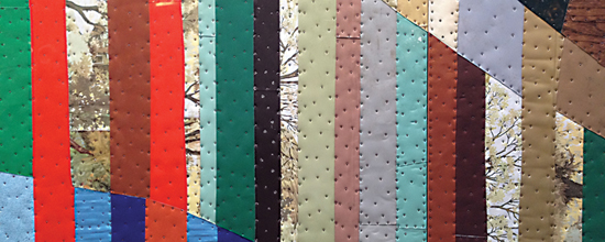
Across the board, flooring continues to evolve to meet the changing needs of the market. Woods are wider with tons of character and color play. Handscraped and even rustic reclaimed looks can work in formal or casual environments. Tiles and stones are also bigger, offset and with smaller grout lines. Carpet is still driven by interesting textures and subtle patterns and colorations. There are more beautiful choices at all price points for today’s consumer. Whatever their vision, they can use color to achieve their point of view.![]()
Our society has been looking to the future with a sense of tentative hope. The 2013 color trends will run in the same vein. Although there are attempts to push the feeling of uncertainty out of our psyche, we cannot seem to get rid of it fast enough. There is an optimism that better times are soon around the corner but also a caution against investing with abandon. In the commercial interiors arena, we look forward to a heavy focus on neutrals that will be slightly tweaked from previous seasons and easily paired with relevant accent colors. Color accents will be bold statements derived from rooted themes of heritage, culture and ancestry. This sentiment is closely tied to that of previous years, where we were searching for something familiar to keep us grounded. This year will, in many ways, be an extension of such thinking.
Neutrals will continue to act as the foundation for most color stories, reflecting the need to make wise decisions for planning and consumption. Neutral palettes will heavily reference all things earthly: dust and dirt; minerals and oxidation; roots and natural fibers. These references will appear as undertones, not as direct translations. Warm-value neutrals, especially, will successfully incorporate these references. Additionally, the ongoing curiosity in all natural, organic and handmade goods will play a supporting role in maintaining this interest.
Grey will continue playing an important part as a neutral. It, too, will have earth-inspired tones: ash, sand, fog and stone. Mixing of values within the neutral and grey families will allow for the creation of complex yet sophisticated color combinations that can exist beautifully with or without accents. These marriages of mixed values will be ready to anchor the palette when the accents are added to the mix.
Green
Green accents of 2013 will need neutrals to stay grounded. Since green is often associated with ideas of growth and regeneration—themes common in today’s social sphere—it will prove to be popular this year. Similar to the lush complexity of greens found in nature, so will be the offerings of shades of green. Mixed values of greens will be apparent, but clean greens, in general, will rise above muted ones. The purity of color will reflect the continuing desire for simplicity, stability and beauty. This is shown through Pantone’s selection for color of the year, “multi-faceted Emerald continues to sparkle and fascinate…bring(ing) a sense of clarity, renewal and rejuvenation…important in today’s complex world.” Keep an eye out for how this color pairs with neutrals to imply quiet confidence and joins bright accents to imbue freshness and energy in a space.
Blue 
Blues will be seen in two primary ways: making a bold statement or evoking a sense of security. An almost acidic, bright blue will allow for uplifting palettes when coupled with other vivid color tones. Coordinating nicely with the greens for the year, these blues will be less green-based, focusing more on pure color with various intensities. Another example of the first approach is a deep, saturated blue, acting as an anchor. Akzo Nobel, the world’s largest paint company, chose Indigo Night as their color of the year for reasoning similar to Pantone’s selection of Emerald. The rich hue speaks to elegance, stability and confidence. Again, this reflects the call for simplicity in today’s not-so-simple times.
Whereas the first approach to uncertainty is bold, the second approach is more subdued. There will be a desire to wash away feelings of concern, replacing them with feelings of calm, which is why we will see combinations of the values found in water. Gray-toned blues, from the idea of soft-breaking waves, and pale blues, from its crests, will be good value steps from the bright and rich blues. The softer colors, already distressed in feel, will provide a sense of familiarity and safety.
Red
The theme of security and comfort will show through familial elements when looking at the color red this year. Interest in heritage and ancestral roots is evident in the continuing love affair with all things handmade and homegrown. The term farm-to-table easily evokes images of a red barn and farmhouse, rural motifs, and gingham tablecloths. Sun-ripened tomatoes, blood oranges, berries and pomegranates will offer cues for intense chromatic options. Taking the idea of bloodlines to another level, Stylesight (the global trend forecasting group) taps into the arterial nature of the color red. They reference the “mysterious power” of the heart as it pushes blood through the body to maintain life. The softer side of red, to offer value shifts, will be represented through flesh tones. A pale rose shade will be used to ground the energy in this color family.
Yellow
Though yellow will continue to appear in palettes as a bold accent, it will not be as prevalent as last year. As with other accents for 2013, look forward to seeing brighter and warmer yellows. When it comes to value steps, yellow will follow the same course as other colors and have dusty, lighter companions to act as complements to more saturated tones.
ELEVATING CRAFT
Generally, the clarity and vibrancy of accent colors are part of the macro-trend calling for beauty and luxury. This trend is not based on frivolity or exorbitance but is rooted in cultural identity, craftsmanship and a greater acceptance of investing in quality.
Collectively, our immersion in technology has led to a pseudo-revival of the Arts and Crafts movement. This renewed movement has been present for a few years now, but seems to have graduated to a new definition of what craft means. Initially, the idea was that handcrafted goods should reveal the inherent rawness of the process or the materials used. Now, we are beginning to see a historically based understanding that craftspeople worked diligently to prepare the most flawless products a handmade process could offer. Because of the singular focus of the maker, handmade goods are expected to have great attention to detail and, in turn, are equated with luxury. We will see the raw and rustic embracing refinement. The unconventional and exploratory will start to pair with traditional design information. As we move cautiously into a new year, the key will be to make sure that signs of optimism—color and otherwise—are not squelched but rather embraced and encouraged to grow.
Copyright 2013 Floor Focus