Bentley's Todd van der Kruik: 2014 Com'l Color Trends - Feb. 2014
By Todd van der Kruik
The biggest surprise in 2013 was the lack of any really big surprises. Despite Washington’s unrest, the economy continued to grow, unemployment declined and the housing market improved, however slightly. Economic signs for the future look good, but after several years of Is it over yet? recovery, we don’t necessarily believe the signs.
Last year left us on a bit of a cliffhanger, and we’re hopeful that this will be the year we finally get the answers to our questions. Will the economy get back to a normal growth pace? Will the boomerang generation finally get out of mom and dad’s house and give housing construction a boom? Or is the new normal truly here to stay? As we leap into a new year of color and design, economic growth, lingering uncertainty, hopeful optimism and adaptation as a lifestyle become key motivators to consider.
Authenticity has been a buzzword for the last couple of years, encouraging introspection among the middle class and elevating the status of homemade and homegrown to rock star levels. As craftsmanship became the new luxury, we learned the value of doing things ourselves or at least developed an appreciation for those who can build, bake, grow or create. We were reminded that quality matters and acting locally is good for everyone. But as our level of fondness for the handlebar moustache crowd nears saturation, it becomes increasingly difficult to separate authenticity from good storytelling. We listen with discerning ears to the tales we are told, remembering the lessons learned from the product greenwashing of the mid-2000s. Authenticity is in transition, and we are looking deeper, past the retro typefaces and into the heart of the matter, asking the question we really want to know, what makes humans human?
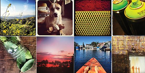
The new authentic is motivated by the need to self-express and, if Oxford’s 2013 word of the year is any indication, we want to see your selfie too. Driven by the low-tech lomographic palette of photo-sharing filters, we look to a wide range of greys to provide a dark and gritty foundation for color.
Grey is more important than ever and if we thought we could get away with using it all the time, we might just try. The grey we crave starts at zero and slowly expands in all directions, absorbing color along the way. Muted, color-infused greys in both warm and cool varieties remain neutral on the floor but add dimension and flexibility in combination with competing surfaces. Color streaks through the palette like light leaking through an old camera. Its high-contrast hues don’t fight for attention but blend naturally into the picture, shifting the tone and adding originality to what might otherwise be confused for conservative.
Blue is still making waves, moving from its watery incarnation of last year into deeper, earthier hues. A shift towards red helps take it away from the sea and provides a bridge between warm and cool. Nature plays a significant role, informing the color with natural root dyes like indigo.
We continue to draw color inspiration from the farm, inviting heritage vegetables to lead our discovery of new reds, yellows and greens. The authentic taste of heritage or heirloom vegetables, nurtured for generations to achieve unique color, flavor and texture, contrasts sharply with the homogenized supermarket variety and feeds our shift toward authenticity and self-expression as luxury. The rediscovery of ancient varieties of vegetables like carrots in shades of white and purple, among others, rattles our perception of tradition. We find these new traditionals to blend seamlessly with our neutral palette, taking cues from farm and field to achieve the perfect balance. The deepest colors of the farm transition to a new, earthy rendition of jewel tone, with the richest colors now taken from eggplant, grapes, tomatoes and other legacy varietals.
In addition to the farm influence, look for oxidized metals to have an impact, especially yellow and gold grounded in dark, earthy neutrals. Blues and greens will benefit from the exploration of exposed minerals, leading to experiments in turquoise, copper and opal.
The last five years have taught us to adapt, both personally and professionally, to the ebb and flow of the world around us. In 2014, adaptation emerges as a lifestyle for many and a design tool for those willing to take risks. Business strives to grow and change with the times, seeking classic aesthetics that can easily adapt to a world in flux. The word “timeless” echoes from the boardroom to the mailroom. We build new stories from stories already told, infusing innovation and clever solutions to keep the design both surprising and elegant.
New classics emerge in unlikely places as we allow ourselves to look more deeply at human motivations, leaning on our own experiences for inspiration and guidance. Telling our own stories through design connects them to the stories of others and to the underlying narrative of the world at large. In a recent exhibition, the artist John Tsombikos, better known as the street artist Borf, unveiled a series of paintings entitled Rothko’s Modern Life. Taking inspiration as much from Rothko’s classic color-field paintings as from his own experience as a graffiti artist, the series drives to the core of human motivation and offers new context to classic design. While the paintings are a juxtaposition of the two artists work, they also serve to acknowledge the tension between self-expression and suppression, connecting Rothko’s imagery to the efforts of city officials painting over graffiti with swatches of mismatched paint.
The coming year will be an exercise in discovery as we seek new ways to define classic and timeless design, adding our own personal narratives along the way. Think about adapting as a design philosophy, an ever-changing language with which to communicate with the world around us. Share your story and watch how the connections unfold.
Copyright 2014 Floor Focus